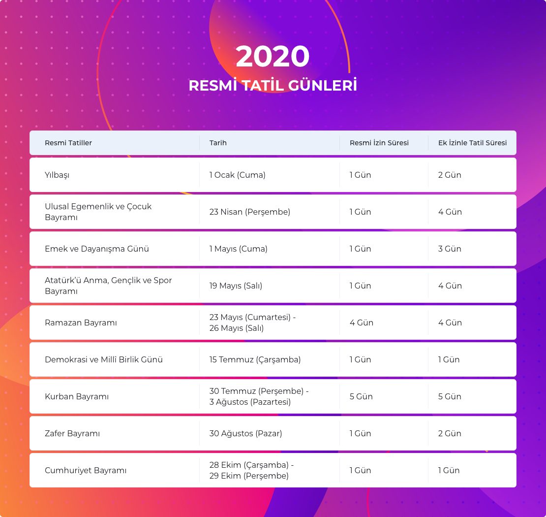
My web designer made a design showing the public holidays, but I didn’t like the background of the image. The page on which the image will take place does not look very harmonious in my opinion.
Could you recommend a background that will fit the page better? The table will remain the same.
Here’s the image and the web page that the image will be located.
Image: (sorry it’s in Turkish, the image shows the national holidays in Turkey)
Is there a reason you haven’t asked your web designer for something more suitable to your tastes? Are you personally going to swap it out or will they have to do it for you?
Bottom line we can’t begin to know your personal taste. In my opinion, talk to your web person and be up front with what you are looking for. They can’t read your mind and neither can we
The background draws attention to itself as being very vivid and aggressive, but whether that’s good or bad depends on the rest of the site. You mentioned it not looking harmonious with the rest of the page on which it will appear. Well, maybe, but that page doesn’t exist in isolation from all the other pages on your website. The bigger question, I suppose, is whether or not there’s a harmonious relationship between, not only the elements on the page, but the entire website and the general branding of whatever company the website represents.
As RedKittieKat said, a lot of this seems to be about your personal taste, but perhaps you should look at it from the perspective of your target audiences rather than from your personal likes and dislikes. You might come to the same conclusion either way, but without knowing more about your web designer’s reasoning, your reservations, your company, the rest of the website and the tastes and preferences of your audience, it’s little more than a guessing game as to what’s right or wrong.
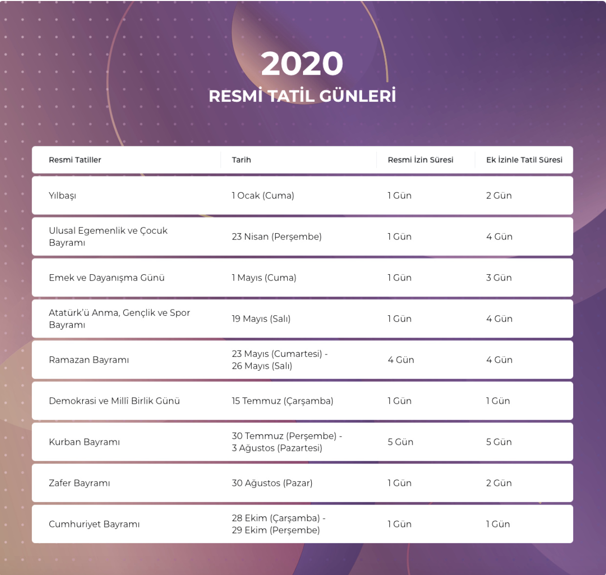
In the off chance you’re concerned about the vivid colors of the table background not matching the photo, it would be easy enough to reduce the color saturation of the background to bring it more in line with the colors in the photo, like below. However, that dulls it down to a more monochromatic look, which might not be right either. If it is the colors that you’re objecting to, though, it’s just a matter of altering them.
My designer made a few more designs at my request but I didn’t quite like any of them. I didn’t want to take more of his time, so I wanted to take a few suggestions.
I’m actually looking for more warm colors, I don’t want the image to pop-up that much just like that Just-B has shown.
Just-B, thank you so much for your detailed reply. That’s a really good suggestion. You enlightened me. I’ll ask him to reduce the color saturation and make it warmer.