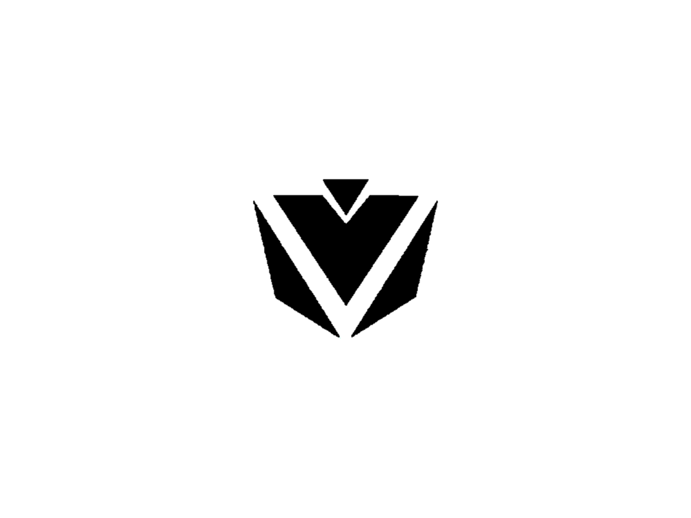
Greetings everyone! I’ve registered recently (about a minute ago) to ask help on my Logo, I saw that the lines in my logo are not clean straight and I wanna ask the process on how can I make the lines straight and clean.
I use Paintdotnet (sorry, this forum doesn’t allow “links”) which allows me to create custom shapes but all I did was use the basic shapes, and yes, I did use Photoshop for further edits like what you can see in the second pic. (which is my Steam avatar btw)
Edit:
Sorry, using Illustrator is a very tedious work to do for me, as I am very much new to Graphic Designing or even Logo Designing and I don’t have much time to learn about the program as school will start soon. Thanks for the suggestion anyway!
If you really want to, you can use the handle end of a screwdriver to hammer a nail into a piece of wood; but, at the end of the day, it’s not the right tool.
My Brother was infatuated with them back in the 80’s and my nephew loved them before he could pronounce it … His favorite is Bumblebee I’ve been getting schooled about Transformers and Decepticons for decades lol But how can you not love the heroic battles of Optimus Prime fending off Megatron?
… and now I’ve completely derailed this conversation … apologies to the OP
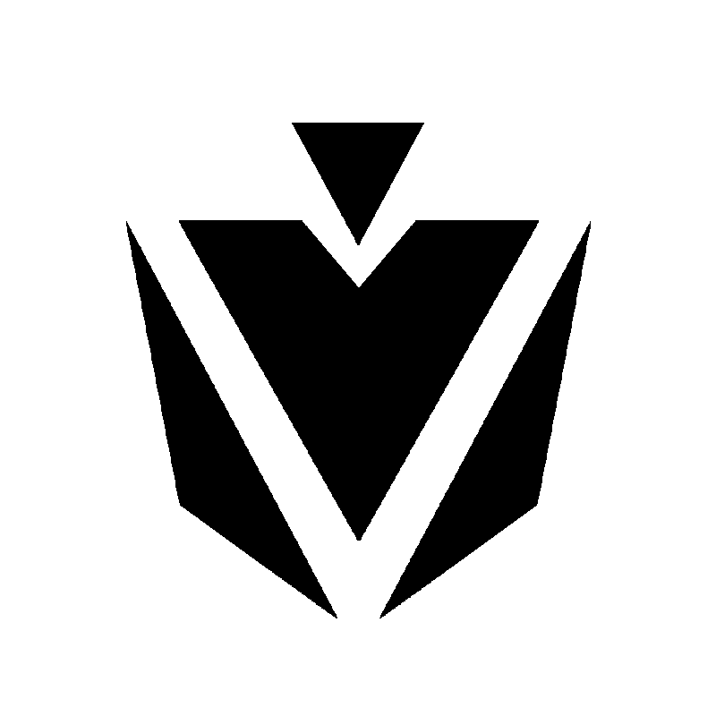
Hello guys, I appreciate you all talking about the Transformers stuff, and yes, my logo was supposed to be a “mech” looking kinda thing and I appreciate that you guys have noticed it, it made me feel accomplished, and also, I’ve cleaned the lines by using the Pen Tool on Illustrator and basically copying the outlines of my logo, here is the output:
Can you guys take a moment to rate it and say if it’s better than the original. Thank you all for the comment especially PrintDriver and those who helped! Cheers.
Edit:
I know it’s still a bit messy in some way (especially the diagonal lines, I really can’t do it that perfect but learning Illustrator is a fun process and I’m willing to learn everything on it especially for logo designing.
Yes, it’s better than the original. Illustrator creates straight, smooth, scalable lines — something you won’t get in a photo editor, like Photoshop.
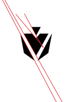
Your angles appear to be a bit off from being parallel with each other, though (see attached image). The one having to do with the small triangle are far enough off to look intentional. The larger ones, however, look more like mistakes.
In addition, I agree with @Eriskay’s observation about the V. If you made all the line angles I mentioned above the same, it would solve that problem and, in the process, simplify the shape’s visual complexity. Then again, it might change the overall shape to be something other than you wanted.