Hello! Could someone please help me with this issue?
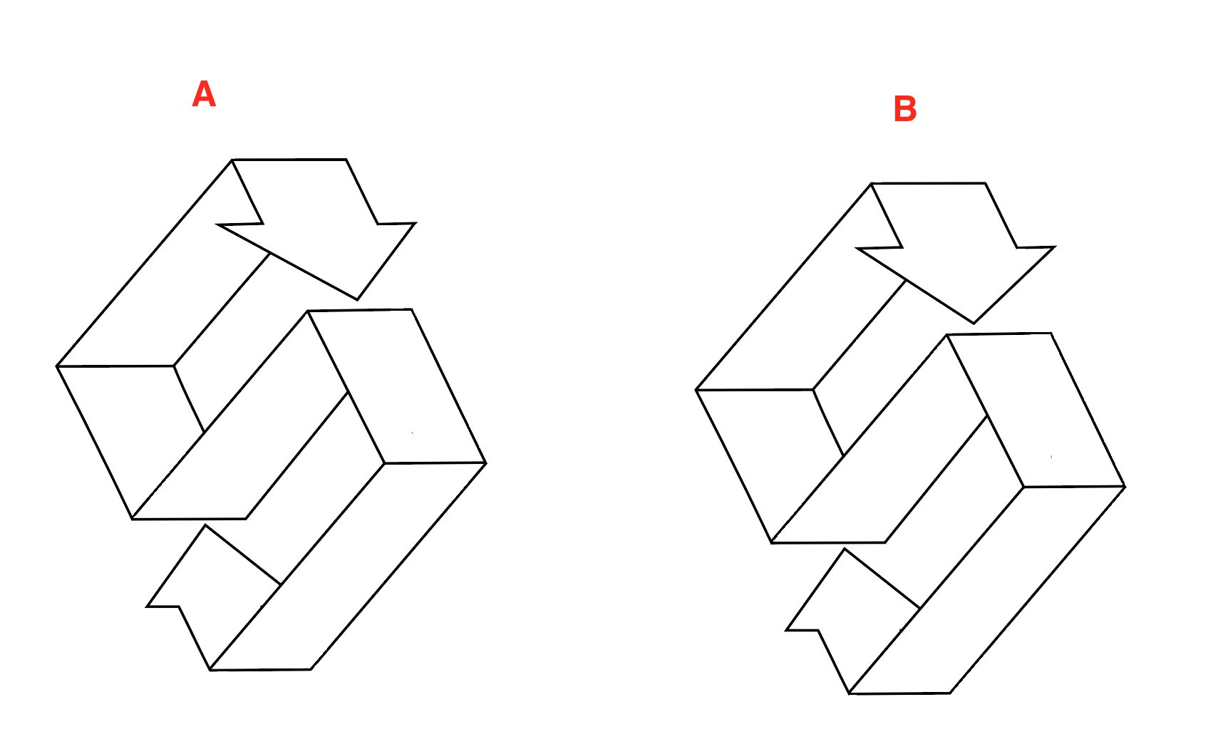
I haven’t done a lot of geometrical/perspective needing logos and now that I need to I struggle a lot with the upper arrow part of the logo.
I have been looking at it for so long that my eyes can’t say if it is perspectively correct or not…
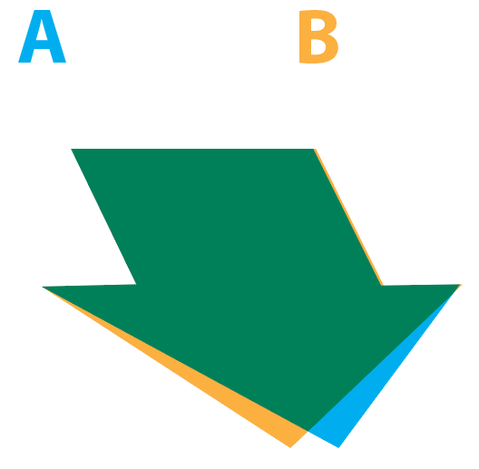
It almost looks to me that the upper arrow of B looks more natural because it doesn’t have a too sharp left edge, however the point of the arrow is not located in the middle of the line beneath which makes it weird/ out of perspective.
Logo A looks right regarding that the pointer is in the middle but then I find that the left edge is too sharp, but can’t make it less sharp because of the perspective. (imo, otherwise it looks even weirder or it can’t be done)
So please can you say wether Logo A is right or what I need to change because my eye balls and brain cannot handle this anymore
Your help is appreciated!
Your drawing has no perspective — it’s isometric with no vanishing points. In other words, instead of aligning the lines to vanishing points, you’ve aligned them parallel to each other.
Of course, using either 2- or 3-point perspective would change the nature of the drawing, which you probably don’t want.
If you plan to stick with the isometric look, the arrow’s points need to align with the middle of the horizontal line it’s pointing at. Yes, it’ll look a bit weird because isometric drawings don’t correspond to the way things actually appear.
Long, long ago, I used to work as a technical illustrator for a computer company. We often used isometric drawings in the manuals because all the lines can be measured without perspective interfering with the measurements.
Then again, maybe you already know all this, and it’s not what you’re asking about. If it’s unfamiliar, look up isometric drawings and two- and three-point perspectives.
Version A
But review the bottom arrow as well.
As B said, Isometric has no perspective so the bottom arrow would point to the center of the line as well.
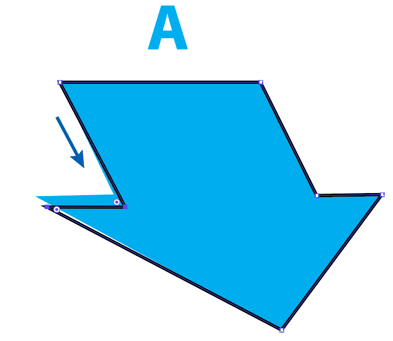
To rightly keep version A (which is closer to correct, logically and aesthetically), and refine it by flattening that angle you find troubling, you’d only need lengthen the left side of the arrow just a bit by moving two anchors:
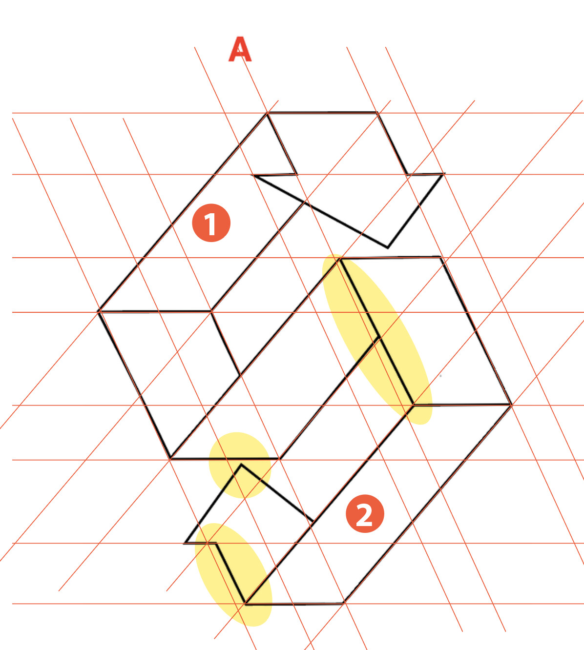
As others have mentioned there are other inconsistencies.
section 1 and 2 as you can see are different widths. 2 is quite a bit skinnier. You can also see that in the highlighted areas that the lines are not aligned properly. I’m not sure what software you are using but I’d recommend creating an isometric grid guideline and then draw your shapes using that grid.
Thank you for showing this to me, and mentioning the creation of an isometric grid guideline! I am using Adobe illustrator, though it is my second time that I use the program, so still learning a lot