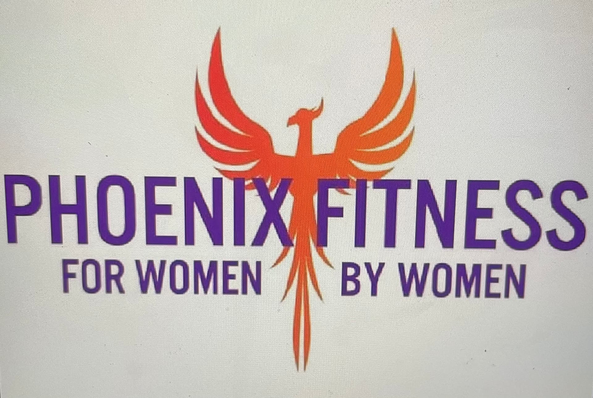
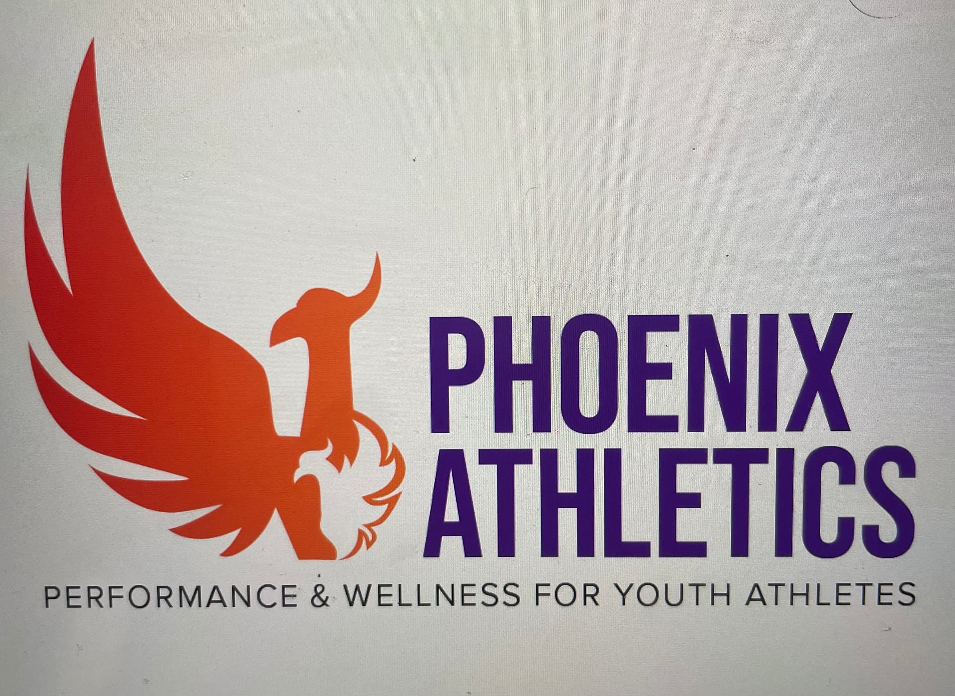
This logo is for a sub-brand of a women’s gym. The gym is Phoenix Fitness. Keep in mind I did not do the original logo but have been asked to do the sub-brand logo. It is for Phoenix Athletics which is a fitness facility for youth athletes to build strength, conditioning, agility, etc. Here is my first crack at it. Is it too different from the original to be recognizable as same brand? Any help is appreciated. Original and sub brand below.
1 Like
Whatever the gray background is, you don’t want it there (unless you are using your thumbprint as a watermark?) It’s too subtle and lends more chaos to an already busy design.
I wouldn’t make the baby phoenix appear fat.
I like that you’ve removed the skinny outline.
I’m not a fan of gradients in logos, but these days, whatEVer. You build it, I’ll print it, but it’s gonna cost you $$$$ if you ever want me to paint it (think 3D logo on a wall)
I think we’re looking at a photo of the logo on a monitor.
I’m assuming the top version is the actual logo of the gym.
Is the small bird supposed to represent youth athletes?
I’m not too sure removing one of the wings from the bird works.
1 Like
No way! I thought only I did that! LOL! (sometimes its the fastest way to get something on the monitor into a text message. ![]() )
)
Thanks for the feedback. i tend to agree with the gradient but was trying to make the 2 cohesive to make the brand connection. My husband said it was too cutesy for teen athletes… like he wouldn’t want to wear it on a shirt. Maybe it’s back to the drawing board… maybe flame with the Phoenix in it as negative space??? Hmmmm
I think the illustration work is nice, and it was a good attempt at tying in with the primary brand; but, yeah, it sort of reads like a mama bird sheltering a baby bird. That may not resonate with teens.
The bottom logo looks like a bird with a missing (or broken) wing. And the smaller bird doesn’t work for me at all. Do yourself a favor and start over. I know you can do better. Just put more actual work into it—a little more creative thinking.
This topic was automatically closed 365 days after the last reply. New replies are no longer allowed.