Help on what to do as an new graphic designer

Hello.

I get right to the point but I been on and off as an graphic designer since last year, mostly due to me quitting my job last year and try to start off as an freelance graphic designer on Upwork until I got another job again. I only did one graphic design work back then so I really didn’t get much exprience until I came back again as an freelance Graphic Designer after getting my graphic design certification from my community college. I had managed to do two works on Upwork involving making an graph and then sketching out an artwork for an different client. But after that, I had no success of finding another job.

I been having an hard time trying find more work mixed with me feeling that I’m not good as an Graphic designer yet or an good artist to the point where I feel overwhelmed when I look at an job post that I felt was too complicated for me. I try to look at sites like maybe Fiverr and Etsy to see if they would be easier but I got scared looking at the users on there lol. I’m still at school at the moment trying to do my assiocate degree next so I’m wondering if I should just wait till I finish more classes to learn more or still learn right now, build up an stronger portfolio and try again later.

These are the work I did so far on Upwork for clients:


The work I did from school:
ChaseMooreMagazine

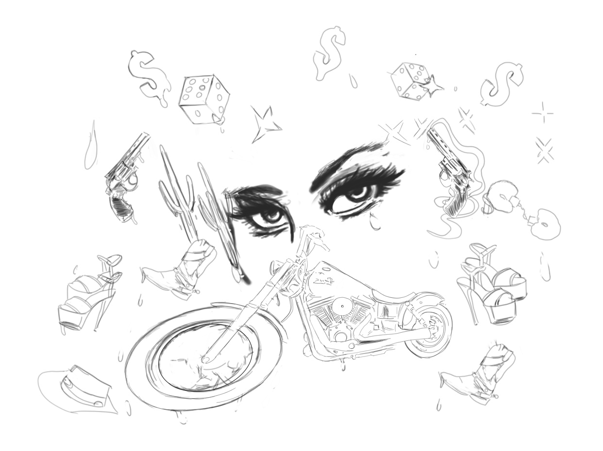
This one here is actually are actually projects I just done for myself as practice


Chase Logo finished

You’re unlikely to find a very good job in this field with work like the following in your portfolio. I can count at least ten deal-killing mistakes in just one corner of your layout, from spelling to punctuation to lack of clarity to iffy layout decisions. I’m sorry to say that, but you need to pay far more attention to detail and get some solid critiques on your work. You could benefit enormously from getting other designers’ opinions on how to improve those things you’re likely not seeing.

I do like your sketches, though, which are really nice. I just don’t think you’re applying that same talent to your design work. Why, I don’t know. You mentioned a design certification from a community college and that you’re pursuing an Associate Degree. Are you pursuing that through the same community college, and is it a degree with a design major?

If so, what kinds of critiques are you getting at school? If the school is worth attending, you should be getting heavy criticism that will help you see those things you’re missing. It’s only then that you can begin addressing the shortcomings.

Feel free to post your work in the Crit Pit here. People will gladly tell you what they think. It might be hard to hear, but getting those outside viewpoints could very well alert you to things needing to be fixed that you’ll never notice on your own.

1 Like

Also I think my lack of applying the same talent to my design work could be because I wasn’t really putting in the same effort like I do with my drawings since I was still new to it unlike I am with drawing/sketching which I been doing longer than I do for my graphic design work. I’m trying to change all of that now by focusing more on making small projects for myself to get better and make it into an daily habit.

I’m going to be pretty critical because Upwork and Fiver have a lot of meh designers thinking they can jump into freelancing with little to know real experience.

12 Steps of Forgiveness
There is no clear hierarchy or distinction of text.
The type is plain, misaligned, riddled with basic grammar errors, and there are a few hanging chads.
Remembering God’s love has an image that looks like it was just slapped on with no effort to remove the white background.

The Illustrations
Just-B said they look good and they do. Kinda interesting but also looks unfinished.
It looks like youre trying to do something with perspective and it falls flat in the dice, hat and front motorcycle wheel. Its better work but still not worth $$$

Empyreon
Graphic design is a communication art. You cant communicate what you cant read. The amount of filters and gradient effects applied to the text isnt pleasing to look at. The idea seems solid however and I get what youre trying to do.

Star Wars
Everything is in a box and that box has an odd drop shadow and the boxes aren’t even one shape.
Your utilizing too much type. Stick to 2-3 typefaces or use different weights/sizes for contrast.
Use a grid to align your text and everything should come together more effectively.
The title hugs the border too closely and BIG & EVIL looks like it has an odd stroke to it.
Think of type as a way to be creative with alignment but also less is more when it comes to effects.

Mexico City
A better layout, but falls flat with over utilizing image/overlays.
Think of a way where you can say Mexico without an over-reliance on the flag colors & tex-mex fonts.
Research is pretty critical component in design. How can you blend modern & traditional style? Anicent images and modern building are a stark contrast. Mexico has both. How are you organizing the design. Do you sketch?

I sketch alot in my free time but I never use it before when I do my graphics. When I did the mexico design I just put together what was the most pleasing to my eyes.

And I learned the hard way about jumping into Upwork with little to no experience which is another reason I stopped doing it and kind of wish I learned more beforehand. Also what be the best way for me to gain experience?

Edit: Sorry but repost because I accidentally delete this reply post

Thanks for that input. And well on the school part, I got my cert. through mostly online classes where I never gotten any critiques since it was just kind of following instructions from the instructor and that’s it. Maybe when I take my graphic design classes again after I’m done with my current math course, maybe I can try to do them in person and maybe I get critique that way. If not, then I will try posting in here since I need different POVs anyway.

And also its the same school and an design major.

The best way to gain experience is by practice, reading and putting your knowledge into practice.

A good education in graphic design will incorporate history, criticism, aesthetics and technique. If the only thing they covered is technique… how to use the software… then they aren’t delivering adequate pre-professional training.

I probably going to take an look back at the classes I took then to make sure I was actually getting everything I needed because I think I do remembered in my graded page that there was notes giving me critques but its been awhile since I actually took the class. And I actually had took an history course that I do remember some of the things that was in it.

If anything else, I’m probably going to try to relearn again this year and hope to get better before this year ends.

That’s definitely the way to go; learning. However, make sure you learn in the right direction with a good degree from a reputable university. The more you learn and practice, the better you’ll get, but don’t think, for a second, that you will be in a position to start earning money as a professional designer by the end of the year.

I’ve been at this for 30 years now and one of the most important things I’ve learnt so far is how much I don’t yet know – which is why when people at your stage of the game talk about offering their services professionally, it’s all I can do to not resort to extended bouts of extreme, frustrated profanity. It’s not entirely your fault, if that helps. There are too many private colleges out there ready to take students’ money and not actually educate young, hopeful, eager designers In return. Knowing how to use software doth not an education make.

Once you are in a position to start working (hint; in about three years)! avoid crowd-sourced design sites like the plague. They are just a race to the bottom and devalue the worth of the design. it is far better to gain experience in a design studio for at least four or five years before even thinking about freelancing. Even then, crowd-sources sites are the devil’s spawn.

Learn from the best. Research. Read – everything. Understand typography. Really understand it. Learn the history of it, hand draw letterforms until your hand hurts. Learn to love them. Never underestimate the strength and usefulness of white space. I could go on, but that’s what getting a good degree is all about.

One other tip, in addition to what has been said; please, never use machine-condense (or expanded) type, ie don’t use horizontal scaling. It’s painful. If you want a condensed font, use a condensed version of a font and don’t simply apply 75% horizontal scaling to a regular font. It’s a real typographic room 101.

Finally, stick around here. There a lot of experienced, knowledgable people who you can learn a lot from – as a supplement to, not a replacement for, a good education.

Thanks for those advice! You kind of ease my worries since there was alot of things I was worrying about right now. I guess I can try to take my time with this since it sounds like it be awhile till I atleast know what to do.

Just curious since we get folks from all over the world, is English a second language?