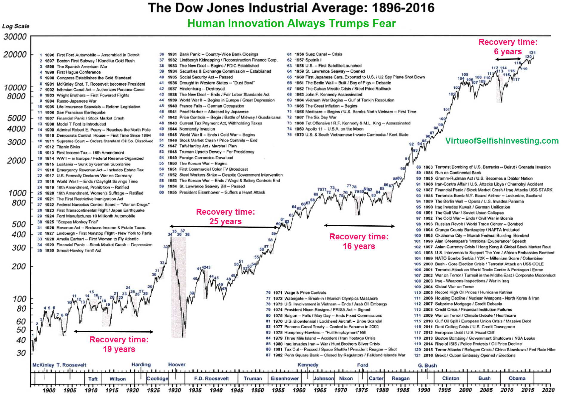
I basically need to recreate this chart from the ground up and while I’m a pretty experienced designer, I’ve never worked with graphs or infographics. I’m just wondering if anyone has any advice on how to accurately recreate the data line (with all its spiking peaks and valleys). Any advice would be greatly appreciated as I really have no idea the best way to proceed.
I’d likely approach it in one of two ways — both using Adobe Illustrator.
I’d either create the grid by hand in Illustrator, then draw the fever line in or I would input the data by hand into Illustrator’s line graph tool, then let Illustrator build the fever line.
Either way, it will be tedious and time-consuming.
Hi, I guess I’m a bit too late, but may be it is still interesting to mention that Datylon developed a plug-in for Adobe Illustrator to create advanced and re-usable charts. It’s called Datylon Graph and you can download a free trial from their website.
