I’m designing an advertising banner for a tile business. I’m trying to do something strict, without unnecessary elements in the Swiss style or the constructivist style, focused on an adult clientele, which would not stand out from the environment of my town and would be memorable. Can you tell me what should be added to the composition or removed, maybe some color palette will be better than the one in the image (at the moment I’m left on a variation with a brown palette, I think it fits best). The banner will be in the sizes shown in the images.
Is that what’s best for you or is it what’s best for the client? Your job right now is to sell paving products, not to create a Swiss style sample for your portfolio. I’m not necessarily saying the Swiss style is the wrong solution — I don’t have enough information to make that call — but you need to be strategic about it.
What kind of banner are you referring to: a physical, printed banner or an online, social media banner?
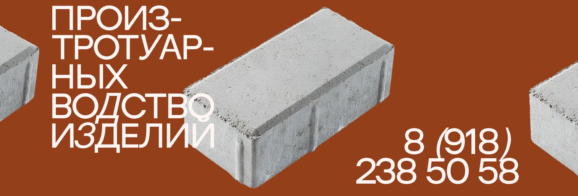
You seem to be forcing your typography to conform to a preconceived notion of Swiss style rather than following typographic conventions that facilitate readability. I’m not especially familiar with Cyrillic conventions (I assume Russian), but hyphenating a word in a headline seems unusual, let alone hyphenating it twice. In addition, why are some of the characters in italics?
One of the main tenets of Swiss (and Bauhaus) style is that form should follow function. In other words, the function of a design should take precedence over how it looks. As @Steve_O mentioned, the primary purpose of your design is to promote the company’s products. Does your design do that? Will it be effective in engaging potential customers? Does it supply and present the information in the best possible way? Is plain brick the best way to do that? Would an image showing their paving stones in use be more effective?
I don’t necessarily know the answers, but I’m wondering if you’ve asked yourself these questions. Or are you subordinating the function of the banner to your preferred form and style — A Swiss Constructivist look?
With regard to strategy, I believe that a memorable design can attract a customer and possibly retain them. Of course, the quality of the product should always keep up with this understanding, however, there are many small good manufacturers who cannot break into the big market due to unsuccessful branding. That’s why I’m looking for something neutral, as I wrote above, based on a functional style.
If we return to a number of your questions about the function of my creation, then I don’t know the answer to each question, that’s why I’m asking for help here, maybe someone can advise me on how best to arrange the elements in the composition, what interval to make, what elements to focus on. I’ll add that I was looking for thematic examples on pinterest, behance and several other sites, but I still couldn’t find anything related to the production theme, so I focused on Soviet posters
That’s not really strategy. That’s your goal. Strategy is how you achieve the goal. So what is it about the Swiss style that will resonate with your target market and turn them into paying customers?
I think the Swiss style might appeal to a potential client for its simplicity associated with a minimalistic compositional style, and it would also look like something new in my environment that would attract people’s attention.