Hi everybody. I’m an amateur designer and I have been requested for changing the image and the look of a busines. The busines is a kitchen and bathroom designer who wants to renew the appearance of the store and im having trouble choosing the colour for the logo, since he wants to keep his logo but he is ok to change the colours i would appreciate your opinion. The guy wants something more classic than modern i was thinking of using gray and colour not saturated. And also if you have and idea for fonts.
Thanks in advance!
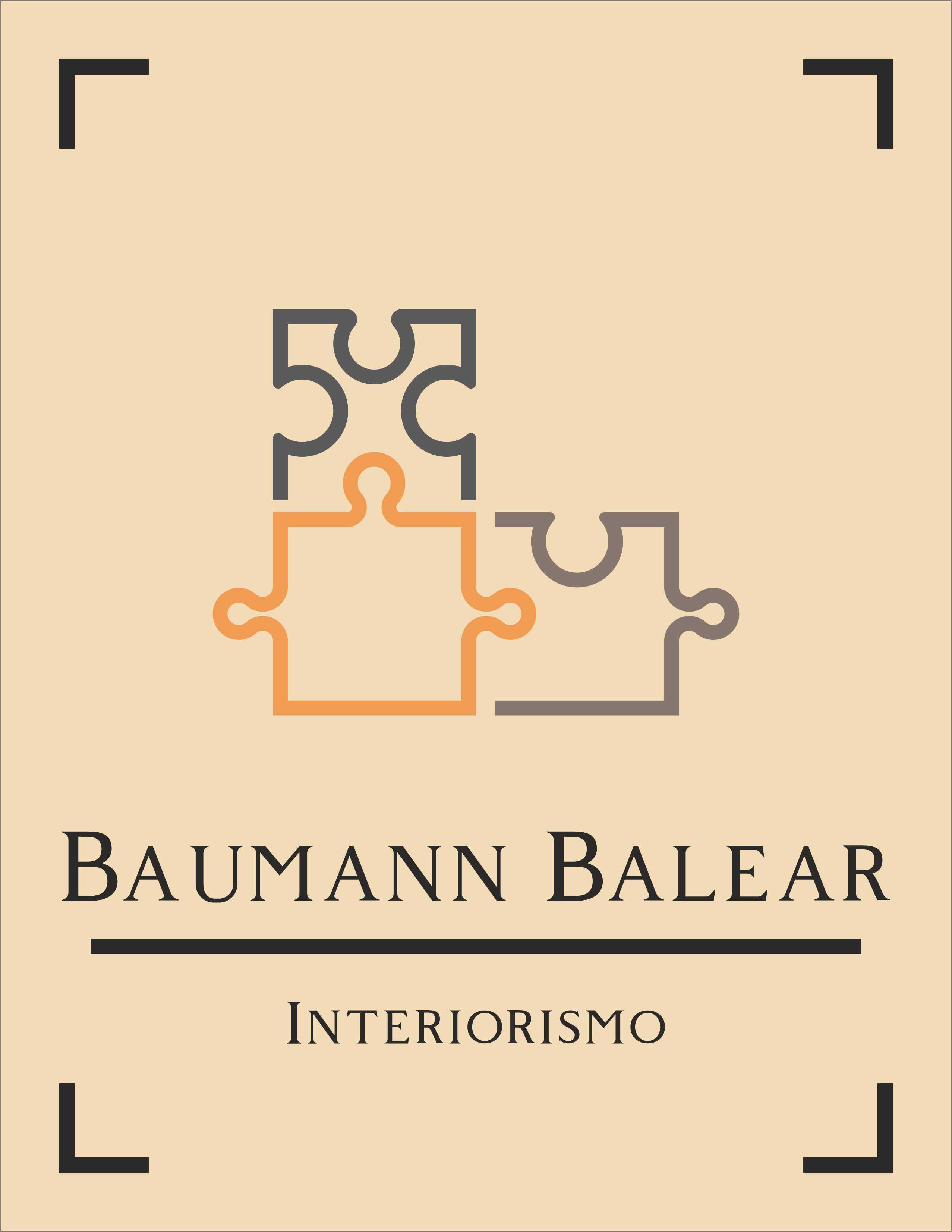
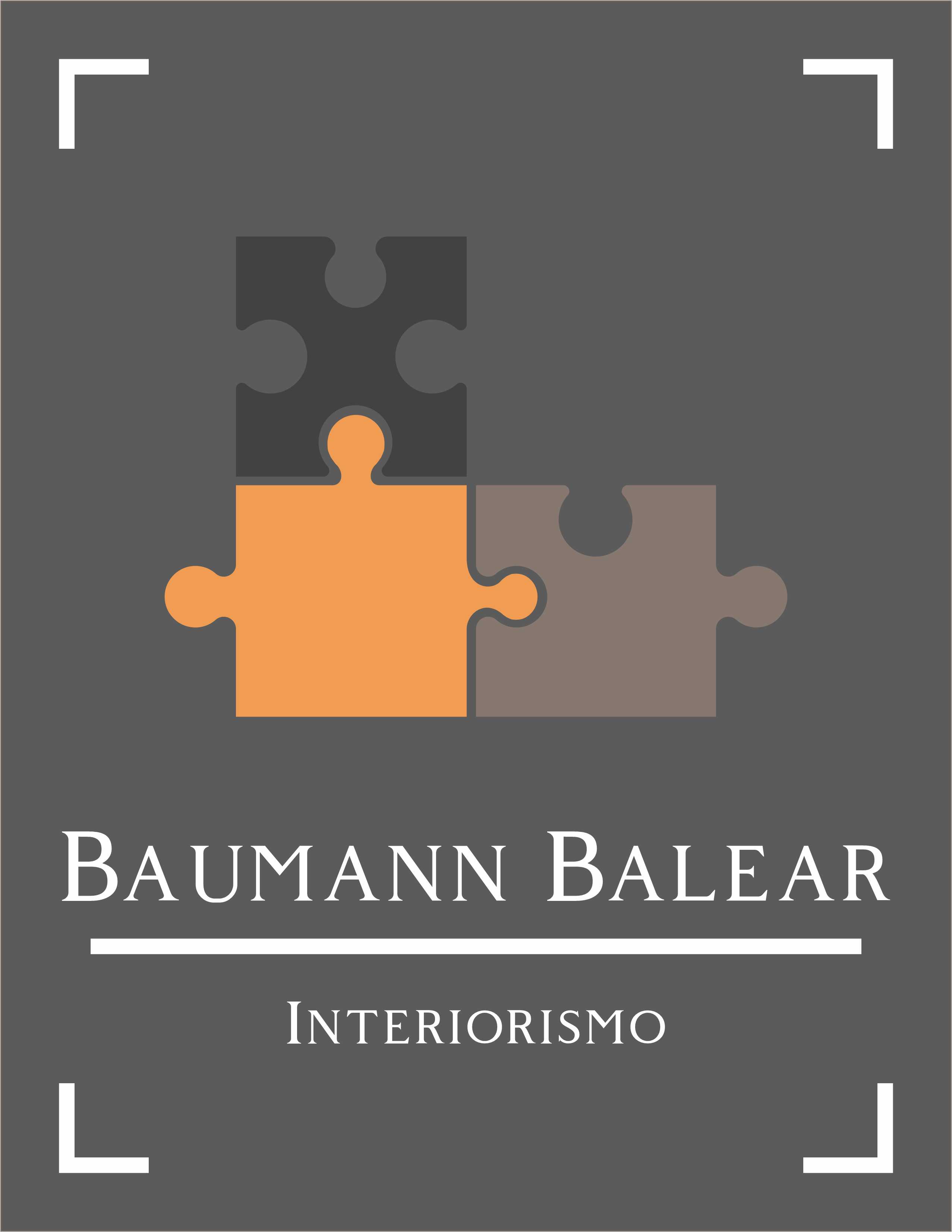
This is what i made so far ( byt the way, the logo is just 3 puzzles pieces, the rest such as colour or shape and fonts are up to me)
The colour is the least of your worries. The whole jigsaw puzzle cliché is so completely done to death. I’d come up with another idea that better represents who they are and what they do.
2 Likes
I agree with you, but unfortunately is jigsaw puzzle or not job at all…
I agree with @sprout – the puzzle pieces don’t work. The crop marks and the horizontal rule are superfluous. Also, watch your kerning.
I’m a little confused. Is the entire composition the logo or is the logo just the puzzle pieces? You mentioned the logo needing to stay the same and only being hired to change the colors — is this correct? Did they hire you to leave everything the same while only changing the colors? That doesn’t quite make sense.
What are the corner things? Are they part of the logo? Why are they there? Why are their two versions of the puzzle pieces if you’re only allowed to change the colors?
Anyway, I like the top one better than the bottom. The orange really jumps out above and beyond the other two, more muted puzzle pieces. Is that intentional for some reason? If not, all the pieces should probably be equal in terms of visual prominence — same overall value and saturation but different colors.
The typeface is fine, but I’m not so sure its personality matches that of the puzzle pieces. The typeface is a quirky traditional style, but the puzzle pieces are more geometric and contemporary.
The (for lack of a better term) male and female parts of the puzzle pieces are different sizes. This makes sense on the second one, but not on the first, outlined, version, where there’s no separating line between the pieces (hard to explain).
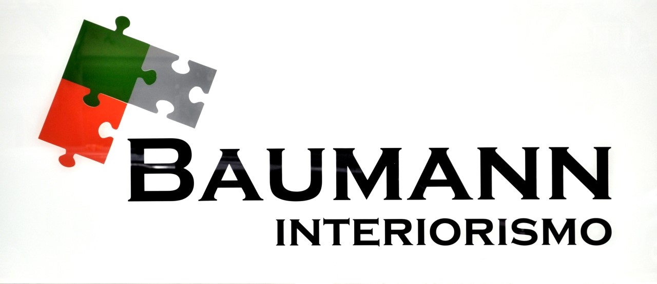
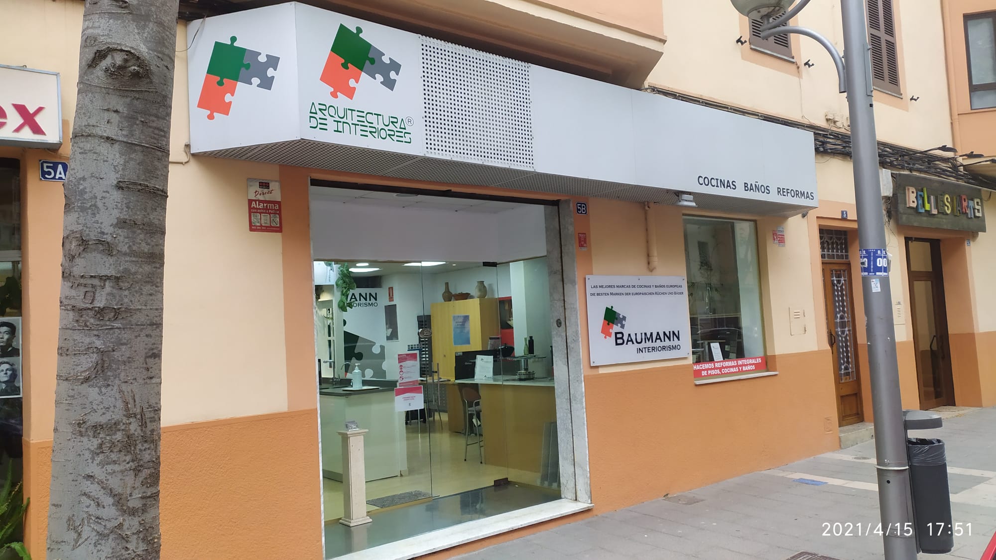
Hi thanks for your responses. I forgot to show you the original one. The owner wants to keep the puzzle pieces as he says is the brand logo and all his costumers know it. So im trying to keep the “puzzle pieces” but trying to make them look better. The whole project is not just only the graphic part, is also re decoration of the store, make a website, personal cards, flyers, etc.
My job here is to create a few concepts of the brand with a new look, new colors and the information i have is that the owner wants to keep the puzzle pieces and make it more classy (or whatever) so im trying to create some concepts and if the guy like what i did then i get the job. This is not a professional project, is just something casual to make a few extra bucks.
Could you please tell my your display model?
Do you have a colorimeter?
Getting the colors right is going to be tricky unless you have a calibrated wide-gamut display.
You don’t need a color accurate monitor to do logos. You would probably do better with a Pantone book as that is still, for better or worse, the language of color in the industry.
As for what the OP is doing “for fun” and apparently on spec ,is worth at least high 4-figures if not 5-figures. No joke. An on-brand rebrand and fitout? Yeah… have at it. LOL. <sigh…>
Calibrated to what exactly?
In my case (an OLED display, an X-Rite i1 Display Pro Plus and CC Profiler):
Luminance: 80 cd/m2
White point: D65
Gamma: 2.2
Tonal response curve: standard
Contrast: native
I was taught that 80 cd/m2 is the lowest luminosity setting that doesn’t cause a display to display colors incorrectly and white points below D65 distort your color perception, reducing the number of colors you can see.
A pantone book is only as good as the lighting conditions in which it is viewed:

Colour calibration on a monitor vs printing vs pantone are very different things.
You might be colour calibrated to view pantone colours accurately - but that has nothing to do with CMYK.
If you colour calibrate your monitor to CMYK then it’s for printing (or other colour model) - but then you need to know what printing machine is being used.
So unless you are the printer - and you’ve colour calibrated your monitor to your presses… then a CMYK calibrated monitor is only as good as the output of the machine outputting the artwork.
It won’t matter for Pantone - as the output of the Pantone is ink based - so every printer works off the same mixture - producing the same results depending on the Pantone Books for reference.
2 Likes
Thank you, though I’ve never come across calibrating your display specifically for Pantone or CMYK.
CC Profiler/i1 Profiler and DisplayCAL have no CMYK/Pantone-specific calibration settings.
So your point about your calibration method for logo design here is what exactly?
I can’t imagine designing a logo for a client on a random, non-calibrated display, with no control over how the colors will look once printed.
I pay a lot of attention to color accuracy. I have an OLED display** with a 95-96% Adobe RGB Coverage and an X-Rite i1 Display Pro Plus Colorimeter + CC Profiler (formerly i1 Profiler). I calibrate my display weekly.
Every sigle logo file I send to a client has an embedded CMYK color profile.
** I have a laptop, because I hate being tied to my desk. ![]()
Yeh but my point is there no point in randomly calibrating your monitor to see colours you want to see on your screen (and nobody else’s screen) that have absolutely zero bearing in print or other reproduction.
Which is completely pointless - as embedded colour profiles are stripped out by printers anyway.
And why a CMYK profile? Do you use spot colours? What about LAB?
1 Like
I have to disagree.
With a properly calibrated display and the right lighting setup you can get a good print-to-screen match, as demonstrated here (10:25):
I use CMYK because - until I’m mistaken - it’s the most popular standard in the print industry.
As important as a good, reasonably well-calibrated display might be, I don’t view the details you’ve described as being especially important for designing logos.
For some purposes, yes, but not for a logo design. For example, as in the video you linked to, photographers wanting perfect prints need their display, the ambient lighting, and the printer calibrated in ways that work together to produce near-perfect prints.
However, it’s usually not possible to calibrate one’s monitor with the output device or the printing press for general graphic design purposes. Even when that is possible, there’s an inherent difference between the additive color of an electronic display and the subtractive color of printed materials.
As for precise color profiles, what’s appropriate depends on the printing device/press and the substrate or paper stock. Send the same CMYK file to two different printers, and it’s unlikely that the printed results will match. As Smurf2 said, profile information is usually stripped out by the printer and replaced with what they know will work best on their equipment. For that matter, it’s typically stripped out or overwritten when creating the press-ready PDF or even before that when an object, like a logo, is placed into InDesign or another layout application.
Whatever color profile you include with your logo design will almost certainly be negated by other more situationally specific factors and profiles during the logo’s placement into various documents and subsequent prepress adjustments.
Four-color process printing deals in approximations and adjustments for the job at hand, and none of that, as someone supplying logo files to a client, is something that you have any control over.
The only way to achieve good color matching (rarely perfect) is to use spot color inks. Pantone spot colors should generally match from one printer to the next, although variables still affect the final results. Even when printing with digital devices, those printers are typically calibrated with look-up tables to separate the Pantone spot colors into whatever ink mixture is most accurate for that piece of equipment.
If color fidelity in a logo design is of utmost importance, a designer should start with Pantone colors, then use whatever 4-color process percentages best approximate those Pantone colors for CMYK. Everything that happens down the line — from client to designer to printer — is beyond your control.
No question, a reasonably accurate, quality display is important, but going too far with calibration details soon reaches a point of diminishing returns that are meaningless. Again, the only way to achieve optimum calibration is when the display can be calibrated to the printing device and every step in the process. This was relevant to the guy in the video because he could calibrate his ambient lighting with the colors of his monitor and his printer. If he took those same calibrated files to a print shop down the street, those files would very likely print differently. This is not relevant to designing logos for clients.
1 Like
Please, not another, “but your print doesn’t look like my monitor…”
QFT with my bold for emphasis:
Again, the only way to achieve optimum calibration is when the display can be calibrated to the printing device and every step in the process. This was relevant to the guy in the video because he could calibrate his ambient lighting with the colors of his monitor and his printer. If he took those same calibrated files to a print shop down the street, those files would very likely print differently. This is not relevant to designing logos for clients.
I could send the same image file to three different print devices using three different inksets and three very different media. While they all would look great, they are all going to be different enough to be noticeable. I could get them to match, but it would require some great deal of effort, none of which has anything to do with your monitor calibration.
1 Like
On the same note, a logo designed for “color looking good on a monitor,” will do the same thing as those three images above. They will all print differently as there is no frame of reference for the color. They are just pretty pictures.
But add spot Pantone colors into the mix? (depending on the colors chosen) the color match would be nearly spot on across media because now we have lookup tables specific to that machine, ink and media.
That part about depending on the colors chosen? That’s where the designer’s skill comes into play where they are not picking out-of-gamut Spot colors, knowing full well that logos are not always printed in spot inks.
1 Like
I’ll bet the original poster is like…
5 Likes