Help to choose Colour for logo

I can’t imagine designing a logo for a client on a random, non-calibrated display, with no control over how the colors will look once printed.

I pay a lot of attention to color accuracy. I have an OLED display** with a 95-96% Adobe RGB Coverage and an X-Rite i1 Display Pro Plus Colorimeter + CC Profiler (formerly i1 Profiler). I calibrate my display weekly.

Every sigle logo file I send to a client has an embedded CMYK color profile.

** I have a laptop, because I hate being tied to my desk. :wink:

Yeh but my point is there no point in randomly calibrating your monitor to see colours you want to see on your screen (and nobody else’s screen) that have absolutely zero bearing in print or other reproduction.

Which is completely pointless - as embedded colour profiles are stripped out by printers anyway.
And why a CMYK profile? Do you use spot colours? What about LAB?

1 Like

I have to disagree.

With a properly calibrated display and the right lighting setup you can get a good print-to-screen match, as demonstrated here (10:25):

I use CMYK because - until I’m mistaken - it’s the most popular standard in the print industry.

As important as a good, reasonably well-calibrated display might be, I don’t view the details you’ve described as being especially important for designing logos.

For some purposes, yes, but not for a logo design. For example, as in the video you linked to, photographers wanting perfect prints need their display, the ambient lighting, and the printer calibrated in ways that work together to produce near-perfect prints.

However, it’s usually not possible to calibrate one’s monitor with the output device or the printing press for general graphic design purposes. Even when that is possible, there’s an inherent difference between the additive color of an electronic display and the subtractive color of printed materials.

As for precise color profiles, what’s appropriate depends on the printing device/press and the substrate or paper stock. Send the same CMYK file to two different printers, and it’s unlikely that the printed results will match. As Smurf2 said, profile information is usually stripped out by the printer and replaced with what they know will work best on their equipment. For that matter, it’s typically stripped out or overwritten when creating the press-ready PDF or even before that when an object, like a logo, is placed into InDesign or another layout application.

Whatever color profile you include with your logo design will almost certainly be negated by other more situationally specific factors and profiles during the logo’s placement into various documents and subsequent prepress adjustments.

Four-color process printing deals in approximations and adjustments for the job at hand, and none of that, as someone supplying logo files to a client, is something that you have any control over.

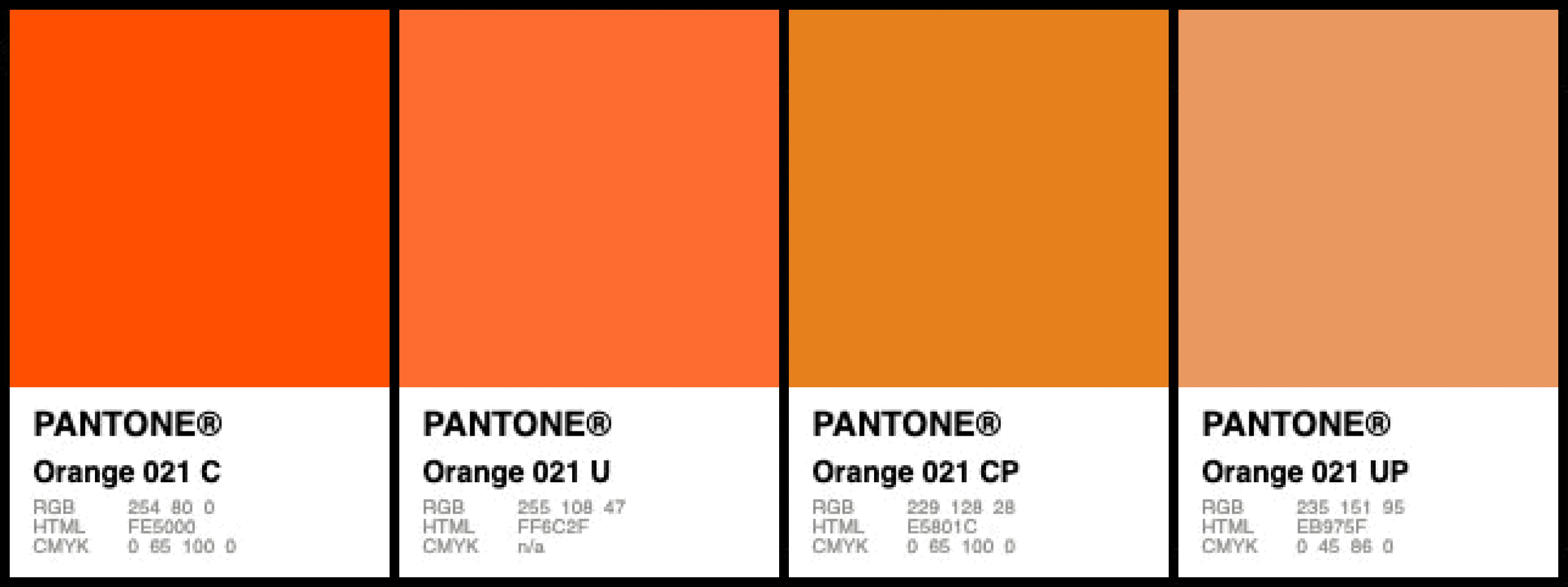
The only way to achieve good color matching (rarely perfect) is to use spot color inks. Pantone spot colors should generally match from one printer to the next, although variables still affect the final results. Even when printing with digital devices, those printers are typically calibrated with look-up tables to separate the Pantone spot colors into whatever ink mixture is most accurate for that piece of equipment.

If color fidelity in a logo design is of utmost importance, a designer should start with Pantone colors, then use whatever 4-color process percentages best approximate those Pantone colors for CMYK. Everything that happens down the line — from client to designer to printer — is beyond your control.

No question, a reasonably accurate, quality display is important, but going too far with calibration details soon reaches a point of diminishing returns that are meaningless. Again, the only way to achieve optimum calibration is when the display can be calibrated to the printing device and every step in the process. This was relevant to the guy in the video because he could calibrate his ambient lighting with the colors of his monitor and his printer. If he took those same calibrated files to a print shop down the street, those files would very likely print differently. This is not relevant to designing logos for clients.

1 Like

Please, not another, “but your print doesn’t look like my monitor…”

QFT with my bold for emphasis:

Again, the only way to achieve optimum calibration is when the display can be calibrated to the printing device and every step in the process. This was relevant to the guy in the video because he could calibrate his ambient lighting with the colors of his monitor and his printer. If he took those same calibrated files to a print shop down the street, those files would very likely print differently. This is not relevant to designing logos for clients.

I could send the same image file to three different print devices using three different inksets and three very different media. While they all would look great, they are all going to be different enough to be noticeable. I could get them to match, but it would require some great deal of effort, none of which has anything to do with your monitor calibration.

1 Like

On the same note, a logo designed for “color looking good on a monitor,” will do the same thing as those three images above. They will all print differently as there is no frame of reference for the color. They are just pretty pictures.

But add spot Pantone colors into the mix? (depending on the colors chosen) the color match would be nearly spot on across media because now we have lookup tables specific to that machine, ink and media.

That part about depending on the colors chosen? That’s where the designer’s skill comes into play where they are not picking out-of-gamut Spot colors, knowing full well that logos are not always printed in spot inks.

1 Like

I’ll bet the original poster is like…

giphy-downsized-large

5 Likes

I hope so

Just picking up on that to make another comment that might be relevant to Jakub’s color consistency management…

Small differences don’t usually matter unless those same similar but slightly different printed colors will be seen side-by-side. Colors look different under different lighting conditions, but our brains compensate for those differences, so we usually don’t notice. There is no such thing as perfect pitch when it comes to color — only relative pitch.

Where spot-on color consistency really matters is when different items will be seen side-by-side — at a tradeshow booth, for example. And yes, there are brand managers at some companies who go around with swatch books checking everything. Still, for most purposes in most businesses, if the color consistency is a little off in one direction or another, it isn’t noticeable and usually doesn’t matter.

1 Like

But what cmyk. Unless you know the output device. Is it US Web Swop, and it so do you know for definite it’s being printed on a Web press in the US?

Unless you know the color profile that will be used embedding a cmyk profile is likely not going to make a difference.

You would need the pantone reference for the color lookup tables. Or better would be LAB values.

Even with pantone printed on two different presses you can get mild color shifts.

There is no straight forward cmyk conversion.
Often I will have a pantone version of the logo for spot color work. But I typically ignore the cmyk breakdown if the spot color and tweak the cmyk values.

So I present a 1 color black, 1 color white, spot color version, cmyk version and RGB version.

With the formula tweaked slightly in each to best represent the colors in the logo.

I’ve seen first hand the same pantone color print two different shades on machines next to each other.

1 Like

To add even more uncertainty into the equation, there is the whole uncoated vs coated colours with Pantone. Rarely are the same PMS C and U numbers, the the same colour – or even similar. Often as not, you end up specing entirely different colours for C and U to achieve a consistent (!) brand colour. As for then breaking them down to CMYK, RGB, rarely do I go by the mechanical conversions. It’s as much an art as a science. It takes a combination of knowledge, skill and experience.

Years ago, when the tech was very new and very expensive and I was still wet behind the ears, but had seen enough print come past me to know that colour consistency is a moveable feast, the company I worked for, at the time, spent a fortune having their monitors (CRTs) calibrated every couple of weeks. In the morning the room was always dark and gloomy. By the afternoon, you could hardly see the monitor, let alone make credible colour judgements.

Even back then I remember thinking it was a ridiculous idea (with the caveat, that you did need to adjust CRTs far more than modern screens) – unless you were going to light control the room, always use the same printer and make sure everyone who viewed the perfectly consistent printed colour did so in the same room at the same time of day.

With the best will and all the knowledge, skill and experience in the world, it is only ever going to be a ‘best, educated guess’. You have to accept a margin of discrepancy. It is all about mitigating that margin to as narrow as you can. To imagine you can eliminate it is, at best, delusional.

1 Like

To clarify, it’s the same color, the same ink, it just reproduces differently on different stocks of paper.

As correctly pointed out, you rarely spec the same coated and uncoated numbers, typically you pick an uncoated version that’s similar to the coated visually.

Which you might never get.
Greens, oranges especially, can be tough to get coated and uncoated visually the same.

021c and 021u is impossible.

1 Like

Orange 021 is one of the “nuclear” colors. Goes in the same pile with Reflex Blue. While you can get very close with a CMYKOGV press, those machines are limited in application (and how many there are in the wild.) We’ve gotten fairly close with a straight-4 machine with really intense ring chart matching (and a top notch ink set,) but it still has a slight green tinge in CMYK.

I did a lobby display job once for a major corporation that uses a very specific pantone color (so specific, they send us their very own custom chips.) The corporate Brand Police came to the shop to review color proofs. While in my office, under the florescent lights, you could see the guy was very very unhappy. “I can’t approve that,” he said. “Delta-e too far off.” I kindly explained the exhibit wasn’t being built in my office and took him out to our lobby with the floor to ceiling windows just like the lobby space where the display was going. You could literally see the color change on the prints as we walked down the hallway and it matched perfectly in the daylight lit space to happy smiles all around.

Stage/video lighting is another area where CMYK digital printing is hugely variable. We’ve had blue pantones pop pink under the wrong lighting simply because the stage lighting complimented the magenta ink tones on the print. When that happens, the lighting tech used to have to climb a ladder to change gels, now they just change their RGBA LED mix in the fixtures from the house board. We’ve come so far, LOL!

Color correction is usually done in a 5000K light booth that very closely approximates indirect daylight (not direct, bright sunlight, that’s a whole different color story.) If you want a printed something to look “spot-on”, in, let’s say, an educational museum where it will be displayed under halogen pin-spots, maybe think about supplying one of those pin spots for color correction purposes. Otherwise? Who knows.

I love going way off topic. We should do this more often. :slight_smile:

1 Like

Indeed. That was my point. Sorry if I wasn’t clear. You can never just pick one Pantone colour. You usually need to pick different ones for different stock,

1 Like

Yes, I understood exactly what you meant, I just wanted to elaborate on that point :slight_smile:

It sounds to me like the guy is too cheap to go back to his original designer and wants you to do a ton of work for pennies. Watch your time spent. Keep in mind that the colors will be influenced by the stock colors for his cards, letterhead, signage…everything, so that should be priority number one. It is never that easy to just pick color and say you will have it everywhere. And listen, since you will have to change “everything” don’t get hung up on calibrating anything. Press Checks are the key to success. Once you have approved proofs from the people doing the jobs then you do the press checks to make sure it gets done right. Get as many proofs of the different materials as you can with the colors you suggest. Make sure to do your homework so that you can explain to the client about color changes on different mediums. Been there, done that…have the extra Advil to prove it… :crazy_face:

Get as many proofs of the different materials as you can with the colors you suggest.

Might want to point out that that proofs cost money. You might get “samples” for free but drawdowns or strike-offs for specific files with specific colors? Not so much. One offs of anything cost money. And press checks? Not at this level. A pro designer could take this and get things to match quite well across the board by picking the right colors the right way and choosing good printers that are calibrated, not gang run. But this is a spec job being done by a non-pro. I wish the “client” well…

The thing about designing things for print on an uncalibrated display is that if the colors look right on that display, they will certainly be dark and desatureted once printed, because an uncalibrated display is usually too bright, not to mentioned the color temperature and the way colors themselves are displayed without a proper color profile.

I thought we had a breakthrough - but here we are again.