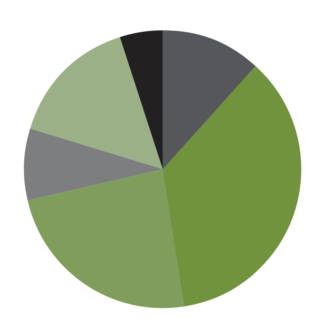
I am struggling with coming up with a color combination for the following infographic. We have branded our colors as green and grey. We can not introduce any other color to these. I tried using opacity colors, but that didn’t work…because if placed on a dark background, they will make it darker/lighter.
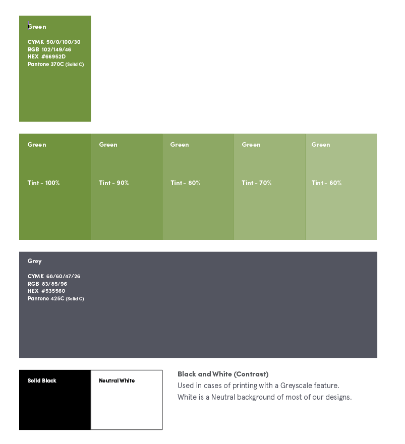
Don’t use opacities.
Use tints. The percentage slider in the Color palette.
Tints are solid colors.
Opacities are transparent.
Try to stick with tints ending in zero (10, 20, 30, etc) on the off chance your printer will have a tint swatch deck. In most cases, you will get what you get though. At least with a tint, it will be some percentage of the original spot color.
If you use tints or opacities of a CMYK mix, all bets are off on what you’ll get on output.
Why not? Trying to make graphs like that using only 2 colors is a doomed mission. That self-imposed rule of brand colors-only is the root or your problem, and the result will never be effective in terms of clearly conveying the information. Just sayin’.
You might not have any control over the official colors, but it’s ridiculous trying to make a complex color-coded pie chart that’s limited to only two colors.
I get the whole branding thing. I mean, I do this stuff for a living. However, when adherence to a branding guideline starts taking precedence over common sense, things have become bassackwards.
Are you really saying there are no instances in any of the company’s products, publications, announcements, etc., that can use any colors but green and gray?
I was told that they are very strict on their 2 colors. Before, they used the set versions in MS Word/PPT to do their graphs and charts. Nothing was branded.
I know it’s super ridiculous to make complex color-coded pie charts with 2 colors.
I mentioned before I could make shades of the green and grey, but that might be difficult too.
Probably irrelevant since you have limited control over this, but seven or eight percent of men have varying degrees of red-green color blindness. For these people, a grey and green pie chart will be mostly just grey.
Since it’s so common, color blindness ought to be considered in almost any design that relies on color differences to convey information. Purposely restricting color choices to the very colors that are most likely to cause problems just doesn’t make a whole lot of sense. It’s a bit like a company restricting its written communications to an official set of company words that a significant percentage of its audience cannot understand.
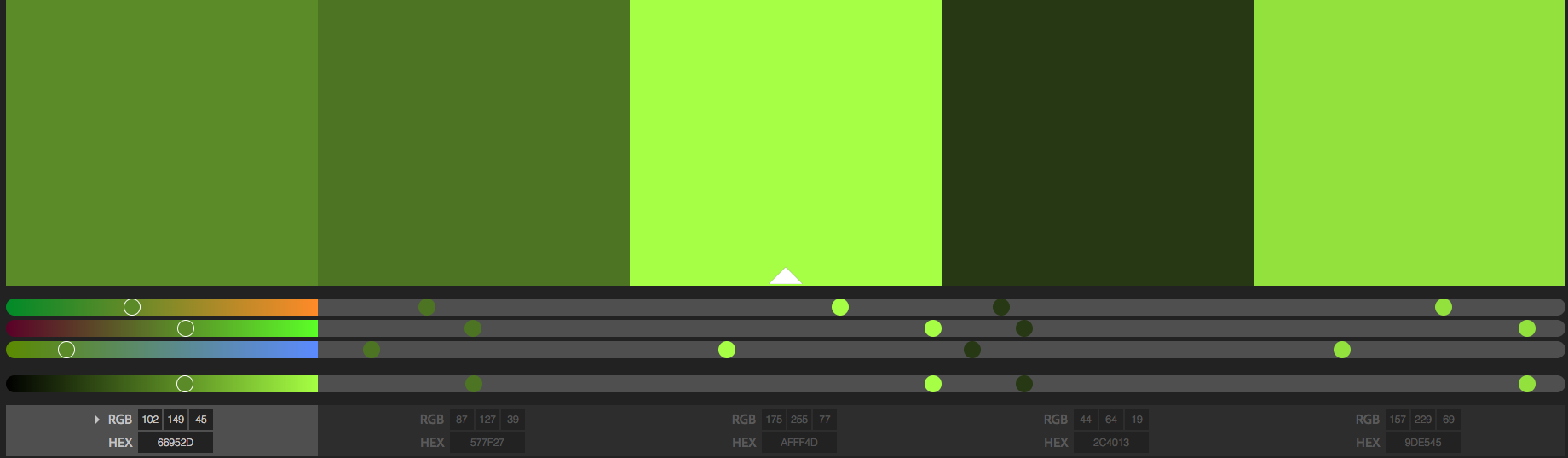
In case you’re curious, I’ve used this in the past on a few projects here and there it simulates how your graphic/photo might appear to someone with varying types of color blindness.
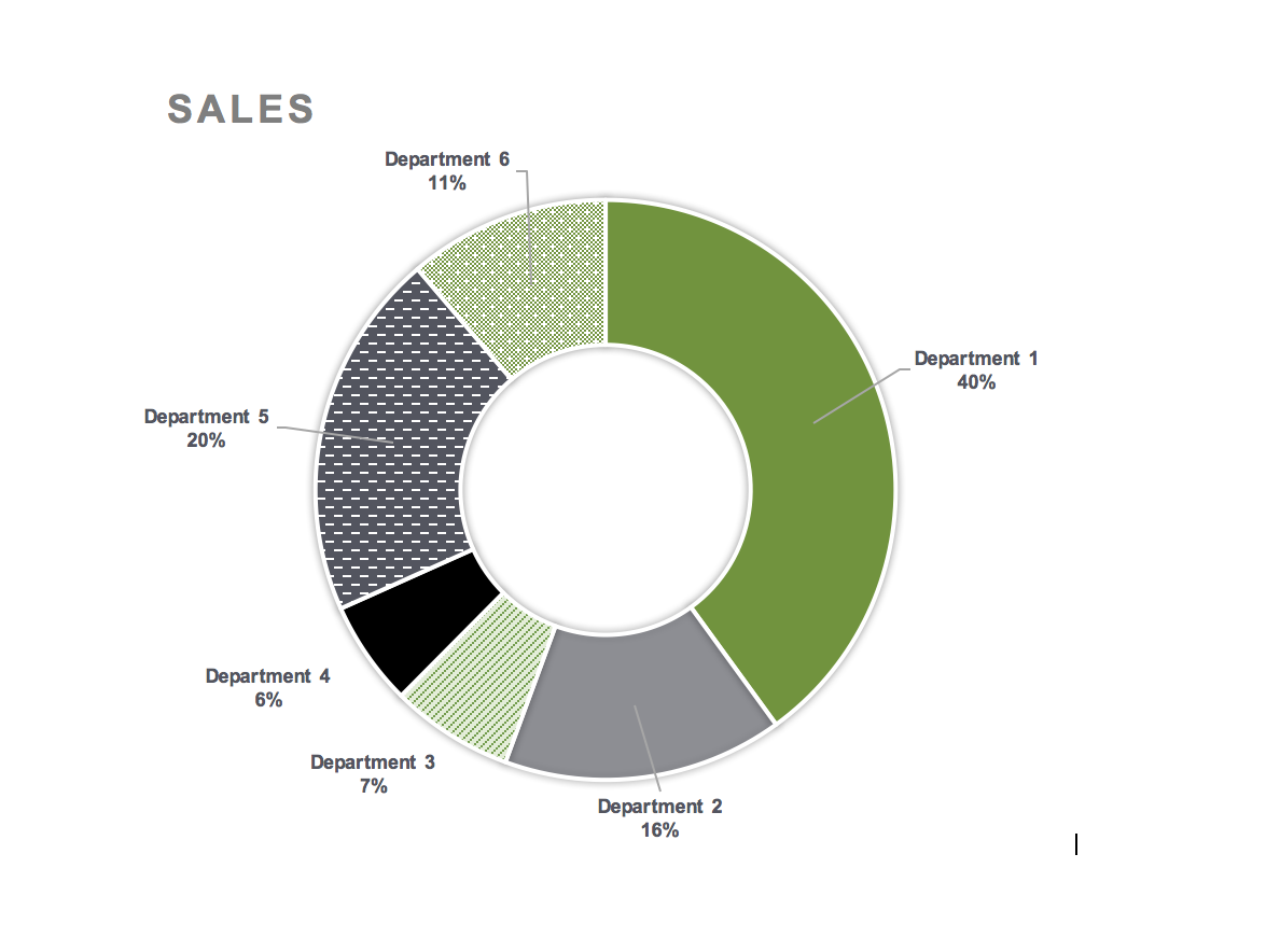
Thank you for all the help with this task. I’ve attached an image of the results that the group wants to go with going forward.
I think the references to small boxes on the sides of charts is very difficult to interpret. So with that being said, I made sure the charts and graphs have the number & category next to it. It creates that direct reference instead of trying to play decoder.
Looks good. I might be inclined to remove the gray border line since the client wants it simple and clean.
Will this be for a print publication or just online. If it’s for print, you might run into a moiré problem with some of the patterns — especially, the one already filled with halftone dots.
We are mostly going to have these documents online. I printed and the only issue was the half-tone you mentioned (Department 3 & Department 6) are the issues. Any way around that? Besides picking a new pattern that is more defined…stripes instead of dots.
Probably just avoid patterns without tiny, regular details, like thin lines, little dots, etc. Of course, the coarser the patterns become, the less refined they look, but it’s a compromise. Mezzotint sorts of patterns can be composed of small dots, but since they’re irregular, they generally don’t cause moiré pattern interference issues.
You can do a color blindness proof in Photoshop as well.
the image should be RGB
Then go to View>Proof Setup > Color Blindness and select either Protanopia or Deuteranopia.
If you are trying to comply with CUD standards, you have to check both. (we used to do this for some park service stuff and we always check emergency directional signage)