I’m helping friend who wants me to design a logo for this shoe Instagram account. The purpose of the account is to showcase new shoes and perhaps resell. The name he came up with was “Just Kicks” I drew up a few sketches and I was hoping to get a few more ideas. I’ve explored some concepts with shoe laces, shoe boxes, and even one that looks like an app with a notification emphasizing on how the account is always showing the latest shoes on the market. I’m definitely leaning more towards the colored sketch in the picture and creating a logo that is more three dimensional.
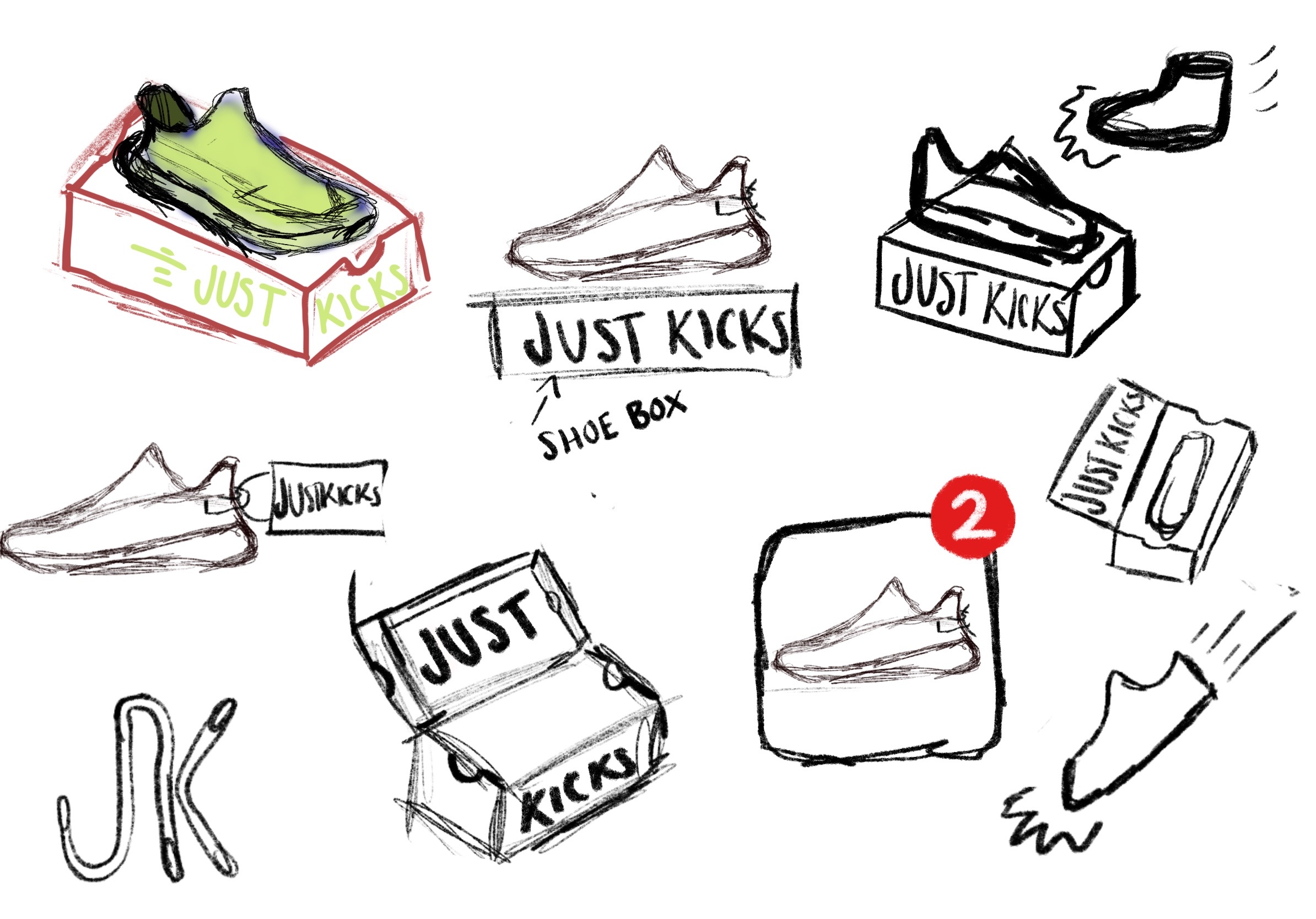
Since its mainly for the account’s profile picture I was thinking something graphic would work better than just having the name being the focus of the logo.
Would think about simplifying. A instagram profile pic is only like half an inch in size I would say? something detailed like the green one may not show up well.
1 Like
You say this friend is going to resell.
Is s/he going to do any branding on labeling, shipping boxes etc.?
Never assume something that starts on the web will stay on the web. Don’t sell your friend a headache logo down the road should they want to print it.
Some more ideas. I simplified the logo a bit more as suggested from some of the feedback. I went with a deconstructed shoe concept because my friend added that another aspect of his account was about showing the process of repairing them and flipping them.
So the subject matter of the Instagram account is shoes and for a logo you’ve drawn a shoe. Maybe you’re not exploring the full range of possibilities.
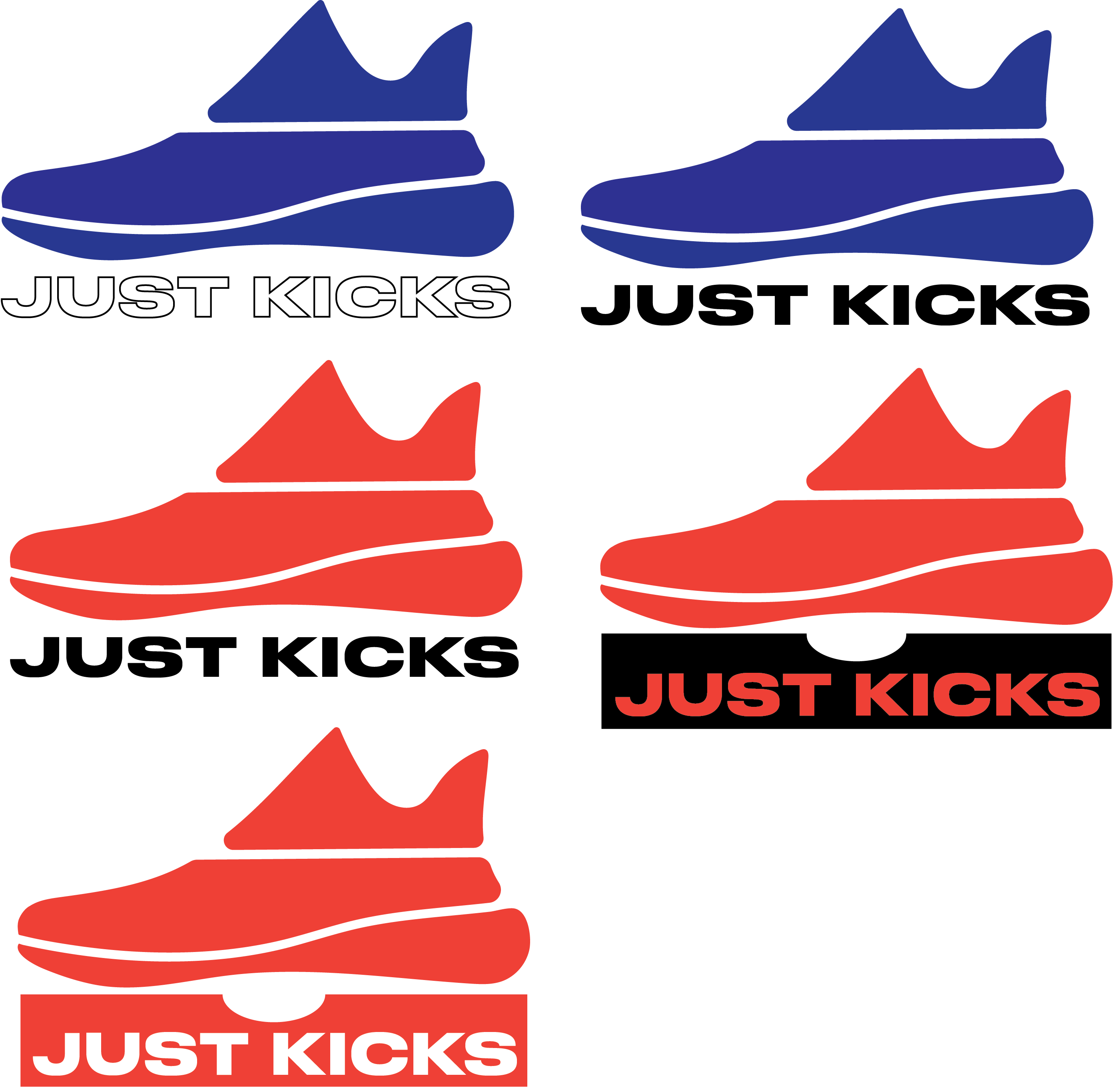
Have you noticed how the last K in Kicks is poised to kick that final S right off its baseline?
In my first post I showed sketches and different concepts but ultimately I did choose a shoe for the exact reason that the account is meant to showcases shoes. As I said this logo would mainly be used for the instagram’s profile picture and I think it’s important to have that iconography to quickly get a shoe enthusiast’s attention. Also that is a good point about the K and S. Thanks for your feedback.
Its not the most clever thing out there. its clean, simple and a shoe.
The red one (middle left) is my favorite of them) I don’t think the blue works, neither does the box.
Suggestion I would make is maybe try integrating the type with the logo like between the mid and base of shoe kinda like negative space, and play with the letters a little bit to match the contours of the shoe.
This is a sneaker resell company its should feel stylish/fleek/unique, when I think about sneakers I think about Jordans…have you watched the netflix doc yet? People want to buy Jordans sneakers cause they want to “be like Mike” cause your sneaker says something about you but your logo is feeling like your buying old navy knockoffs. The shoe you used matches the “trend” of sneaker culture right now, but Im looking at your logo and get the impression i’m shopping at shoe warehouse or famous footwear.
1 Like
I’d have to agree, but it’s really best if a bland lot. However, what really jars for me, apart from the kerning, are the awkward negative spaces between the shoe and the type.
Overall, as seems to be the consensus, it’s all just a bit obvious really. It’s OK, but just a bit beige. Definitely not stand-out and buy me. I guess a lot depends on the market and the price points of the products.
2 Likes