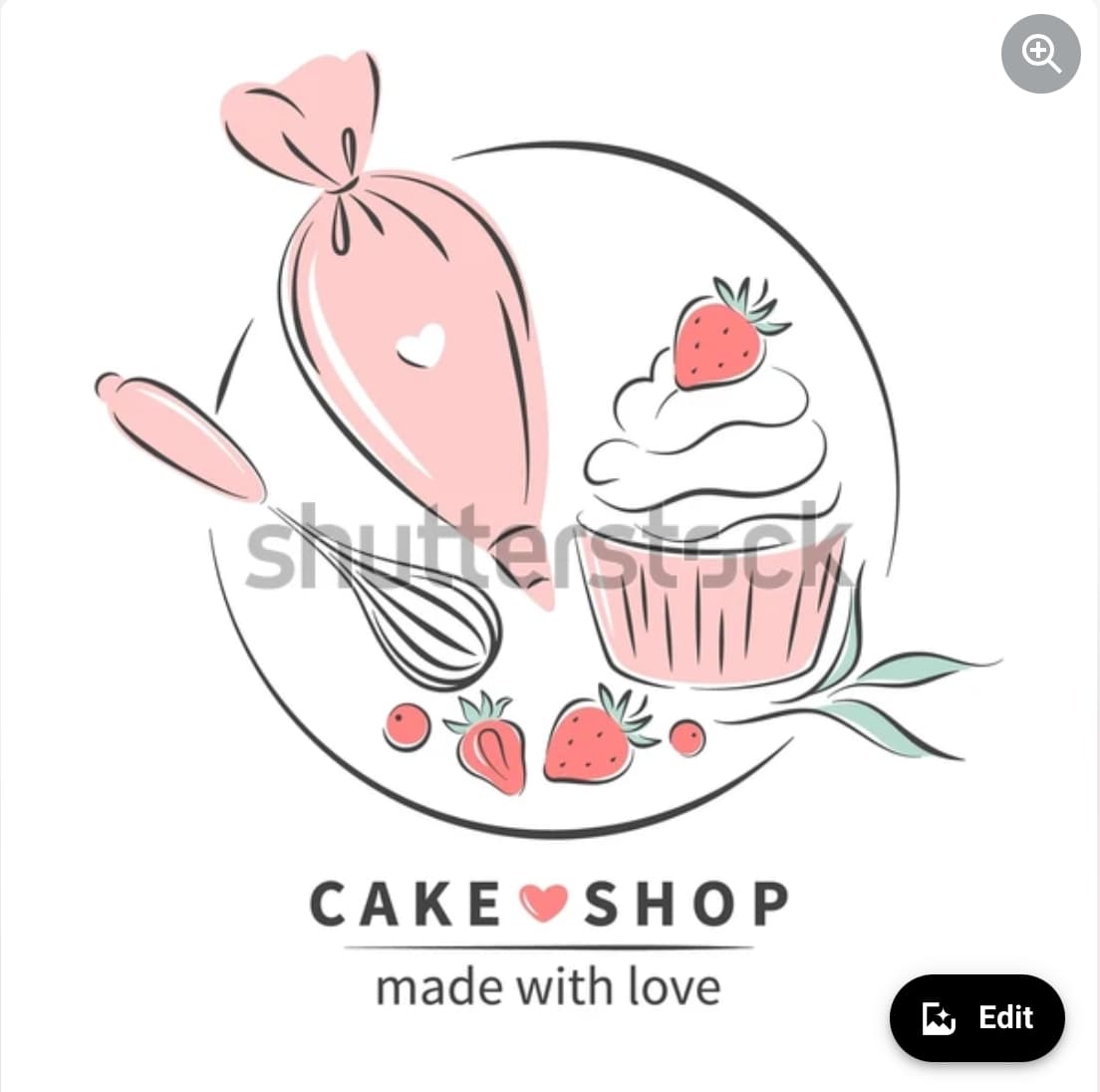
Hi, wondering if I could get some guidance from fellow designers, who have knowledge or know of any tutorials that will help me create something similar to the style of the logo attached to this post.
I am enhancing my skills for an upcoming project and could use some help.
This looks like it’s pretty straight forward vector art that could be done in Illustrator. Granted, it’s nice line work and would take some practice to get it right, but it’s all doable with basic vector tools. What are you having a hard time with?
Thanks for responding.
I can create the logo with the use of basic shapes, but it’s the type of style I am looking to master.
ie. change in line width on the circle in the back, how it looks like its be done in a paint brush effect, how parts of the lines are cut to make up the part of each object etc.
Hmm. Sounds like you are seeking guidance on style (look and feel for the illustration) rather than execution (how to achieve the look in Illustrator). That’s something that, in my opinion, just takes practice and experience. One thing you can try (maybe this will work for you, maybe it won’t) is to print out a picture of a cupcake (or whatever), put tracing paper over it, and sketch on the tracing paper to get the basic shape and lines down. Then scan the sketch and use it as a template in Illustrator. You could skip the tracing paper and put the photo right into Illustrator and sketch over that, too. Personally, I find sketching with pencil is effective.
Do you own a graphics tablet, like a Wacom or similar?
That kind of line art is much easier to create using a pressure controlled device than trying to use Illustrator’s variable brush tool to make it look like you did it with a nib pen.
I would definitly use the variable brush to do the circle part, but the rest so definitely the Wacom. There is one copy/paste element in there that ruins it. The whole strawberry. Bad form if you are going for the hand-inked look.
As for style: It’s basically a Pen & Ink technique with a color wash thrown in. The wash is done in a much harder edge than you would get with a hand color wash - which I also think ruins the effect.
How’s your hand-art skills? Cuz that’s what this pretty much is.
I would aim for a style like this with Affinity Designer for iPad + Apple Pencil or a similar setup, having done several pencil sketches on paper that I’ll pin down in the software underneath my vector work.