If the image doesn’t upload this is gonna seem dumb.
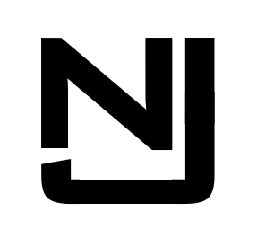
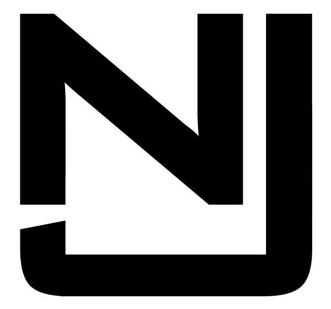
Hey all, I’m not a graphic design major but I’m making a monogram for a shirt out of my initials (NJ). To do this, I built one in Microsoft Powerpoint (long story) and I wanted to know if anyone with professional qualifications had any feedback for my design.
The monogram will need to be 3/8" tall, so I wasn’t able to do anything crazy. My inspiration was Sonny Corleone’s monogram from Godfather, I’ll link a photo of that if my first image loads properly.
I totally agree with Smurf2, It seems to be not relation with the two letters and the size of both of them aren’t related (the J seems to be bigger than the N) you have two options : make the J not inclined but at the end to be straight or you will need to make the beginning of the Line of the N to be inclined and not straight, this is to create a harmony with the two letters. Other thing you can do (as a suggestion) is to join the two letters to make a connection or a sequence but keep in mind that the two letters, the J looks bigger than the N so each one should be equal on size. Another suggestion if you want, that would be easier for you, if you use a vector drawing program to make the logo, that would be easier, there is a program called as inkscape you can use and you can find hundred tutorials how to use it on YouTube.
I’m going to have a different take. Considering the size restraint you mentioned, I think what you came up with is a fine solution. The smaller the application, the simpler the execution needs to be.
My one suggestion would be to make the strokes of the two characters the same width or weight. If you look where the top of the J’s hook is at the bottom of the N on the left side, it looks like the J is thicker than the N. But this might not be perceivable at the size you’re talking about.
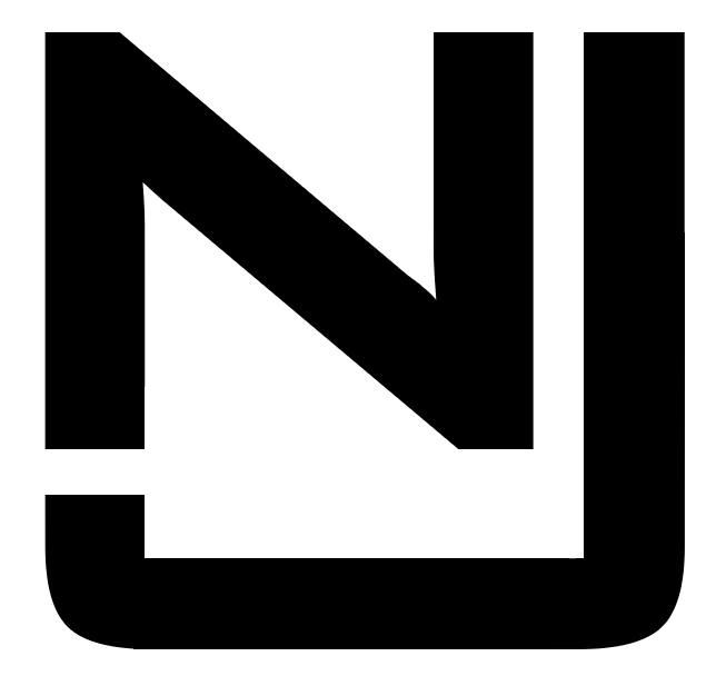
Thank you all for your replies, when I made this post I expected to make some graphic design cardinal sins, but it seems I’ve done alright.
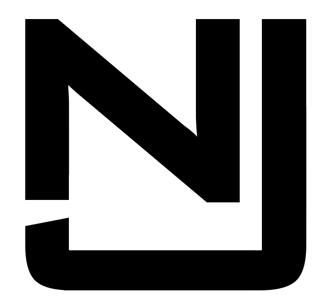
I made the change to the monogram to equalize the line thickness, and they should be as accurate as the embroider needs. I would move on to Inkscape, but the reason I’m using Powerpoint is that the diameter on the curves is preset with the text (BankGothic Md BT) and I only need the one monogram.
HI very good and congratulations ! now it looks better than before, but again one small detail, but again there is a small detail that you need to take a look, just the letter “N” the stick line is that on the right (before the “I”) I mean the line \ there is not balance between the beginning and the end, they seems to be not aligned or related, it seems to be a little inclination from both sides (left and right).
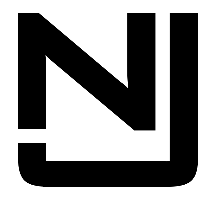
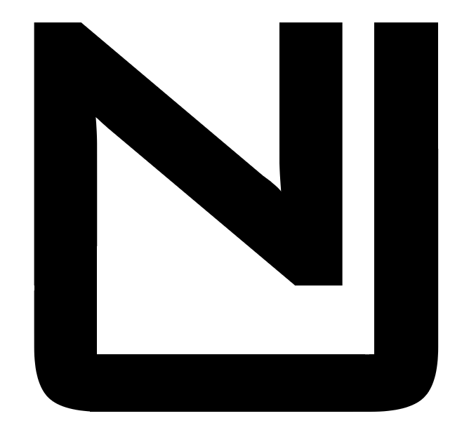
Of the three you posted, I like the first the best. The slant in the J adds a bit of visual interest. It also seems to make the J a little more pronounced than the second option. Having them connected is a swing and a miss. You loose the J altogether.
Man, you have a keen eye! The issue has been resolved for both of the good designs, and I’ve confirmed that every other set of parallel lines are equal, including spacing.
Now that I’ve had a couple of you wonderful people to look it over I’m feeling pretty happy with the two final designs. I don’t have much of a preference, so it’ll probably just come down to what’s physically possible with an embroidery machine at 3/8".
Thank you all very much for your help, I’m much happier with this design now. If nobody has any last-minute additions I’ll try to close this thread by tomorrow. Take care!