Hello. 3 products which I was the one who designed the packaging won an award. My client wants to place the awards on the tags/labels.
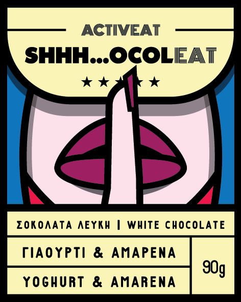
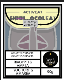
This is the chocolate (which is a sticker 8X10 cm). (There are 11 more flavors, but the design is the same, only colors change)
Did you win the award for the design?
Or did the food win an award because it won a taste test.
If it’s your award for the design, quite honestly, it doesn’t even belong on the label.
If it’s for the food, and you think it is important for the customer to see the award, and more importantly, will recognize it as an award of merit, then by all means give it real estate on the label. But if the average consumer of those products has no idea what that award is, or you have to educate them with a caption under it, is it worth the loss of label space?
Sorry for not clarifing.
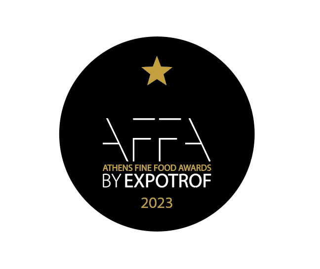
It’s an award for the product as a whole, not for the design in particular. (I think it’s clear for the ATHENS FINE FOOD AWARDS tag).
My client wants to be placed on the label as a strong selling/marketing point and she is very adamant about it.
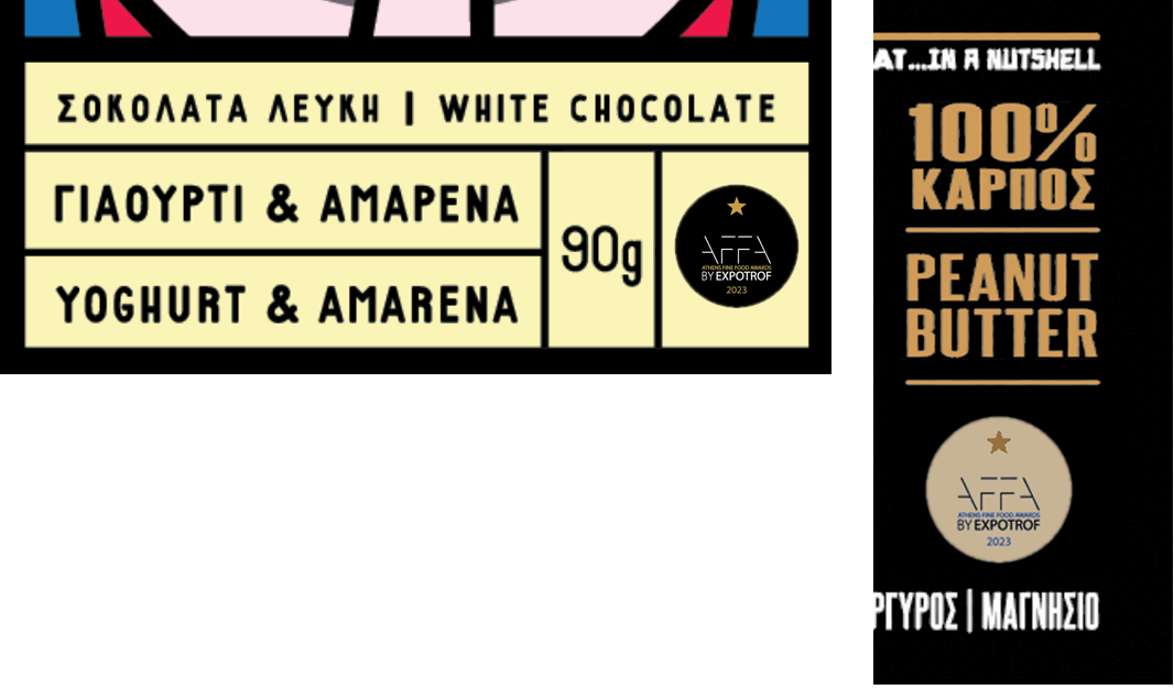
My problem is how could I place it? Where? There is no space and the Badge with the small text will be illegible if it would be scaled down a lot.
Any options, opinions, thoughts?
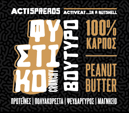
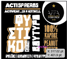
Could you do something similar to the following? Does the award symbol need to be black? Since the words peanut butter appear larger in Greek, I’m guessing the English words aren’t as important and could take up less space to make room for the symbol.
thank you so much for your time! much appreciated.
the thing is that if the badge becomes that small nothing will be legible.
And the AFFA award representative told me that I can use the badge only “as it is”.
Does the AFFA have a document outlining requirements?
What I mean by that is most companies and organizations have brand guidelines which define the minimum size that a logo/icon/graphic can be displayed, how much negative space needs to surround the logo/icon/graphic, whether the logo/icon/graphic can be reversed out, etc.
That would be where I would start. Since if I know that the graphic needs to be a certain size at a bare minimum that would help me understand the challenges.
I would add, and this isn’t your fault, but perhaps you could push back on the fact that the AFFA badge is illegible at a small size.
I had quickly looked into that but didn’t bring it up. The AFFA links I found show several different uses of their logo — usually in a square space in both black and white — for example,https://affa.gr/wp-content/uploads/2021/04/AFFA_LOGO.pdf and other images found using Google’s image search.
I asked @Stefanos1984 what the acceptable colors might be as my way of implying that there might be more latitude with the symbol than assumed, and if that’s the case, there might be different ways of displaying it in the available space to make it larger, remove the circle, or more colorful. However, for all I know the round symbol is the official seal to be used to indicate an award.
I guess what I’m getting at is that, as @CraigB suggested, there might be more latitude in using this symbol that would enable it to be used in different ways.
If it turns out that it must be in a black circle and look exactly as the example of the seal shown, it’s probably a matter of going back to the drawing board and redoing the labels or creating a separate sticker for the award, along with charging for that extra work. This is in the student section, but a request from a client for additional work should entail fees whether or not it was initially student or client work.
As is probably obvious, I have lots of time to kill today.
Shorten the design at the top -that will allow to bring up the illustration of the finger on the lips.
Rearrange the grid to incorporate the AFFA logo.
It makes the grid taller - which is why the top needs to be a bit shorter to incorporate to the illustration.
It’s just very rough cos we’re not allowed redo the work just rough sketches - so I didn’t spend more than 5 minutes here.
Thank you all for you time!
I 'll test smurf’s suggestions.
Unfortunatelly the award kills the whole design, especially for the chocolate, which is very well acclaimed.
PS: of course I will charge my client for the changes.
I’d be talking the client out of putting the design of the award into the label.
It will only be for a short time - possibly.
And there’s the whole thing of changing all the plates at the machine, and ditching stock or relabelling existing products.
It would be far better to issue them on stickers to the stores - and the sales rep can drop them off and explain it needs to go on the packaging but not obscure the label.
I know a guy who does this for a chocolate brand in Ireland, he’ll deliver the batches to the stores, and give instructions to store managers for placement.
Additionally, it could be cheaper to apply a sticker to the packaging from the get go.
If the client is adamant - then I think it’s going to be quite costly.
I would do something where the award is stuck on over the existing label rather than try to incorporate into it into the label. This also leaves it open to the option of having more than one award and feels less contrived and more natural IMO: