Here I am again with some mockups

I am here again with some mock ups and prototypes that I created using graph paper (I took a look at some design examples on the internet). Please take a look, feedback and comments are very welcome !. I will add other mock ups gradually after these three


.

I’m not sure I would even want to try a sauce named “sweat”…
Didn’t even get past that…

1 Like

English isn’t your first language, and I understand how you might confuse “sweet” and “sweat” — if you put SW and EAT together, you’d reasonably expect sweet, not sweat (perspiration).

There’s really no excuse for spelling errors, though grammar is another matter. That said, there are plenty of spelling and grammar checkers available now, so I’d strongly suggest using one.

What’s more concerning is that “Sweet” is spelled correctly on the bottle, yet you still didn’t catch the error elsewhere.

Similarly, the correct spelling is “capsicum,” not “caspicum.” This suggests you’re typing words without properly checking them.

TOP TIP - NEVER TYPE ANYTHING - ALWAYS COPY AND PASTE FROM A RELIABLE SOURCE.

When it comes to the product itself, the sweet variety is usually bell peppers. The peppers shown on both labels look very similar, and there’s no visual cue (icon or illustration) indicating which pepper is used in each product.

There’s also no call to action — for example:

Now Available
New / Improved Recipe
Buy 2, Get 1 Free


I wouldn’t go to a concert advertised as featuring “many Special jazz musicians.” Why is Special capitalised? You should name at least a few jazz musicians, that’s surely not difficult to look up.

January should be capitalised. Overall, the design reads more like a generic seating ticket than an actual event ticket.

The leading and paragraph spacing in the T&Cs is off.

More importantly, I’ve never seen an entry ticket that also functions as a full promotional advert. Entry tickets are usually much simpler and include tamper-evident or access features such as holograms, watermarks, barcodes, or QR codes for scanning.

As both an advert and an entry ticket, this design fails at both.


Rock Music Live Fest
Colosseum is spelled incorrectly.
EveryWhere should be Everywhere.

The text is very difficult to read; the lack of contrast between text and background severely impacts legibility.

There’s no time, no price, and no clear call to action, all of which are essential.


For fake portfolio pieces, you should focus on developing strong copy first. Use AI, or base your text on real adverts that already exist. Why invent content when writing clearly isn’t your strength?

Poor copy is what’s dragging these designs straight into the bin.

Use existing examples, or ask AI to create copy for a fictional poster.

At a minimum, always include:
Name of event
Who’s performing / attending
Where
When
Price
Clear call to action

Always consider
Target audience (who this is for)
Format or genre (especially for music/events)

Those elements help turn a design from “something that looks nice” into something that actually works.


Now the bad part is over.

The good news is you’re leaning more into the hierarchy and it’s really made an improvement into how the designs are presented.

With a bit more thought and clarity around the copy and a bit more research into the products you’re promoting, whether it’s sauce, jazz or rock and roll, the imagery has to be right.

If there’s a mistake in the images it leads to confusion.
If there’s mistakes in the copy it makes it look unprofessional.

Attention to detail is absolutely crucial.

2 Likes

I would like to express my thanks to all of you for your feedback (Specially you Smurf2). I know that I was throwing arrows against the wall (doing nothing or something that does not make sense)This is very important to me. As for the mock-ups, that’s what they are, and I will make all the improvements to them. Today and tomorrow I will be resting from designing. On Monday, I will make again because this is stuff that I will add to my portfolio (only the best one). Happy New Year and I hope everyone has a great weekend !

By Here is a Picture of the Sweet Peppers that I used for the Sweet Pepper Sauce, it is the same model:

There are only a very few sweet peppers with that shape (I can only think of two.) Most people associate that shape with all of the hot peppers. Even when someone is telling me I’m buying a sweet Cubanelle, I approach it with caution. :slight_smile:

1 Like

I’m puzzled by the difference between these two examples. They look as though two different people designed them. If it weren’t for the similar spelling, punctuation, and grammatical oddities, I’d almost be sure of it.

From an aesthetic perspective, the “Rock Music” layout is competent. There’s a short, visually dominant headline, a hierarchy of information, an appropriate typeface, and a coherent color palette. Even though there are problems with a lack of relevant information, leading, and spelling, the composition hangs together aesthetically as a good start. However, I’d raise the guitar player so that the headline wouldn’t hide most of him.

The “Caspicum” ad is another story. I don’t mean to sound harsh, but there’s really nothing here that suggests any understanding of either graphic design or marketing. There are the usual writing errors (you really need to work on that). There’s also no headline, no logical hierarchy, no call to action, and, basically, no useful information of any kind that would convince anyone to buy what’s being sold. I don’t even know what the purpose of this design might be. Is it a poster, a flyer, a supermarket ad, what? It’s just a meaningless and non-functional layout. Even the bottle illustrations are awkward — bottles with round bottoms would tip over.

1 Like

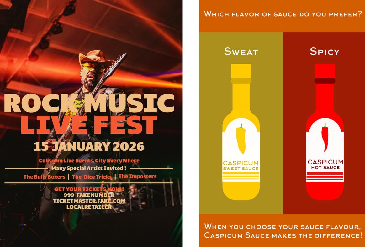
This sauce poster would make sense if it were part of a data-collection concept, people scan a QR code to “Find out more” or “Get a discount,” and that data then drives the sauce flavours.

If it’s for a portfolio and meant to showcase design skills, then focus on that. Do the sauce bottles. Do the labels. Do the mockups. Show the branding decisions colour choices, peppers, stock imagery, typography, hierarchy.

That’s an exciting portfolio piece.

A few random posters with no context or substance aren’t going to sell your services to anyone.

Do the work as if it were real. Do the poster, the staging, the tickets, the point-of-sale (FSDUs with merchandise), the t-shirts or merchandise. Build a system, not isolated visuals.

As it stands, this portfolio might get you a foot in the door—maybe as an intern, not even at junior designer level.

You’ll need to raise your game and your imagination. Don’t work on portfolio fillers—work on portfolio projects that prove you can think, not just decorate.


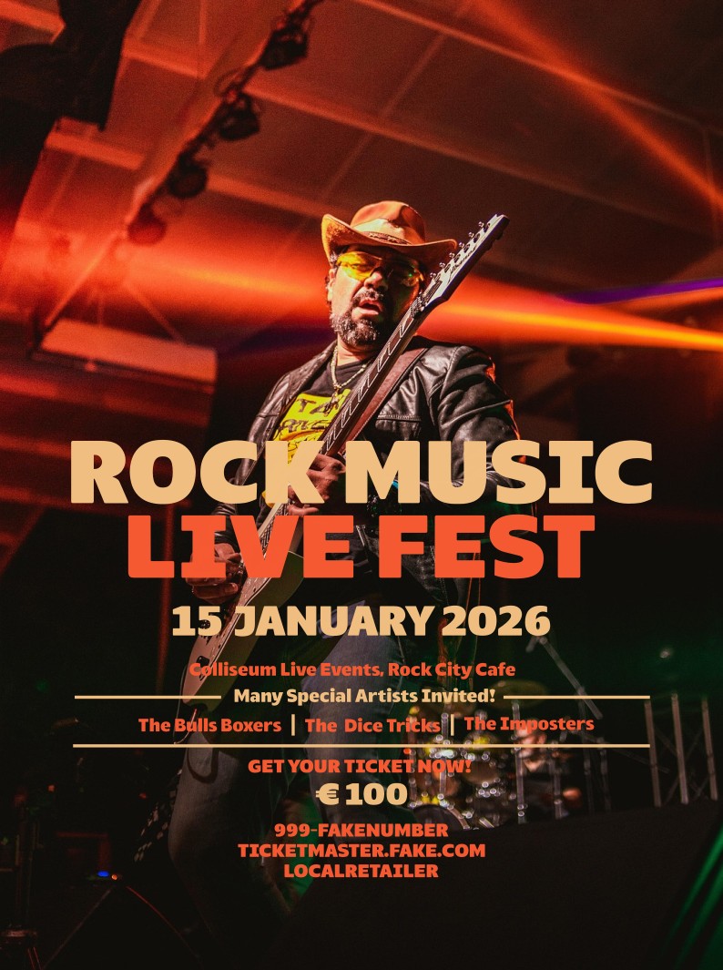
Do you think any of us walk into a client meeting where they ask for one poster and we just stop there? You don’t have a poster you have an event.

The first questions are obvious:
When is it?
Where is it?
Who’s attending?
What’s the scale?

From there, the work naturally expands. Does the event need staging? Podium branding? Backdrops? On-site signage? Billboards, posters, roller banners, wayfinding?

What about the physical touchpoints people actually take away, pens, mugs, t-shirts, hoodies, keyrings, stickers, badges, pins, the stuff that lives beyond the event and reinforces the brand afterwards.

What about a website, web images, banner adverts, etc.

That’s how real projects work. Designers don’t just deliver a single asset they design systems that function across multiple formats and environments. A portfolio should reflect that mindset. If you only show a poster, you’re telling potential clients or employers that you stop thinking the moment the brief ends.

Show that you understand the entire game, not just one piece of it.

If all I did was a poster here, a sauce label there, I’d be broke.

EXPAND the thought process.

Step away from isolated portfolio pieces.
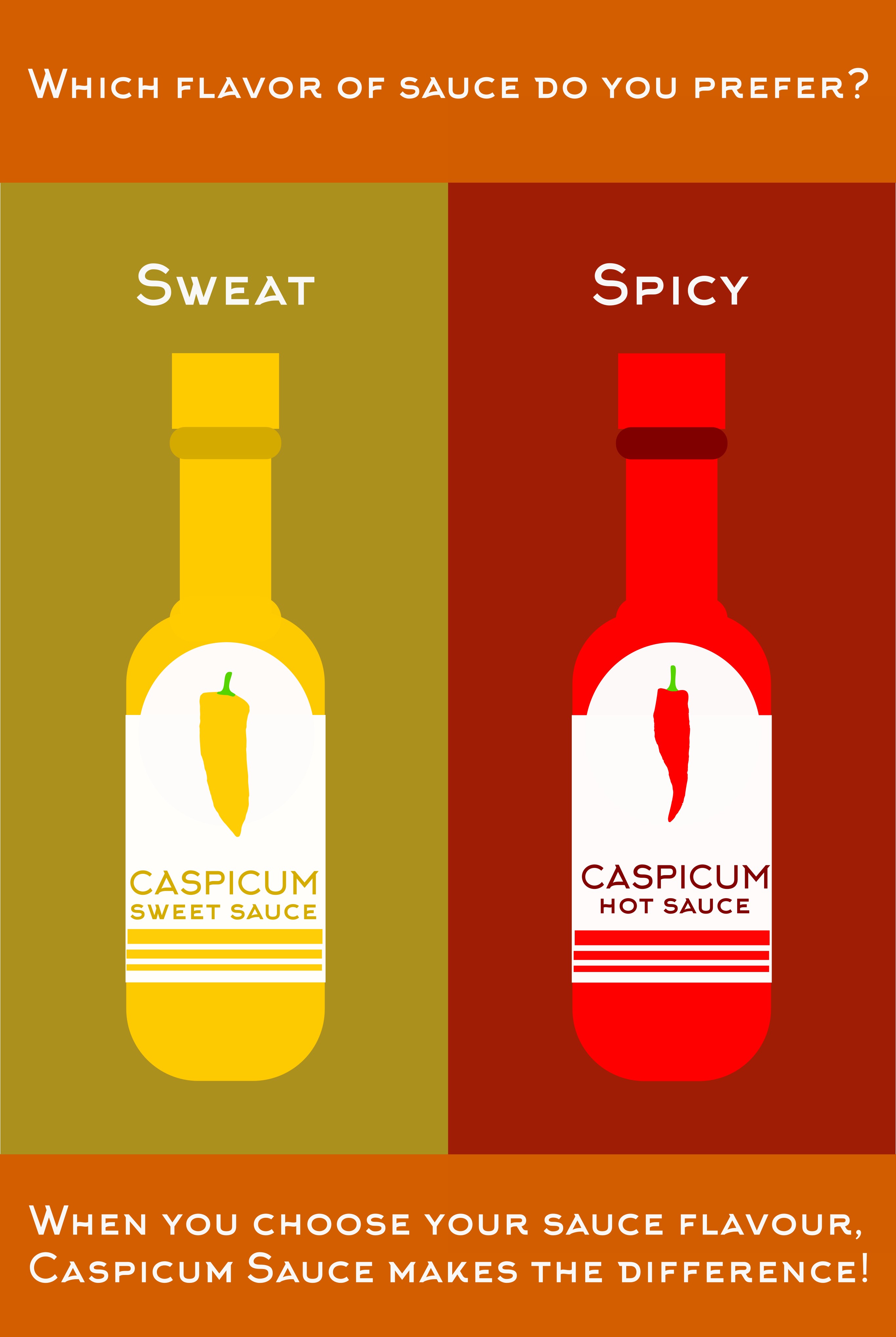
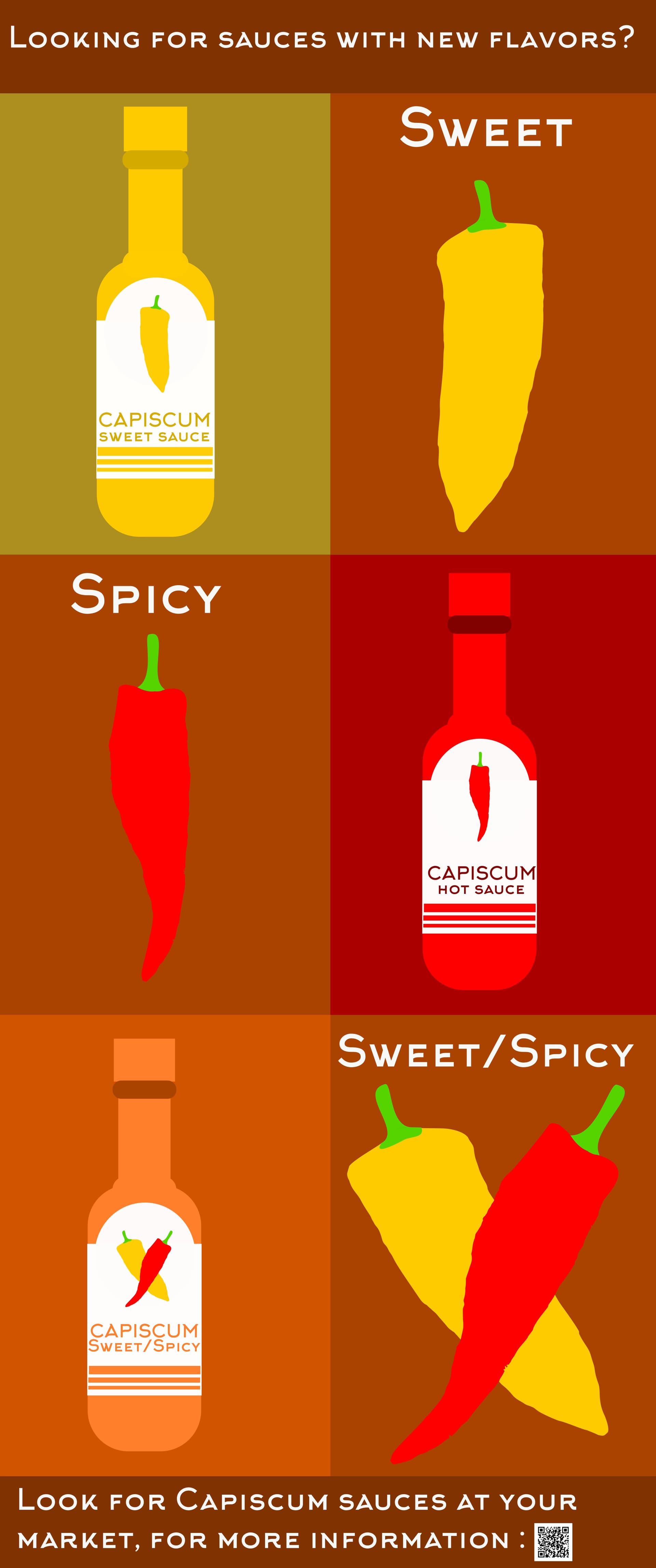
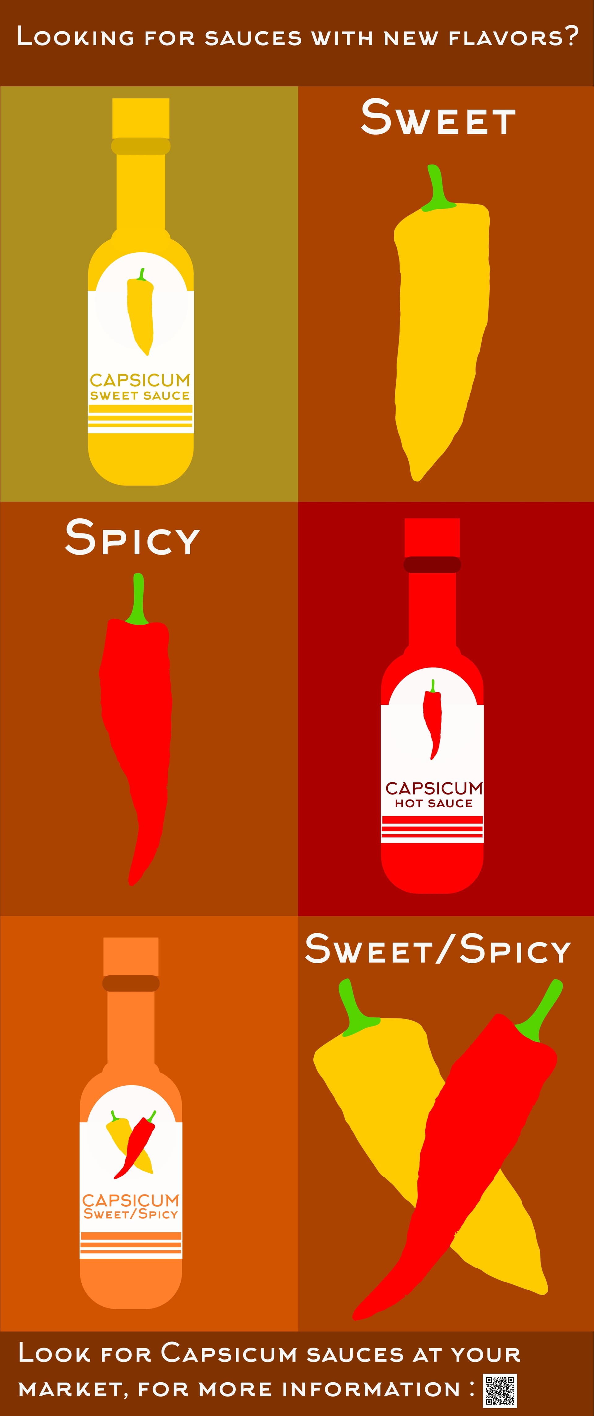
Sit down and think about sauce labels. Start with the fundamentals.

What kind of sauce is it?
Hot sauce, BBQ, fermented, craft, novelty, premium?
Who is it for? Supermarket shelf, farmers’ market, online-only, gift packs?
What’s the tone, playful, aggressive, artisan, scientific, premium?

Now define the brand world
Name, tagline, personality
Colour palette (and why those colours)
Typography choices and hierarchy
Illustration vs photography
Iconography, peppers, heat scales, ingredients, warnings

Design the label system, not just one label
Multiple flavours
Heat levels
Limited editions
Front, back, nutritional panel, barcode placement
Glass bottle vs squeezer vs mini bottles

Once the label works, scale it outward.

Product & packaging
Bottle mockups (realistic, not flat)
Multipacks, gift boxes, subscription packaging
Shipping boxes and inserts

Now ask how does this brand show up in the real world?

Marketing & promotion
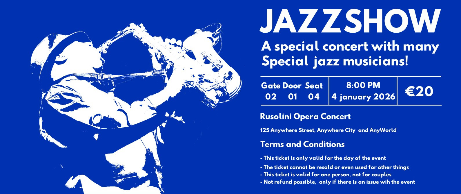
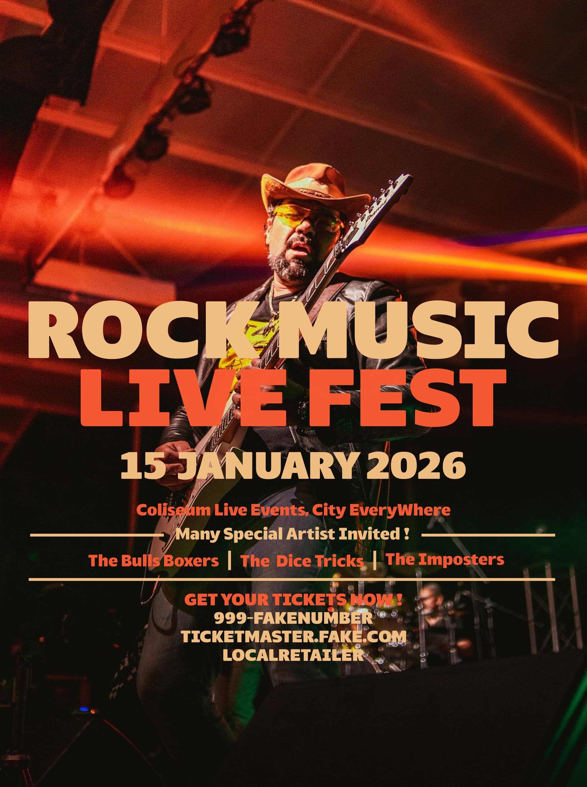
Posters with a clear purpose (launch, tasting, competition)
Social media assets
Website landing page
QR codes that actually lead somewhere (recipes, discounts, data capture)

Now the big leap the event.

You don’t have a poster. You have
“SauceCon 2026”.

SauceCon - Event of the Year
Event logo and visual system
Stage backdrop and podium branding
Booth designs and table covers
Wayfinding signage and schedules
Roller banners, billboards, entry wristbands, tickets

Merchandise & takeaways
T-shirts, hoodies, aprons
Tote bags, stickers, pins, badges
Sauce bottles with event-only labels
Press packs and influencer kits

Finally, show how it all connects
One visual language across every touchpoint
Consistency in colour, type, tone
Mockups that show scale, context, and realism

That’s a portfolio project.

1 Like

Here I am again with many changes, including adding the QR code to some mock ups (thanks, Smurf2, for the information !)


You’ve come up with a new way to misspell capsicum.

1 Like

We don’t celebrate Santa Claus. We celebrate Christmas.

3 Likes

I give up.

Yes, I know; I recognize that I did it again, but I am working on it (I am not perfect), as evidenced by this mock-ups, and I used the wrong mock-ups (those that are misspelled). Maybe I am going too fast when I do mock-ups or when I do Designs?, do i need to check or may be do i need to make them again?. Do I need to think twice? Do I need to find a way to improve my designs and my grammar? Yes I know, this and I am doing it.

Do I need to begin to think like a Graphic Designer?, Do I need to take care of the details of my Graphic Design (Yes I do need to begin like a Graphic Designer and to take care of the details, i just may be going too fast at the moment (the excitement or being to enthusiast everything about Graphic Design). May be what I need is to slowdown and not to do things so fast, is that may be the issue that I have with Graphic Design?

But what I am not going to be is to give up Graphic Design and I will great Graphic Designer like all of you (Because all of you are my inspiration, my teachers and my motivation to do it better every day and not to give up).

Please Note: A I am using a grammar checker in American English (Not EU) because I learned English in USA! and I will make again the last Mock-Up due to Ice-Cream Like Dog Face!