I’m about to own my own business
And I have a logo for store front
And on the front of the cups
But I’m terrible at art and graphic design
Any help to guide me to where I could get a couple prototypes of my description
It’s going to be a rolled ice cream shop
I’m going to name it
The Freezing Point
Because liquid cream goes from liquid to rolled ice cream right in front of your eyes
The image I kinda have in my head is of transparent ice cubes but with a blue hue to them
And the words The Freezing Point being
icicles with a pointy edge to them or something
Along those lines
Any help on how to get some visual templates
Of my idea to help get me on the right path
At least would be greatly appreciated
Check around your local chamber of commerce for some references for a good graphic designer.
You should hook up with an experienced designer who can discuss with you your business model and target market demographics as well as explore some ideas on logo design not just in a vacuum but for your company brand as a whole, across a bunch of different media.
Not gonna tell you how to market your product, but frigid blue ice cubes and tasty, frozen cream desserts are not visually equal.
The most important thing to remember about typography is that it be highly readable. Making letters into icicles might sound like a good idea, but unless it’s done just right, it will interfere with legibility and communication.
Take a look around at the most successful businesses — it’s rare to find one that has used gimmicky treatments of typography in their logos.
What you’re proposing for the logo and typography also heads you down the road of dealing with future reproduction and signage issues due to the likely complexity of the artwork in situations that require simplicity.
I do like the name, The Freezing Point, but as PrintDriver suggested, you really do need a professional designer to do this right.
Wow , you guys are correct
Well , what about something along the lines of this then ?
I meant using that type of lettering frosty yet pretty and bold
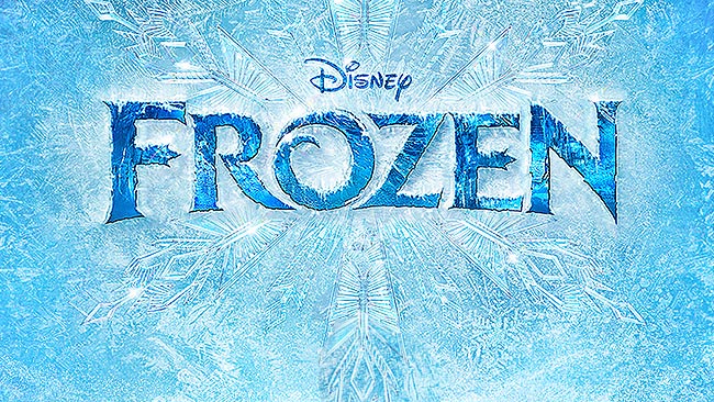
The Disney logo for the movie looks nice, but it’s for a movie. Disney has many millions of dollars to spend on promotions and creating as many versions of this logo as are needed for the various ways in which it might be used: Google Search
You say you’re not so good at design, but I’m gathering that you want to do this yourself. If that’s true, just how will you do it?
Logos are generally very simple. One of the main reasons for this is due to the diverse and unexpected ways in which they will be used.
How, for example, would you convert this kind of frosted, icy lettering to a storefront sign? It’s doable, but it might very well saddle you with significant and potentially expensive fabrication restrictions. How would you embroider it on a uniform apron or print it in straight black and white on your cash register receipts? I could give you lots of other examples, but you get my point.
If you looked at the link I pasted in above, you’ll see lots of variations of the Disney Frozen logo. These variations were likely necessary to accommodate all the various ways in which the logo ended up being used. Disney can afford a hundred variations, but as a small business owner, you likely don’t want to do that, which is where keeping the logo simple, clean and straight-forward will play to your advantage.
What I’m getting at in all of this is that it’s fairly easy to come up with cool-looking concepts (no pun intended). Frosted lettering could very well be just that. It might, however, come with unexpected costs and practical inconveniences that makes that initially great idea less appealing down the road as you run into the problems associated with it.
Thanks again for the reply and absolutely
Great points once again .
I’m surrounded by great minds here !!”
What about this concept , can anyone
Modify this in some way
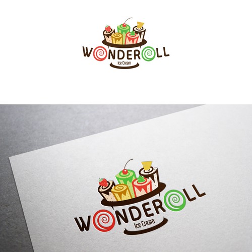
I like the name WonderRolls a lot too
Do you own a store for the franchise named Wonderoll?
If not, you can’t use their logo.
Besides, that’s a contest-created logo it wasn’t even the winner. It has too much detail and is a 4-color logo. The logo that actually won that contest does look similar but is a 5-color logo, which in itself can get expensive depending on output process.
We aren’t going to modify anything for you.
@LookingForHelp
Before you post another reply, no one here is going to do any work for free. If you don’t want to follow Print Drivers suggestion of contacting your local Chamber of Commerce to see if they know of a local Graphic Designer to help you, then you can place an ad to hire a designer from here in our Classifieds section.
I will say it again. No one is going to do anything for you for free.
Also no one, even if you hire them, is going to modify or change another companies logo. That is copyright infringement. End of story.
I hope that has cleared a few things up for you.
~~ Advice from your friendly moderating staff 
That isn’t even a companies logo anyways
Not one company in the world is using that logo
But, it’s someone elses work. Their creation.
That’s why you need to hook up with a Graphic Designer so they can create something that is unique to you and reflects your business perfectly 
It is someone else’s work and was designed for a specific company even though not selected as the winner it is similar enough to the final choice that you would be in serious trouble if you decided to copy it even a little bit or use the company name.
https://99designs.com/logo-design/contests/design-fun-memorable-logo-wonderoll-ice-cream-675782
The creator of that artwork holds the copyright. The franchise owns the store name and the brand.
I know a guy that opened a pizza shop. Got all the way up to the week before opening day, with all his store signage done, his menus, business cards, napkins, cups and pizza boxes printed, then he got a legal Cease & Desist order because his “designer” had infringed too much on a small chain pizza company’s name. The guy didn’t open on his advertised date and had to redo all of his collateral. All that money flushed down the toilet (though he did sue the designer. Not sure how that turned out.)
2 Likes
Previous posts deleted and this topic is closed!
We don’t have a lot of rules on this forum and still people can’t seem to grasp a few.
DO NOT ASK FOR FREE WORK AND DO NOT OFFER FREE WORK!
1 Like