I agree with @CraigB, so building upon what he said…
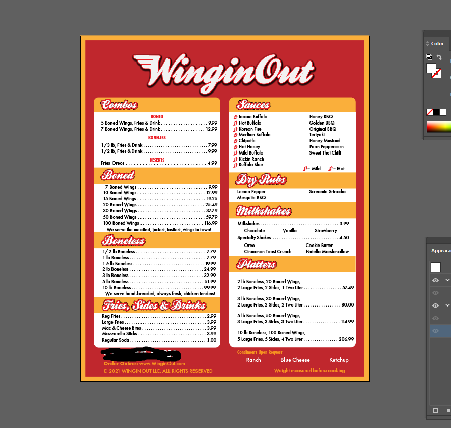
I had a few minutes to quickly play around with it. Several small modifications to the letters are needed to match the original, which I assume is your logo.
In addition to the added wing, the entire W is slightly different from that in the Kestrel font. The original artist apparently redrew it. You’ll need to use the pen tool to redraw the W (or at least the wing part of the W).
I’m unsure how precise you want to be, but several tweaks to the other letters were apparently made too. For example, the counters on some of the letters need to be tweaked and filled in with red. The black outline will also need adjusting in spots to eliminate little white areas between the letters.
Nobody’s pointed out that it seems you’re working in an RGB color space. It’s not going to completely break your menu, but if color accuracy is a concern and you’re not already using Pantone or other spot inks/swatches, you should change the colorspace on the file to CMYK to keep the conversion under control.
Bleed schmeed.
I have had professional designers tell me “that’s your job.”
(I’m a printer.)
The same ones that tell me diecuts don’t need bleed cuz I’m cutting all the white off.
I’m making a list and checking it twice…
Maybe ten years ago, I had a local printer I often worked with tell me not to use crop marks anymore. He said it was obvious where the work should be trimmed based only on the document size and the bleed. He told me his prepress people routinely removed the crop marks from all jobs since they wasted paper.
I followed his advice with other printers too for a while until one of them asked me to include them. I went back to always including them and figured that any printer who didn’t need them could remove them. I haven’t included registration marks on most jobs in years, though. Maybe I got bad advice there too, but I haven’t had any printers complain.
yeah, it’s interesting what goes in and out of importance in the print biz. I had a flier, no bleed, just recently and since it was an 8.5x11 printing digitally, I didn’t include the bleed and crop marks. the printer called and asked me to send a new file with the marks on there. now, I ran a digital press for 10 years. still not sure why he needed them but I sent it. everyone workflow is a little different I guess…