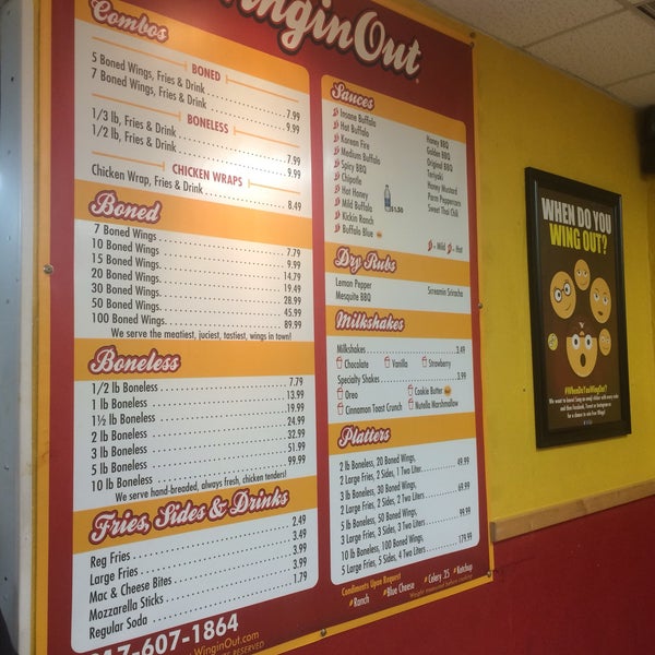
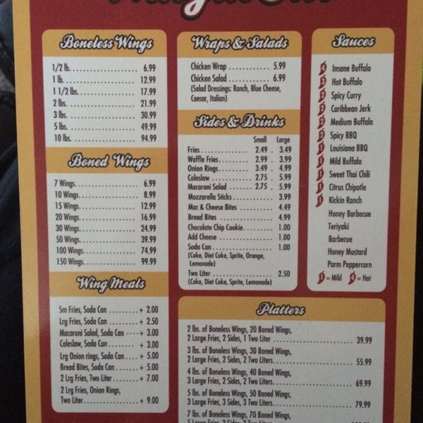
i need to make a new version of this sign and was wondering if any of you guys recognize what program was used to make it originally, and what was used to make the text/font?
You’re not a professional graphic designer. Correct? If I’m not mistaken, Adobe Spark is a do-it-yourself app for creating quick graphics, video, social media stuff, and so on?
Whatever it is, I doubt anyone here uses it. Most people here are professional designers or design students. I’m all but certain that neither the sign nor the typography had anything to do with Adobe Spark.
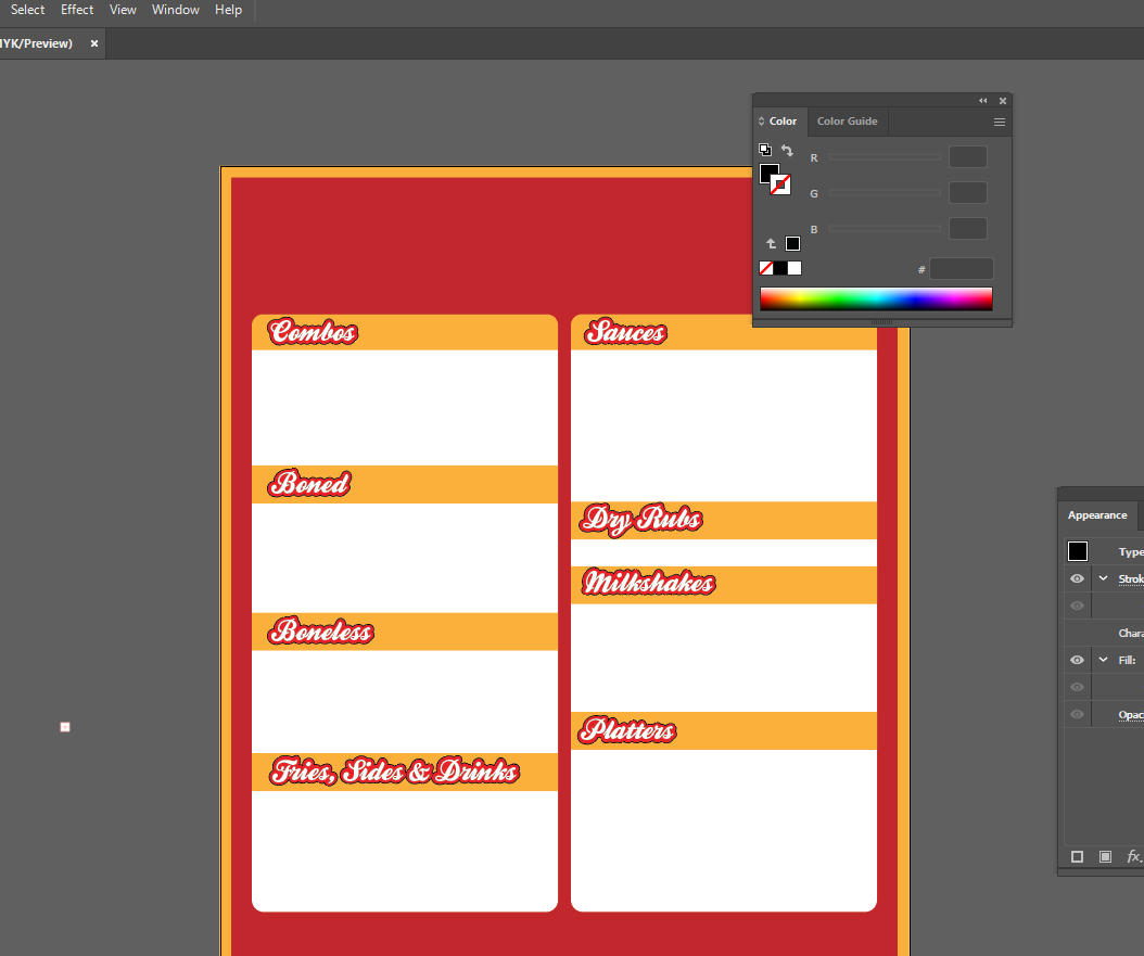
If I had to guess, I’d say the type is from a font and that the letters were stacked in Adobe Illustrator with the bottom one getting a thick black outline and the top one getting a thinner red one. It would be pretty simple stuff assuming you had the right font. Building the typeface from scratch would be far more difficult and almost certainly wasn’t done. Perhaps someone here can identify the typeface if you don’t already know.
i am managing a restaurant and i need to print a new menu vinyl sign with raised menu prices as chicken prices keep going up. I dont have access to whatever file they initially used to print the sign so i will have to remake it myself
AI (Illustrator) is a vector application. Vector art is scalable, so there’s no dpi (actually, it’s ppi) to consider. There’s no point in saving it as .eps if you do this in Illustrator. EPS is an older, largely outdated format. On a sign like this, I’d definitely do the entire thing in vector art unless you include digital photos or certain kinds of illustrations, and even then, the rest should be vector.
All that said, if you haven’t used Illustrator before and if you’re not a designer, you’ll likely spend many frustrating hours on this project and still not have it turn out looking like you want it to. Have you considered hiring it out?
I’m not a chef, but I’ve spent many years making toast. I need to make chicken wings for 300 people and not kill them. Shouldn’t be too hard.
It’d be a train wreck!
I’m not saying you can’t do it, but I’d really suggest finding someone who knows what they are doing. They’ll do it in a fraction of the time that some who doesn’t know what they are doing will. May well be cheaper in the end, It definitely will be if you unwittingly stumble into one of the thousands of potential print production pitfalls out there. It could prove pretty expensive if you get it wrong.
Yes. The best bet is to outline the font, then draw the “lines” from the side of the W and then use pathfinder to merge them all into one shape so that your outline effect is applied to the entire altered W.