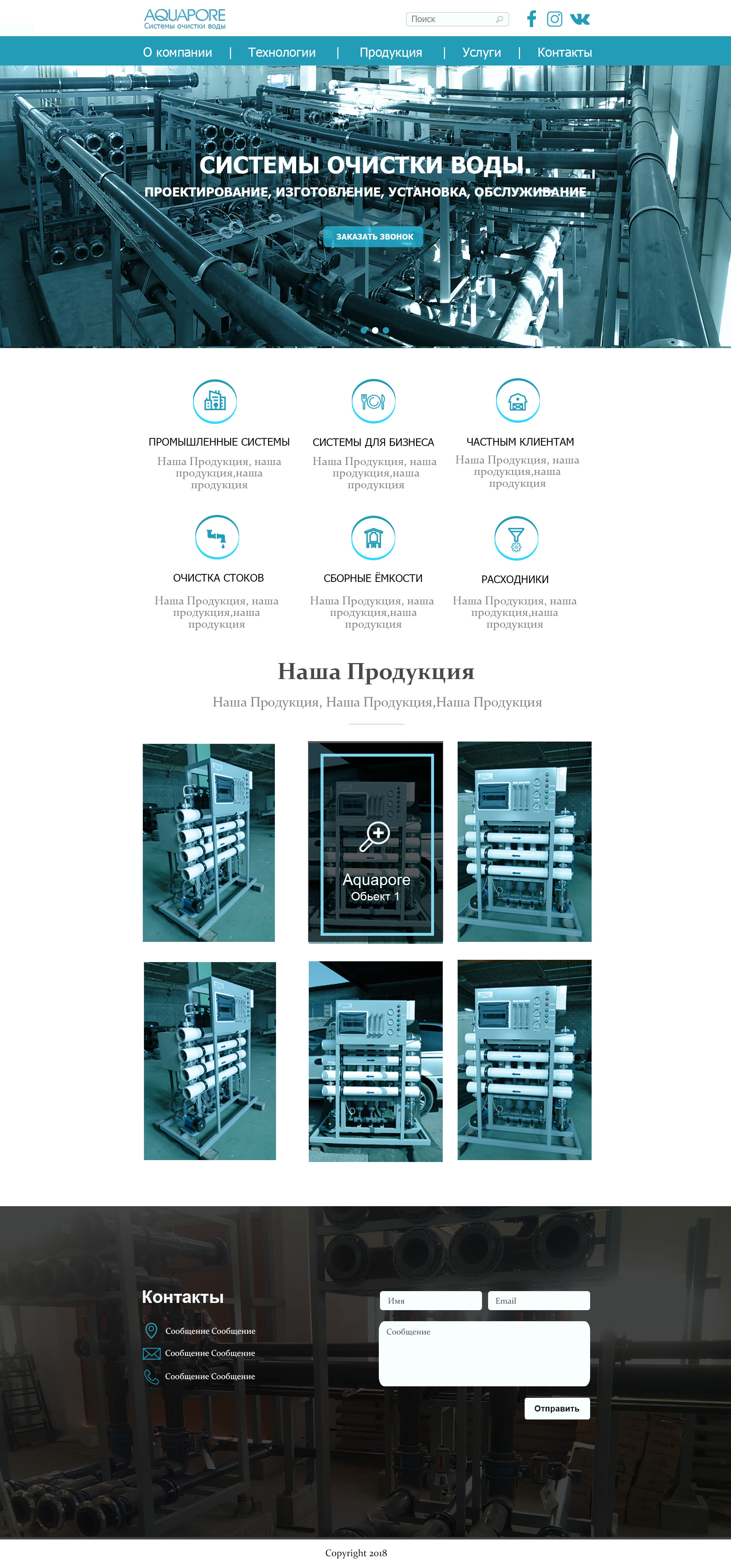
It is too crowded, Give it some space between elements and sections. This will make the layout cleaner. For example, where the icons are. They are too close on each others, add some empty space between them. Also, resize the icons, make them a bit smaller and with some space from the title.
The rectangular pictures on the last section are not aligned properly (the left 2 ones are simply bad aligned compared to the right ones). Give them equal spacing.
Also, the text on the header, is not so visible. Give it a very subtle shadow, but the shadow to be bigger in size.
Other than that, everything is okay.
Thanks so much for your advice!)
I like it! I only have two comments: one is the spacing on the boxes in the middle, as Valvos pointed out. Two, is the serif font on the subtitle between the icons and the boxes. The other titles under the icons are sans serif, with the paragraphs in serif. I would make that subtitle sans serif to keep the styling consistent.