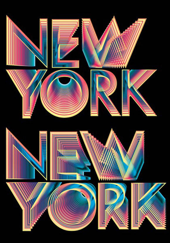
Hi, I’m really new to the graphic media world, and I’m looking for a tutorial on how to make this typography art in either Adobe illustrator or Photoshop. I’m doing this for my church members as they don’t have any budget to outsource this work. So I’m taking up the challenge with hopes of your help. Thank you so much for your kind help.
You might get something close using stacked blends in Illustrator. But there are things about those letters that suggest far more work went into them than a simple tutorial is going to describe.
1 Like
I agree with PrintDriver.
It’s obviously a stepped blend between large foreground letters and smaller ones in the background. Adobe Illustrator has a tool that will do blends, but I think your example involved more than a simple Illustrator filter.
I’m not even sure what software application was used — I doubt it was either Photoshop or Illustrator. I also doubt you’ll find a tutorial. It’s probably not something that someone “new to the graphic media world” will have much luck in replicating.
Most of it can be done in illustrator. It looks like there’s a transparency mode applied to get the color effects. They may have expanded the blend into separate objects to apply transparency modes. Just a guess.
I’m gonna go out on a limb here, seeing now where this says it is 1980s artwork, that a computer may not have been involved at all.
1 Like
I was just going to say that PD … In my opinion this was created by hand. While you might be able to get a similar result in illustrator I really believe in looking at this piece and seeing the color and line work that this was hand drawn. There is too much variation for it to be a repeating pattern.
I could be wrong though ![]()
I did some digging. I hate relying on Pinterest posts but this work seems to be attributed to Andy Gilmore.
At least 2 people attribute that NY poster to him.
https://br.pinterest.com/pin/320177854739259765/
https://www.pinterest.com/texasdiva74/andy-gilmore/
He does work digitally.
This may be early work because his current work is mostly kaleidoscopic.
http://www.agilmore.com/
https://breedlondon.com/artists/andy-gilmore/
https://www.instagram.com/a__gilmore/
This is about as close to a tutorial as he comes:
Ha! ![]() You found exactly what I found, although I can find no reference to the New York art on his website or in any collections of his art.
You found exactly what I found, although I can find no reference to the New York art on his website or in any collections of his art.
Here’s a short video about him and his work where there’s a scene of him using Photoshop. My guess is that his images were created in various ways using a combination of applications with Photoshop being one of them. I’m still not certain that he created the New York artwork, though.
That very first link I posted says it is Breed London. And it lists that NY poster as his.
Breed New York is the artist’s current agent so the possibility is not too far out in left field.
But I don’t trust Pinterest as far as I could throw it so without verification elsewhere, I also have my doubts.
Though he did do two very similar magazine covers and there are indications of similar line art.
Thanks for all your input guys. Appreciate the advise but not the sarcasm coughJust-B. Also, I’ve been at work and managed to somewhat replicate the design a bit.
1 Like
Only problem i had was the gradient option only at linear and radial. Is there a way for me to replicate the gradient from the picture below. I know it’s using a Gaussian blur on its text but I’m looking to get the gradient effect.
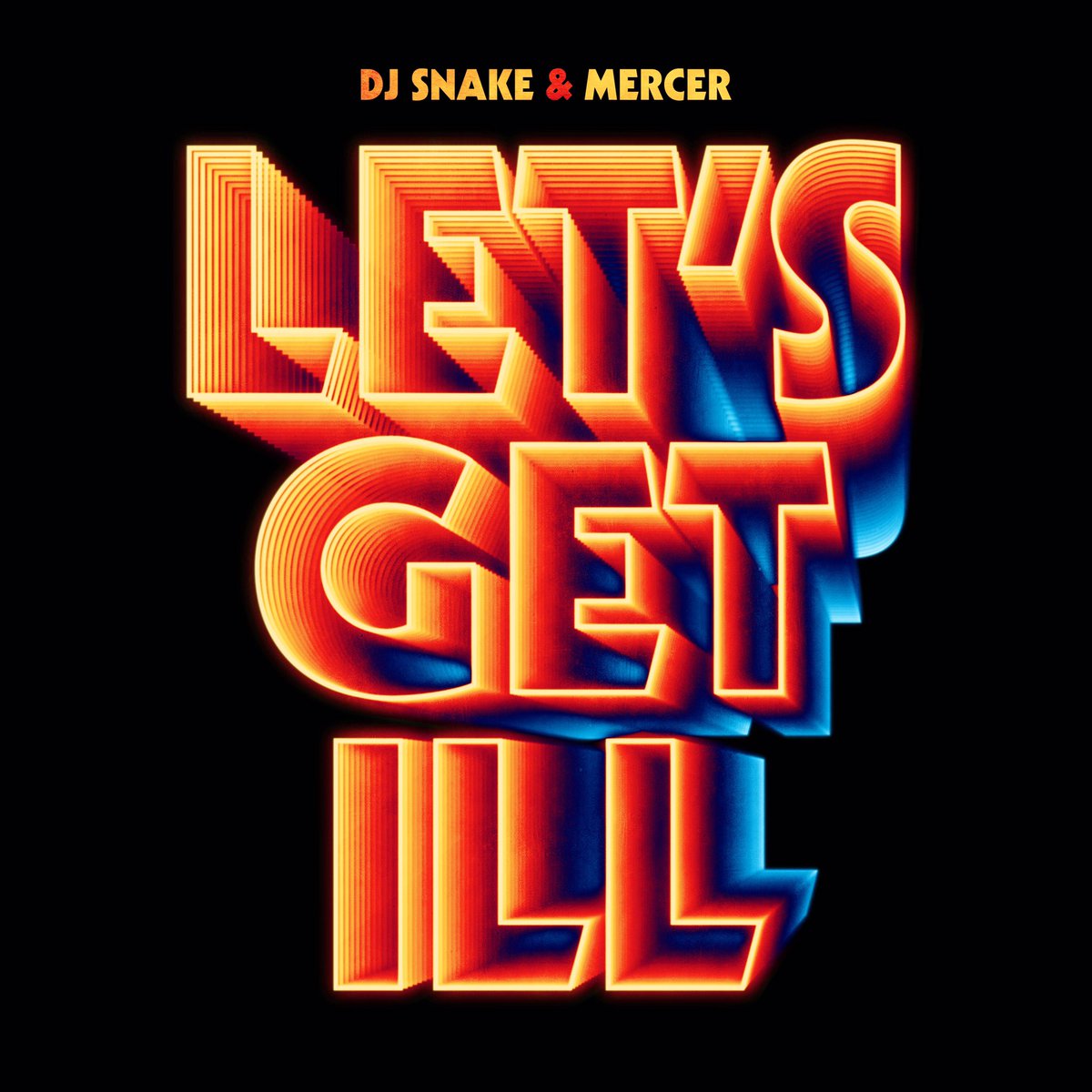
You could try a Mesh gradient. No idea what will happen on a step and repeat blend though…
I don’t know what you’re referring to — there was no sarcasm whatsoever. ![]()
I’m impressed you were able to get this far with it, though.
In the initial example, as the steps recede toward the back, their frequency increases, adding to the illusion of depth. Your blend steps are evenly spaced from front to back. Neither Illustrator nor Photoshop have any straight-forward logarithmic functions like this built into the blend tools, but there might be ways around it — just not sure what they might be. I could easily be wrong, but I’m still suspecting that more than Illustrator and Photoshop were involved in the original piece.
Try this method CraigB posted a while back
https://www.graphicdesignforum.org/t/how-can-this-design-be-made/1425/5
- Do a 5 step blend front to back.
- Break it apart and color each step different colors.
- Do blends between the 5 steps.