I made this today, please check it out.
Dear design gods, why must you test us like this? ![]()
2 Likes
What was the brief you were given to come up with this solution?
1 Like
Anita, I think some more background information would be extremely helpful.
Are you a student, a working designer or just tinkering around?
If you are a student, where are you in your education?
Are you indeed wanting a critique or are you simply sharing your work?
If you are wanting a critique, please include a detailed brief (what is the job, who is the client, who is the target market, etc.).
1 Like
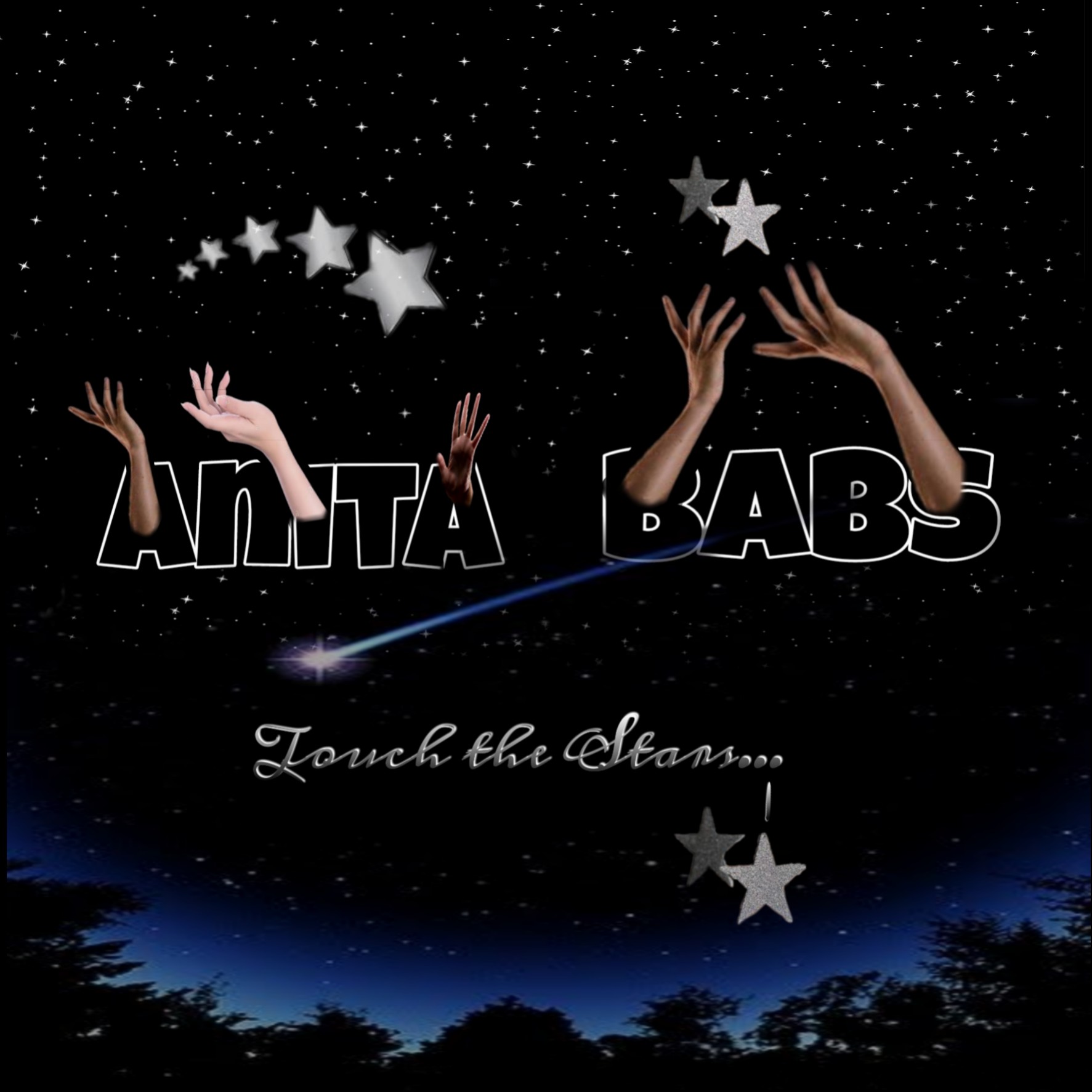
Hi, I’m a student. I’m new in the graphics designing field. I made this for myself. I love the words “touch the stars”, so, I tried to do a graphics representation of that quote. You can criticize it, I believe I’ll learn my mistakes and improve.
Thank you.
I made this for myself. It’s just a personal logo. I’m new in graphics designing. "Touch the Stars is my best quote so I tried to use designing and images to illustrate it.
Thank you, I’d love you to criticize it.
Awwwn![]()
![]()
Thank you, im new in it so, I guess I’m not a design god![]()
![]() . Please, criticize it.
. Please, criticize it.
What grade level or year?
Anita, one of the things I always say is there is a difference between a critique and straight criticism. You will learn from a critique. Criticism is empty of information.
Here’s a trick for you. Select everything and rotate it all 180º. Walk away and come back a couple minutes later. This will help you see weak design decisions or unwanted focal points by resetting your brain.
Try to remove yourself from the emotion of the piece a little and remember your basic design rules: alignment, repetition of shape, contrast, texture, groupings…
Critique:
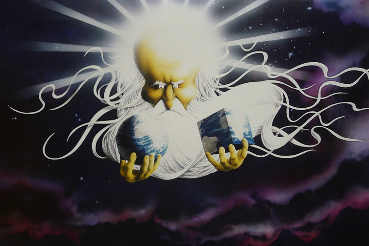
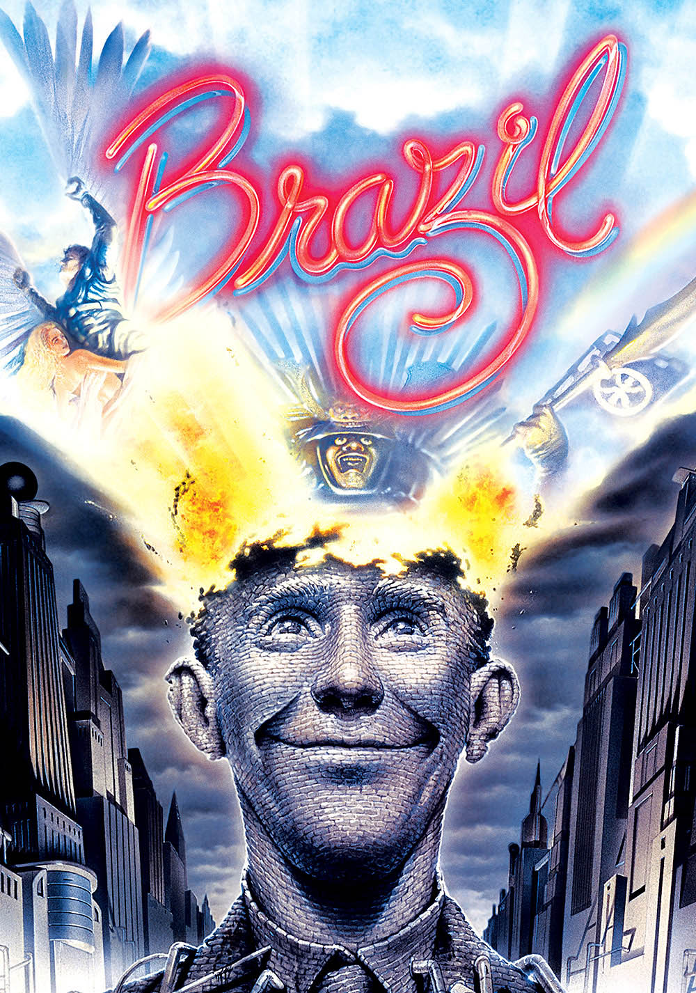
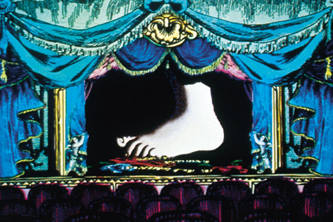
Overall what you have going on is the design elements that are supposed to be light and airy are heavy and bulky, and vice versa. see the images below for how to make design elements lighter.
- “Touch the Stars” is “HEAVY”. Why? Because it looks like a piece of metal suspended in the sky.
FIX 1: lose the bevel.
FIX 2: change the concept and add strings holding it up in the sky.
- choose one of the ways you want to use the stars. As they stand they should either be more different (contrasting elements) or “the same” (repetition of shapes).
- There is no such thing as a truly “white” star. Give them colors.
FIX: Randomize a gradient background and put it over the stars as a “color transparency” layer (overlay often works too). - Un-“scrunch” the trees. They all look like bushes; fat and short.
FIX: Use a perspective map or perspective “transform” to make them look “right”. - Delete 2 dots. Elipses are very overdone and distracting.
Freshman year in the university.
Wow!
Thank you so much ![]()
I really appreciate. Your works are beautiful ![]() . I hope to be like you someday. But, I need your help with something.
. I hope to be like you someday. But, I need your help with something.
1 Like
Just keep practicing and remember your fundamentals. Your drawing classes are probably the most important for you right now because they will help you learn composition.
Take breaks often. Even if it’s only 2 minutes every 1/2 hour or so. We can almost “hypnotize” ourselves when staring at a design too long without refreshing our thoughts. This can lead you down a rabbit hole that ends up wasting a lot of your time on something you’ll erase anyway.
Finally, there is no reason why the trees can’t be overlapped into the sky. That will create more depth.
Concept:
There are 2 1/2 people there. Odd.
The arms breakthrough from the words is not believable, should look more broken.
The dark words are hard to read with the arms coming out of them because you are looking at the outline.
The hands aren’t “touching” the stars, they look like they are throwing the stars out of their hands.
Graphics:
This is not a logo. Read some logo books. This looks like a gaming signature.
What does touching the stars have to do with the name? It’s not explained. Don’t leave your customers guessing what you’re offering.
What are you trying to sell? All graphic art is supposed to sell something. Yourself?
When we do graphic design we are solving the problem of how to reach a certain target market. What is your audience? Your designs have to appeal to them, not you.
Think about these and try again.