Hello, I am looking to receive feedback/critique for this t-shirt design. This is a school project, and I am a beginner in Adobe Illustrator. Please take this into consideration when critiquing. 
Please try to critique this t-shirt design based on the following criteria: the effectiveness of the t-shirt in terms of being able to achieve its goal (of raising awareness for deforestation), overall quality of the design (such as color, formatting, layout), and anything else you would wish to add. A few sentences of your opinion would be greatly appreciated!
Thanks for the help!
Hey, Save it as a .png and then load it to give it a better look. Also try putting it on a t-shirt to better judge the layout on an actual t-shirt. To do this you just google a blank white tshirt and move the design onto it. Don’t have to modify it at all.
For me, as a beginner at adobe illustrator you graphic looks decent. It’s not amazing artwork by any means but still it looks clean, without taking a look at the actual illustrator file I can’t tell if you made any technical mistakes. One thing I find beginner illustrator users do it not expand their text (should be under object expand) that way your strokes and fill will scale properly if you resize it.
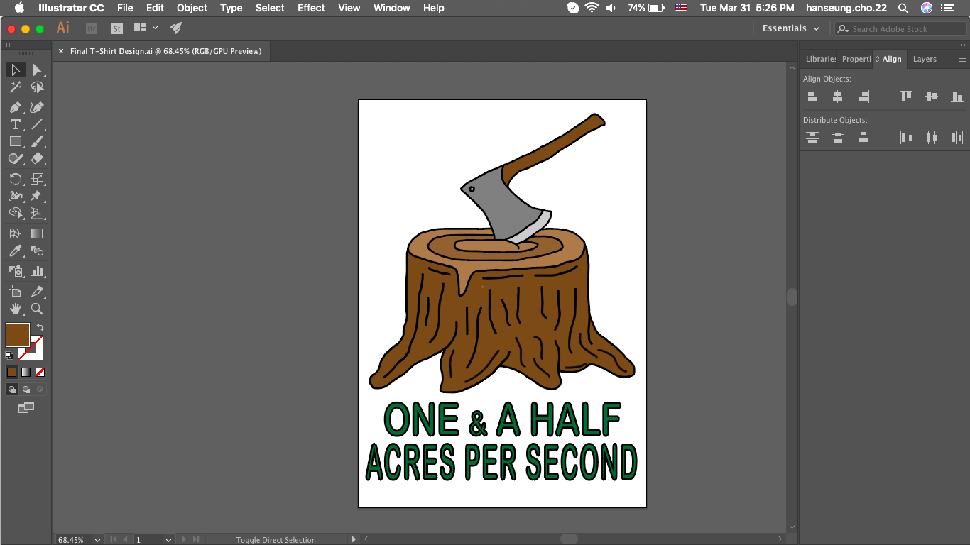
As for the design itself since your trying to raise awareness of deforestation you gotta think about the implications of your message and how that relates to your design. Are you trying to show that its scary, that its leading to extinction?
For me your shirt design without you explaining it can mean one of 2 things.
- we are cutting down the forest really fast
- this is a t-shirt for loggers and damn they are doing a fine job
One of the main reasons might be your choice in typeface (font) the rounded sans-serif you used give off a happy, friendly feel(typography is really important). Moreover, the hierarchy of the text doesn’t say its going too fast. You set it with “One and a Half” being slightly bigger then “acres per second” but the rate of deforestation logically gives off more impact to how fast deforestation is occuring. Reading it as you have it now is a bland “one and a half acres per second” but you want to highlight specific parts to push your message
one and a half ACRES per SECOND
or
One and a Half acres per second
which one reads better to your message?
the shirts cartoonish look and color give off that same feeling.
Overall, I wouldn’t buy the shirt to raise awareness for deforestation sorry to say… but its a good start.
Thanks for taking the time to give me some feedback! I will make sure to take this into consideration.
Expanding text is under Type > Create outlines
The other thing newb designers never do is expand their stroke weights into outlined strokes. You can either do this with the Object > Expand or under Object > Path > Outline stroke. Bearing in mind either way can possibly leave technical artifacts behind that have to be cleaned up if you send your file to a signmaker.
As for the design, my first impression was a logger doing mighty fast work. But it didn’t make me jump to the deforestation thing you are trying to convey. That might be more like tree stumps to the horizon or something, and no axe in sight.
Or go for the feels and show a bird returning to the tree with a worm in its mouth.
“1.5 Acres per second” might read better.
You have quite a mouthful with the visually dense “One & A Half” on there.
Thanks for taking the time to give me some feedback! I will make sure to take this into consideration.