How 2 have branding and differentation in a series

I wrote the book (I am not a designer) and with a lot of help, I did the cover of my first legal thriller (The Perfect Lawyer) in what will be a series. The title of book two in the series is The Perfect Prosecutor, and I’m planning on having the title, author name, all the typography in the same place and using the same color for all the typography, and with the titles being so similar, I’m concerned about people buying the wrong book. Do you have any suggestions for how to maintain the branding effect while still making the book two cover sufficiently different from the book one cover to avoid confusion?

Also the protagonist is the same in both books. He’s changed over from being a defense attorney to being a prosecutor. Would it be wise to use the same image of the attorney on the first cover on the second cover as well (with a different background of course)?

Thanks

He’s still a lawyer though… Just on the other side.

What most do is change to colour
So it be dark, complex, money related, oil

Derive a colour from the theme
Change the image to a different image of the same style

Checkout how Grand Theft Auto utilise the design of the version of the game with the series number

1 Like
1 Like

Thanks very much, Smurf2. That was very helpful, and thanks for the Grand Theft Auto logo link. I’m wondering though if book three or four or whatever should be something like “The Perfect Witness” or “The Perfect Judge,” would I still be able to use the the lawyer image I have now? Just basically have a template, with the same typography, the lawyer-image and a different background, and possibly a different color? (From what I’ve seen of other legal thriller covers the big thing is to get the genre right. And I don’t really see telling the book’s story on the cover.)

You can see by other book coverst they don’t always use the same character on the cover.

I think it’s imperative to use the same ‘style’ but you can change colours and images - just different image but in same style.

I think if I came up with a set of rules now it would be something like

Same physical size book
Similar imagery style
Change the colour to reflect tone of book
Same fonts
Same positioning

Actually one of the books I mentioned there has a good blog

Plenty of resources

It’s about picking your ‘signature’

And then sticking with it.

1 Like

I haven’t jumped into this conversation so far because Smurf2 has given you the same advice that I would have given. However, I’ll add a few of my own comments about two or three things.

The exact same image — No. The same person, in a different pose and drawn in the same style — Yes, that would work out nicely. I know this makes it more difficult since you’re not an illustrator. If that’s not practical for you, I think there are other options that could work, but I would not use the exact same image of the lawyer.

As I mentioned, I wouldn’t reuse the exact same image of the lawyer. Ideally, future volumes in the series would, as mentioned, use the same visual style but not the same imagery.

As for a template, yes and no. If this were me, I’d have a template of sorts stored away in my head that could be adapted to fit the various needs of the different books you mentioned. However, I wouldn’t create a physical template where I simply plugged new imagery and typography in. That would make everything look a bit can and lacking in nuance.

You’re looking for do-it-yourself advice, though, and I can’t give you good advice there since I’m unaware of your situation and abilities or whether you want to spend any money hiring someone. From this and the posts you’ve made in the past about your book, my impression is that you want to go it alone. If your first book is selling well, maybe you should use some of the profits to hire a designer to create the second cover based on the advice we’ve given you.

Yes and no. It might need to visually fit within the genre of what potential readers and buyers of legal thrillers expect, but it also needs to stand out in ways that suggest your book is more than a formula-driven rehash of the sort they’ve read countless times before. There’s a balancing act to navigate.

I’m glad you finished your first book. I remember your posts about it several months ago. The cover looks pretty good. For what it’s worth, I just purchased a Kindle copy of The Perfect Lawyer. I’m looking forward to reading it.

1 Like

I know there are plenty of talented people on here.
But I know a really really talented illustrator based in the UK that is just amazing. I’ve almost worked with him personally on 3 or 4 projects that didn’t materialise.

But if the OP is interested in that option, I’d be happy to facilitate an exchange of details.

That being said - plenty here too. Just putting it out there.

1 Like

Thanks a lot. I need a “signature.” I need simple. Came across one of your old posts saying a figure might not be a bad idea either. The links were all great. Thanks.

Thanks for buying the book and the great advice, Just-B. Okay. I can’t do hardly anything that you suggest. I can’t put the same person in a different pose. I would only be able to use the exact same image of the lawyer. And per what Smurf2 said about colors. I’ve tried to do that and the results have been dreadful. I have worked with a cover designer. Some of her covers were superb right out of the gate. But it’s been hit and miss. For The Perfect Lawyer she did several mockups, but I wasn’t happy with any of them. She got frustrated. I didn’t blame her. So I, with a lot of help from you guys and others, did the cover myself. But I feel like I got lucky. Besides the lawyer figure I used a single background image. I stretched it, which made the pillars look really tall and somehow the sepia coloring worked. Someone here helped me a ton with the kerning and cleaning up the lawyer figure.

Just the opposite really. I would love to have someone do the cover. But how to find someone I can work with? My book is selling decently, but I’ve had friends using high-end cover designers, spending upwards of a thousand dollars, whose covers I didn’t like at all. And the notion of “choose from three mockups” then you get “two revisions” or the like. That just doesn’t work for me. I’m not picky. I just feel like I have to like the cover. I’ve spent nearly a year and a half on the sequel to The Perfect Lawyer. So if there’s a cover designer out there who feels he could work with me, rather than push his work at me, I’d be all for it. I know I don’t have the skills to pull a successful sequel cover off, but I know enough to know what works. I’m never going to be John Grisham, and I’m doing the writing because I like to. I’d love to find a reasonably-priced cover designer that I’d like to work with and who’d like to work with me, because life is too short to not like what you’re doing.

I don’t really know if I’d need an illustrator or maybe I need a cover designer who can do illustrating, but I’d certainly be interested to see what he has to say. Thanks.

Most of what I suggested was what could be done, not necessarily what is practical.

You created a nice cover, but finding another stock photo to fit into the same layout would be difficult. Photographers tend to compose their photos with their photos in mind. They don’t typically shoot photos with a blank spot at the top for the title of a book unless hired specifically to do so. When I’ve designed covers of various publications, I’ve always designed the first cover in ways that make it easy to do the second, third, or fourth within budget.

Toning the cover photo with different colors is a great idea, but it’s more difficult to do with a legal thriller than a fantasy or science fiction book. Courtrooms are various shades of brown, and lawyers’ suits are dark gray, black, or dark blue (at least an ideal prosecutor’s would be). A non-photographic design could work, but you’ve already established a photographic approach with the first book that you want to keep.

I can think of several ideas that would work, but I doubt I could find the stock photos. For example, we could have a photo shot from the back of the prosecutor walking down the center aisle of the courtroom. The judge would be visible, and everyone in the room would have their heads turned to see the perfect prosecutor.

Designer/art director/retoucher fee: $4,000
Photographer fee (on location, lighting, plus assistant): $7,000
Models: $3,000
Empty courtroom rental fee: $1,000
Miscellaneous expenses: $1,000

We’ve just spent $16,000, and we’re still not sure we’d get the perfect photo. I’m not exaggerating the expenses; I’ve designed these kinds of layouts and spent that kind of client money to get exactly the right thing. If anything, I’ve lowballed the costs.

A high-end designer would cost more than that and still be challenged to give you what you want. There’s a reason most publishing companies don’t let authors have much say over the cover designs — they typically have something in mind without considering that almost any design is a compromise of what is doable within budget.

Great, innovative design ideas are a dime a dozen. Pulling off those ideas successfully is the difficult part. A talented and experienced designer will quickly discard unworkable good ideas. The most practical best ideas will almost always involve compromises.

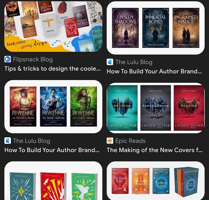
A more realistic and totally doable approach to getting your book covers to match might be to take the magazine approach. From issue to issue, magazines keep the same title/logo and use consistent typography and a similar stylistic approach to the cover art that’s in keeping with the personality of the periodical. Beyond that, magazine art directors take what’s available to create the best-looking and most appealing cover with what they have to work with. Every issue is different from the others, but by keeping the same title/logo and using the same typefaces, they all match.

1 Like

You probably need both.

I’ve spent a fair chunk of my working life designing books. Usually, when an illustrator is required, I will have put visuals together with illustrative style suggestions. Once agreed, either I would source a suitable illustrator (often people I’d have worked with before), or the publisher will suggest one of their go-to illustrators. Occasionally, if it is within a style I am comfortable with, I have been known to do them myself, but 99% of the time, a separate illustrator is commissioned, in much the same way you’d commission a photographer – with an accurate and specific brief.

Rough sketches, or scamps, would be made first. These are then commented on and refinements made, still at a rough stage and sometimes some colour added at this point. Then, more rounds of comments from editorial and design (and usually sales and marketing). Then the final artwork is commissioned. Completed. Applied to the design. Then, often further changes.

As book covers can make or break a book, publishers can be very particular. Most publishers I’ve worked with, have weekly cover meetings where all interested parties get together to thrash things out and have their say. They are usually long and tortuous – and often torturous!

Don’t scrimp on either the author or the designer. You’ll pay for it dearly if you do, in your case, it sounds like you need to find an illustrator with a distinctive enough style that your books become associated with it.

Hope this helps

1 Like

Thanks a lot, Just-B. For the reality check on the costs and the notion of the “magazine approach.” I think that would be doable for me. That was what I had in mind in the first place, but when I looked at all the fabulous covers Smurf2 linked me to it set my head spinning. I’ve got my equilibrium back a bit (I think). And I know what you’re saying about it being difficult to find a stock photo with enough room on top for the title. And looking down the road with possible future titles (The Perfect Witness, The Perfect Judge etc) I think it might be best to leave the figure out in The Perfect Prosecutor, and whatever books may follow, rather than put him in there badly. Just like you said, the exact same typography and a different courtroom setting. At least I’ll get the genre right and there should be a decent branding effect.

(Catching my breath.) Thanks again. I have a better sense of what’s realistic now. I’ll more than likely be back with mockups in the Crit Pit. Really appreciate your help.

Thanks, sprout, for the insider look at things. I originally set out to be legacy published. A pretty big NYC agent read my whole book. It didn’t pan out, but I don’t regret being indie either. Yes, I have beta readers and get plenty of feedback, but I basically do what I want. No editor or agent is telling me to cut this character or whatever. No year and a half or two years to market. (I’m too old for that!) Appreciate your response.

Sorry, I meant, ‘… illustrator or designer …’, not ‘author.’

1 Like