A typical font consists of several hundred glyphs or more. Almost all of those glyphs evolved over time — some of them over 2,000 years old. The basic forms are almost random. Making these random shapes match each other depends on identifying commonalities between the glyphs and imposing similar design motifs upon those shapes (for example, matching serifs or stresses).
Making all those hundreds of random shapes match in both form and personality is difficult in an entire font. Another way to help them match is to develop a grid of sorts. But out of necessity, that grid must be very flexible. The various glyphs still need to conform to their basic shapes.
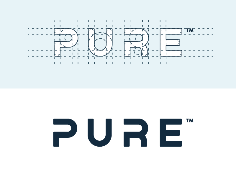
With a wordmark, that task is much easier. Instead of hundreds of shapes that need to match, only a handful of letters are involved.
There are only four letters in the PURE example you provided, all of them similar. Each takes up the same amount of space. The ratio of negative to positive areas in each is roughly the same. And the spacing between each of the letters can be the same since there’s no need to kern them differently since each letter shape plays well with the letter next to it. In addition, there’s a P and an R in the four-letter composition. Since an uppercase R is, essentially, a P with a leg attached to it, the designer used the commonalities between these two shapes to help define a rhythm within the overall shape. Even the counters within those two shapes could be stylized to match, accentuating the rhythm.
The designer who created this wordmark recognized these similarities between the letters and developed a grid they could all fit within. The grid would not work if the wordmark contained an A, J, or an L. In other words, this particular grid worked because the combination of letters in the mark allowed it.
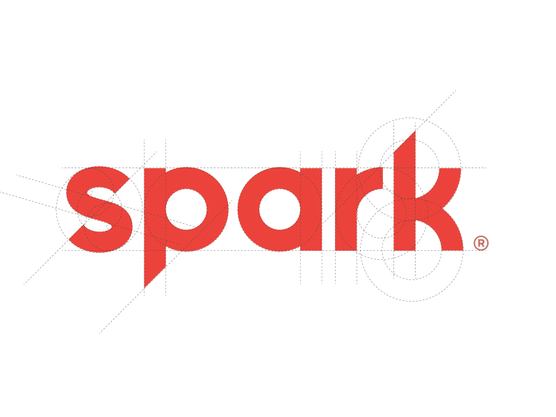
The spark example is very different. Unlike the PURE example of relying on tight conformity to a grid to create a cohesive composition, the designer constructed the letters from matching geometric shapes and angles to provide design cohesion.
In other words, the designers recognized what was possible within the letters that made up the words then built upon those possibilities to bring compositional order and harmony to the overall shape and personality of the wordmarks. The designers did not start with predetermined grids. Instead, the designers looked at the letters and recognized that compositional harmony was possible by leveraging the similarities between the letterforms. In the case of the PURE mark, a tight grid was doable. In the case of the spark example, similar geometric shapes and angles made it possible.
However, I doubt a type designer designed either wordmark. Both contain flaws that a type designer would have seen and fixed. I’ll explain.
Typography is full of small optical illusions that few people realize are there. Good type design always considers these optical illusions and makes corrections for them. Neither of these examples considered these optical illusions, and the marks are poorer because of it.
I won’t point them all out since this post is already getting too long, but I’ll mention a couple of the most egregious problems. Both are due to the letterforms being coerced into compliance with the grid or the basic shapes.
The s in the spark mark has significant problems. It’s geometrically accurate in that it’s constructed from rigidly adhered to basic shapes. Despite its geometric accuracy, it looks off. It appears to be rolling over backward because an optical illusion makes the letter look top-heavy. The bottom half of the letter seems too small to support and balance the top half. Consequently, it appears unstable, as though it’s ready to roll in one direction or the other. Since the weight on the top half of the letter seems to be heavier on the left side, the letter wants to roll in that direction. Fixing this problem would require deviating from tight adherence to the geometric shapes and altering those shapes just enough to counteract the illusions.
The p, a, and r in the spark letter contain other optical illusion problems. Despite them being geometrically accurate, they don’t compensate for the bulkiness created in those areas of the letters where the curved segments blend into the vertical strokes. Fixing this problem involves altering the shapes to make them geometrically inconsistent but visually balanced.
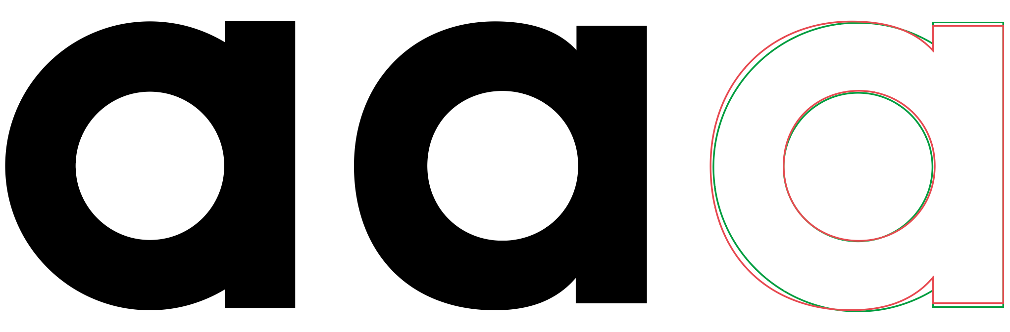
Below I’ve quickly drawn two lowercase letters. The first is geometrically accurate and composed of two simple geometric shapes. I’ve altered the geometric shapes in about a half dozen different ways in the second. These alterations shift the weight balances around to counteract various illusions to make them more optically balanced. The third example shows them overlapped to show how they differ.