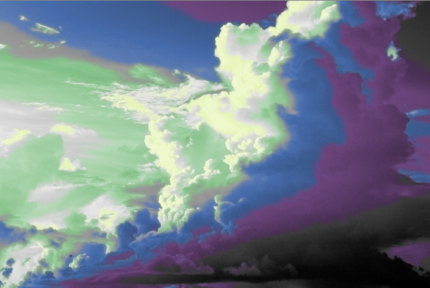
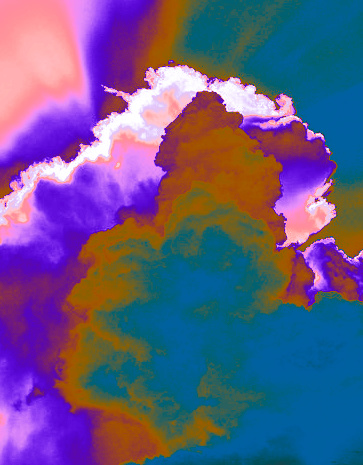
It appears to be a photograph with negative filters applied in spots or hue tweaking. You can do this in photoshop just by tweaking the hue in the image/adjustment menu, or by adding layers with transparency effects. You can even do it in spots with layer masks.
I still didn’t figure out away to create this one.
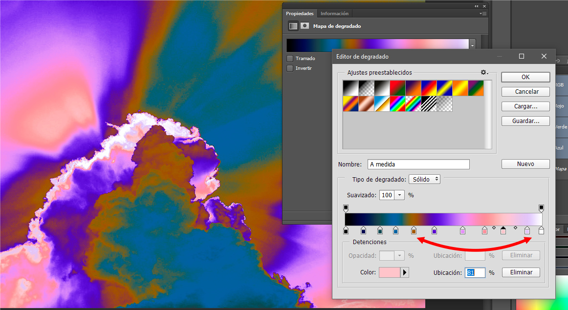
I believe he used some kind of gradient map technique with blend modes
Are there any other designers who want to try one?
I did this quickly, and it is sloppy, but I used the magic wand and played with the tolerance (most important, uncheck the contiguous selection box), that way as I clicked around the!image I got similar values which allowed me to then …
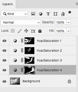
create layer adjustments using hue/saturation and ticking the “colorize” box. Mine is less saturated, but you could bump up the saturation more on some of the selections if need be.
I also played around with selective color, but felt hue/saturation got closer. You may have to do a little of both, and smooth out your selections a little more.
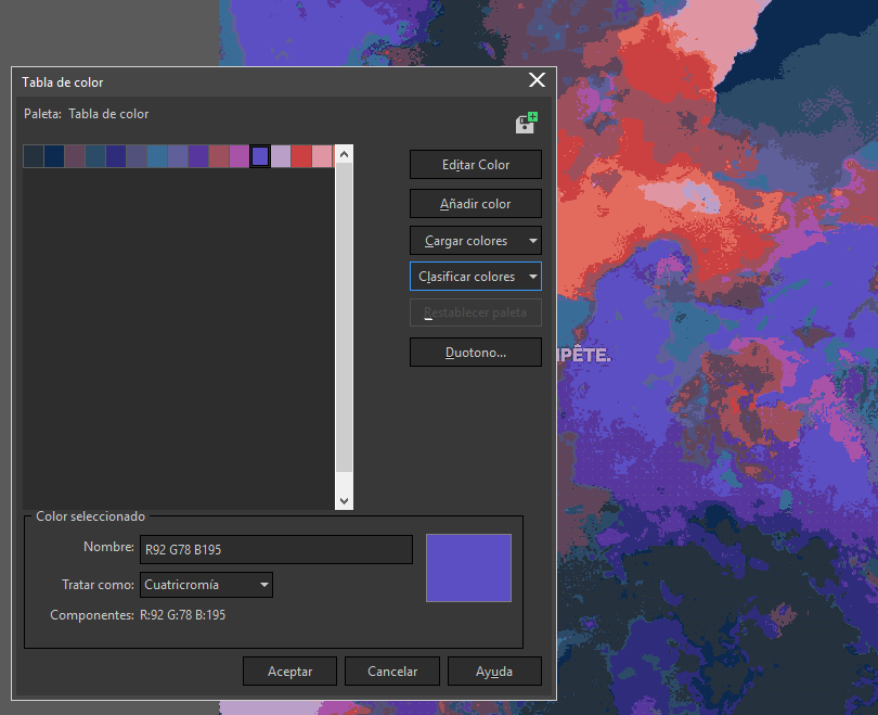
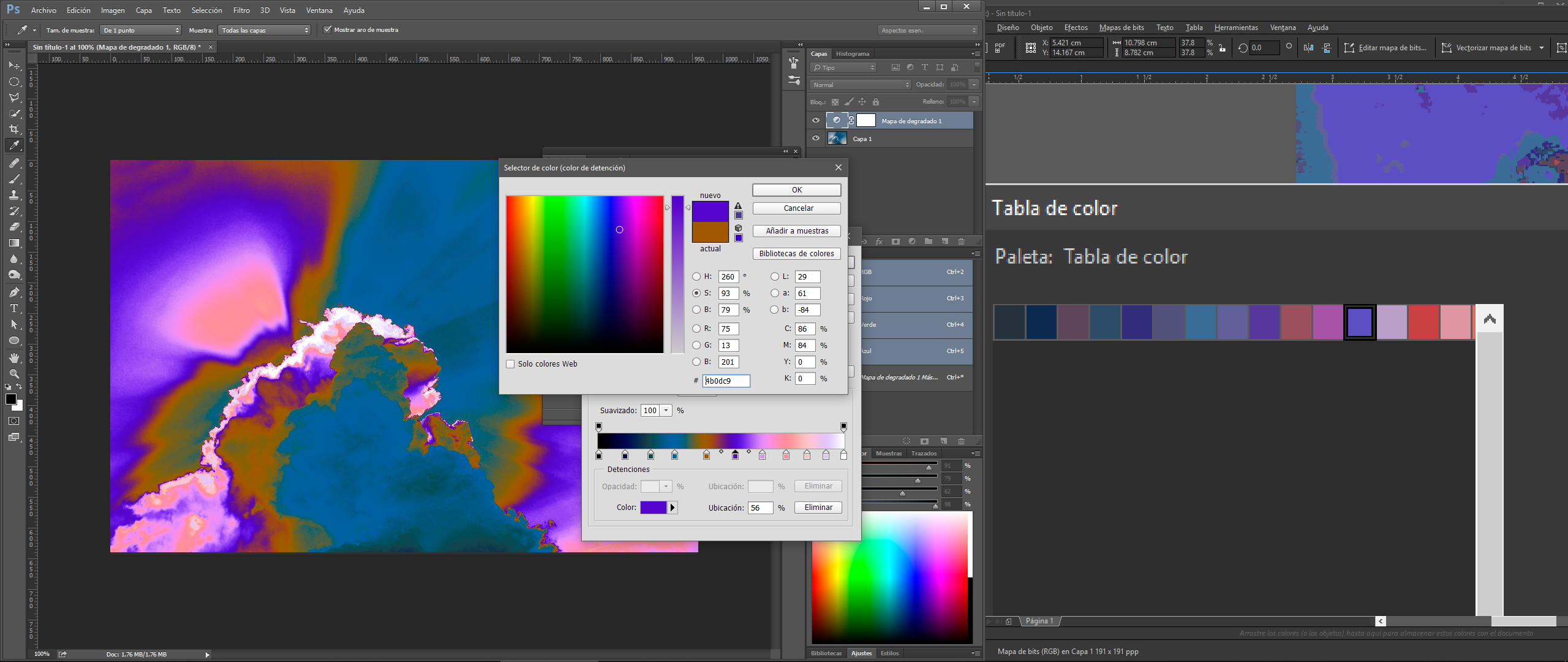
Now on PS or whatever program you have, apply a gradient map and start asigning diferent colors across the gradient. Here is my PS on the left and my color pallete as a reference on the right.
You can use aditional steps. For example on PhotoPaint you could apply some artistic filter like watercolour to the image, so it looks more like a painting or splashes of paint. But the main Idea is to control the gradient.
Another step would be making a composition of clouds. The impact on the image you posted is on the composition, the diagonals. So, if you solve the composition before the grading is a good start.