Hi,
Im working on desiging this up for a client. I usually would just make it cleaner and on brand for this type of dry work has anyone seen any good examples of making these things look more visually appealing? Im stumped tbh.
Cheers
Hi,
Im working on desiging this up for a client. I usually would just make it cleaner and on brand for this type of dry work has anyone seen any good examples of making these things look more visually appealing? Im stumped tbh.
Cheers
What is it?
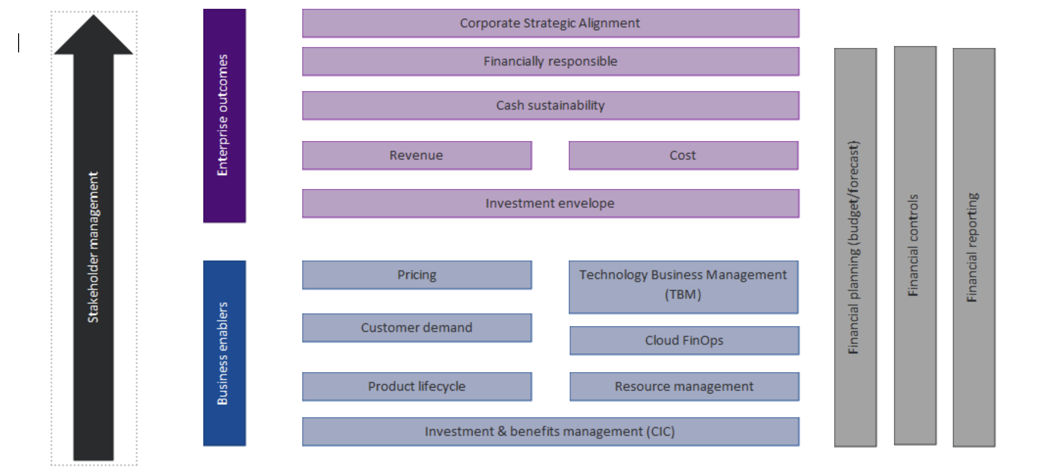
Before worrying about prettying it up, I’d try to make sense of it. It seems to have something to do with finances, but it’s nothing but a bunch of disjointed words that add up to gobbledegook.
Does it go in a publication, a website, a brochure, an annual report, or something else? You shouldn’t separate the design of this (whatever it is) from the design of whatever it appears in. It needs to work within and match the visual context of its surroundings.
Try one of those:
Build something with these bricks. A house or a coin or something.
Make it sci-fi interfacy like by cutting just one upper corner and like colorful lights on dark background.
Make icons for the words and integrate them with the blocks side by side with the words.
I think I’m creative ![]()
Add a background to tie everything together.
Improve spacing.
Better typography.
Don’t use Powerpoint.
You have two issues here, which I think are important for consuming the information the graph presents:
The alignment of the type on the arrow/boxes on the right or left. There is too much text on the right placed vertically to read easily.
I’m having trouble identifying what you’re trying to highlight. You’re listing all roles, using the upward arrow to imply either the passage of time or an increasing level of investment. The beige bars on the right also seem to be playing a role, but they’re vertical. I assume this means they run congruent with the blue/purple roles.
Rather than make it pretty, I would focus on only keeping the vital information necessary. If you had to remake this chart with only 4 boxes… black arrow, blue box, purple box, and beige box, could you tell the same story?
Add icons; if you can choose other colors do so…
This topic was automatically closed 365 days after the last reply. New replies are no longer allowed.