My homework in a graphic design class is to express a certain emotion (e.g. fear, happy) using geometric shapes.
I don’t get it. How can shapes create feelings? I found one example on the internet of using 4 squares to express feelings. I don’t feel the emotion I’m supposed to feel when I look at those examples, although I can think of alternate designs that would work.
However, my assignment is harder because I need to express emotions (e.g. fear, happy), not just feeling (e.g. isolation, congestion, order, bold)
Where can I find such examples? I admit I’m an engineering type person so I probably need more training than average to “feel it”. I think I should first learn to feel the emotions from shapes, before I can create them.
BTW is this a typical assignment for graphic design?
It’s definitely a graphic design assignment. Everything you design has to have a purpose. You are appealing to some demographic, instilling in them the desire to do whatever your client needs them to do. The trick here is that the exercise is fairly generic. You only have to determine what your professor and classmates will “feel” when they see certain shapes. You don’t have to guess about a demographic you know nothing about.
Think about feeling “mad.” Your shapes might get all jaggy and may even be filled with red, or flames.
Or “happy.” Warm and soft comes to mind.
There’s plenty of image examples on the web.
Yes, that’s a typical assignment because as @PrintDriver said graphic design is about problem solving. I remember having an assignment while I was getting my degree that I had to design a black and white poster for a photography exhibit, using no photos or illustrations, just shapes and text. I vaguely remember the ideas I came up with, but that was a few decades ago. It’s meant to get you out of your comfort zone because when you hit the real world, you’ll have real limitations in your designs as well.
This exercise isolates just one piece of the puzzle you might face in the real world.
You might be doing a design that is meant to evoke a response of, let’s say, donating to a cause. Suppose you want to get your target demographic angry enough that they will donate to the cause. You don’t want to be using warm fuzzy colors and soft edges to do that.
Or maybe you want them to feel sympathetic.
Or happy and caring.
Every element of what you design has to point, in some way, to the overall theme of making the target audience do what your client wants.
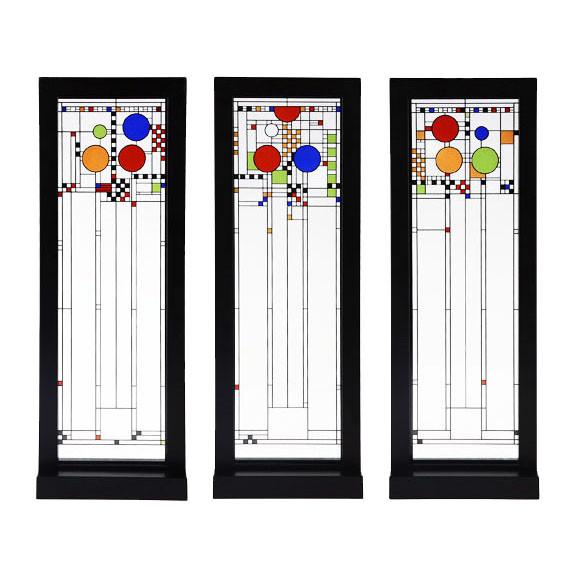
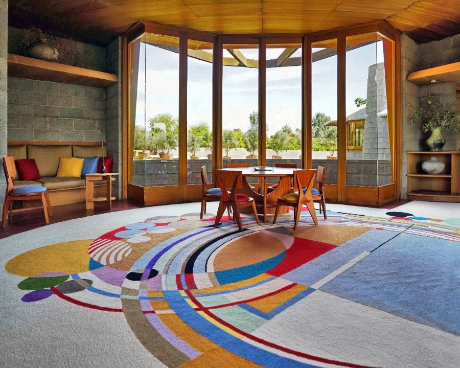
Hopefully, these will serve as some inspiration. The top photo are stained glass windows front he Avery Coonley Playhouse which were designed to suggest flags, balloons, and confetti associated with parades. The bottom photo is the rug from the David Wright House. Both of these were designed by architect Frank Lloyd Wright and do express emotion . . . at least to me.
Isolation can cause loneliness, which is an emotion.
Congestion can cause anxiety, which is an emotion.
Order can result in calmness, which is an emotion.
Boldness can equate to aggression, which is also an emotion.
But the cause is different from the outcome. Isolation doesn’t necessarily lead to loneliness, congestion doesn’t necessary lead to anxiety and so on. Spending time alone on a beach after a busy day can be relaxing. A busy, congested party or concert can be fun (for some people).
Successful graphic design involves much more than creating something that looks nice — it’s about solving problems by engaging the target audience and conveying a message during that engagement. This is done in various ways — one of which is to engage that audience on an emotional level by creating visuals that evoke appropriate and contextually desirable subtle, subliminal emotions.
For example, red can be aggressive or it can be exciting. Blue can be calming or it can be cold. It depends on how these colors are used and in what context. The same is true of using photos, what is written, the choice of typeface or how the spacial relationships are handled and so on.
Most ordinary, everyday decisions are the result of underlying emotions begging to be placated. For example, you’re in the supermarket and need to buy laundry detergent, but you don’t know which to get. You end up relying on your emotions to help make the decision. The detergent in the red and orange bottle just seems stronger, bolder and more gutsy than the wimpy stuff in the baby blue bottle, so you make your decision. It just feels right.
So back to shapes, which all convey very subtle qualities. Triangles are pointy and sharp. Squares are solid and authoritative (if not boring). Circles have a sense of inclusion. A slightly tilted vertical shape says tension (it’s seems to be falling). A horizontal shape at the bottom of a page conveys stability (it can’t fall and is at rest). A huge overpowering big shape looming over a smaller shape conveys dominance or intimidation.
Which subtle emotions are evoked by these qualities depends on how you use them and the context in which they appear. For example, let’s say there’s a composition composed of dozens of packed-together squares. There’s congestion there, but if they’re arranged in an orderly, predictable way, the emotional quality is different from it would be if they were packed together in a chaotic, jittery, disorganized way.
To me, its colors that create the emotion, not the shapes. But shapes can have personalities, if you take curves (soft) like circles or sharp (agressive) corners for example like triangles. They’re used a lot as the basis for drawing peoples faces.
I can’t say shapes by itself do much for me regarding emotion. They do make me indifferent, especially with primary colors and modern art, but I don’t think that counts as an emotion, does it?
I think color will the being the most driving factor award emotion. But the structures themselves can compliment creating emotion. Sharp, pointy figures can create anxiety or anger where round or wave-like shapes can create a more calming feel.
Just-B had some great concepts.
I can see a vast empty space with a lone shape, perhaps with a broad shadow cast from it. You have something toward isolation and loneliness there.