Very impressive! ![]()
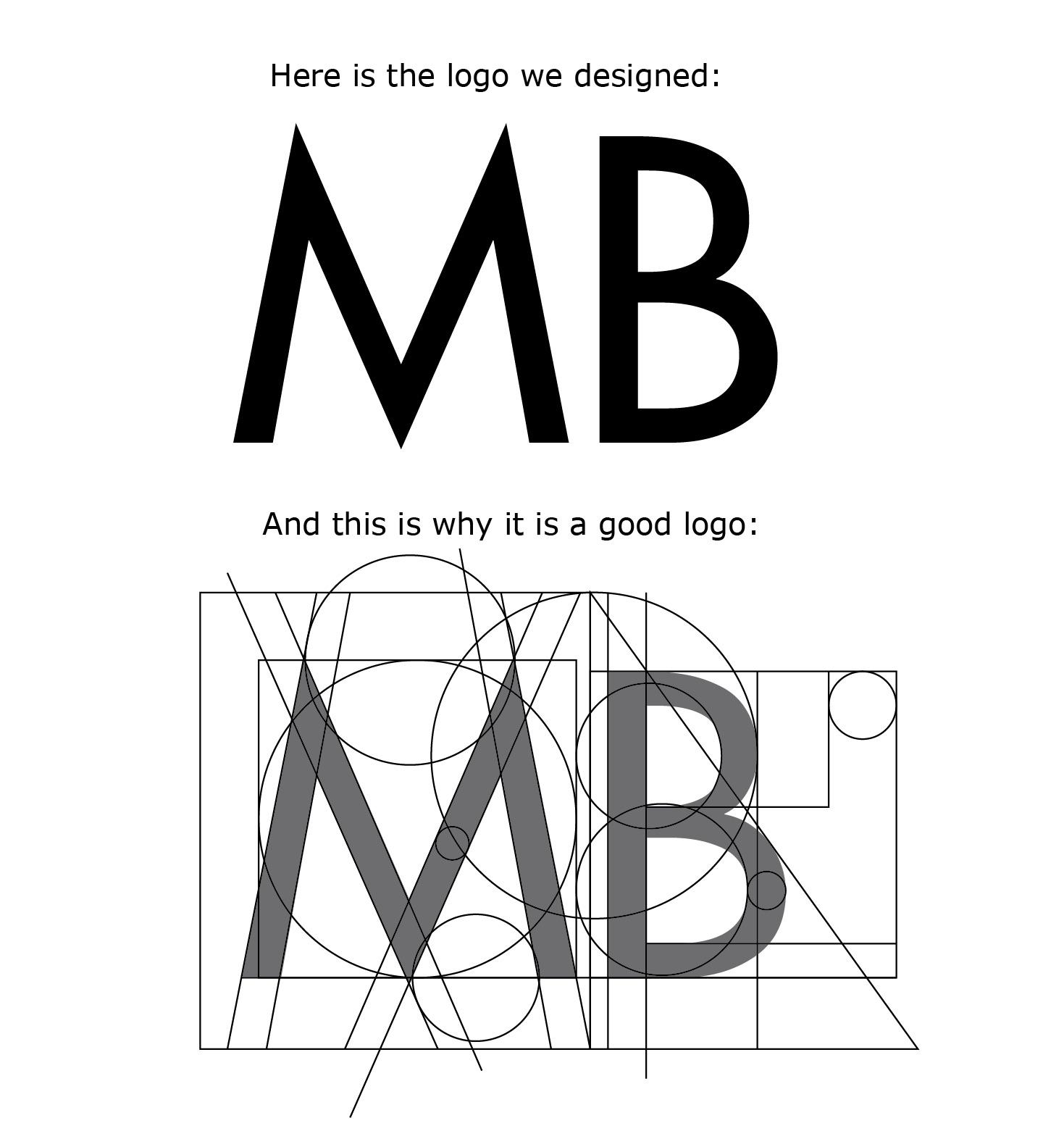
And yet, for all that constructional justification, the top curve of that B looks unbalanced to me and that M is definitely off kilter. That glyph should not be symmetrical.
Awesome Design from a Professional’s perspective. However, the final decision lies on the client who might not necessarily be interested in all the symmetry and the technicalities.
Awesome?
Because it follows one or two, but actually, in this case, maybe no particular mathematical formula?
I can draw lines and circles on any logo. It’s the inter-relationship and aesthetics between the lines and circles that matter.
Check your math.
The only thing that makes a logo “good” is brand recognition.
Well if the client is happy then it’s good.
That’s pretty funny!
The only thing that makes a logo “good” is brand recognition.
This.
Sorry, but I don’t go with that at all. If the client is happy with something, but are blissfully ignorant of the fact that a given piece of work may have completely the wrong tone of voice, then it is not successful. It just means that you have a blissfully ignorant client with something unlikely to do the job they need it to do.
It is no different to having a builder put an extension on your house that looks beautiful and appears to be exactly what you asked for, but they used the wrong roof trusses and poorly mixed concrete. You may be happy, but ultimately, it will not do what you need it to do.
As designers we have responsibility to know what we are doing if we expect people to give us money in return for expertise. That may sound pompous, over-blown and worthy, but ultimately it’s true; if you want people’s hard-earned cash, you have to know what you are talking about.
Alas, there is no license-to-design out there…
Same here, sort of. I don’t think I’ve ever had a client that offered an idea for their brand that would make them happy and help accomplish their business objectives. For some reason, they’re much more inclined to please themselves in this area than they are to influence their market. But in a more indirect sense, when a designer can go back a couple years later to visit a business that’s been skinned with his/her identity design, and the clients’ customers have responded favorably, obviously then the happy client counts for something.
I’m not sure you picked up on the sarcasm. ![]() All the lines are just that, lines and circles drawn to correspond to whatever is there.
All the lines are just that, lines and circles drawn to correspond to whatever is there.
I’ve seen interesting logos whose outlines were built around circles, intersecting shapes and various mathematical relationships, but this isn’t one of them.
This is precisely why I dislike designing logos. Clients tend to get way too personally and emotionally involved with their logos. Their ideas are invariably awful, too complex, fraught with reproduction issues and otherwise just ugly.
This is rarely the case with posters, brochures, flyers, books, pamphlets, packaging or most anything else, but a logo is something else. Clients want to instantly fall in love with their logos because, to them, it represents the visual embodiment of their dreams and goals.
Explaining to them that love at first sight is not typically a formula for a successful long-term relationship is not something I’m especially good at.
![]()
![]() And i thought i was a sarcastic fella.
And i thought i was a sarcastic fella.
A logo may be good from technical standards. However, that does not a successful logo make. It should resonate with the audience and be relevant for the industry.
Exactly. That’s why I tie in all design choices to objective information that they’ve already supplied, and I present it to them in that manner as well. I get little to no pushback that way.
Hey all, it was a sarcastic joke, lol.