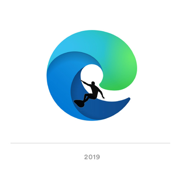
Both of these are a step too far for me. The Edge logo is not an ‘E’ anymore and the Firefox logo is not a fox anymore. The both look like breaking waves now. Designed by a surfer perhaps?
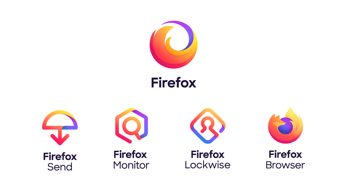
Yeah but Firefox got there first, no?
So tired of waves, globes, arrows, and flames…
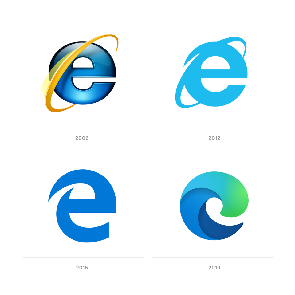
This is purposeful because the old “E” logo was supposed to be a transition from the Internet Explorer logo.
The Edge browser is going to be discontinuing its own rendering engine and will soon be based on the Chromium engine, the same one used by Google to create Chrome. (Get the beta here) Having Edge and Chrome use the same engine means a lot fewer discrepancies for designers.
Knowing all this, I think the logo makes sense as a means to give a clean break from the Internet Explorer days.
I don’t think it’s that bad. Not sure a new logo will save them though.
Save who? Microsoft?
I think these logo redesigns represent society when it boils down to it. It’s all fluid design, it doesn’t look different, but it doesn’t look the same–also firefox’s branding looks similar to instagram.
This/these redesigns look like they will “trend” out in 5 years. I wonder sometimes if design is going through a major shift or if it’s becoming more inbred?
Exactly, so it doesn’t make sense right? A wave doesn’t have an edge…
I thought maybe they were thinking of being “on the edge” = surfing.
But I see this as Shutterstock level quality/idea formulation. It’s a round peg in a square hole.
They’re all going to be owned by the same company eventually anyway lol.
Edge. Microsoft will be fine.
It certainly lacks originality. And that says a lot for the size of an organisation such as Microsoft. Plus it is rather boring and generic rather than “edgy” and authentic.
yes it is.
“Waterfox”? Lol.
Well, Microsoft isn’t really known for its ground breaking creativity, originality and innovation. Sometimes they deliver surprises, but more often than not they borrow ideas from elsewhere, make changes, then integrate the results into their own system. The new Edge logo looking like a cross between Internet Explorer and Firefox doesn’t surprise me much.
Yup!![]()
The New Microsoft logo:
M
I was never into surfing, sorry