How do you like to choose your fonts? - a question just for fun!
Do you have an idea of what you are looking for then use your carefully curated font organizer?
Do you scroll wildly through your font collection until something pleases you?
Look at your thousands of fonts and decide you need a new one each time?
I typically pick typeface that match the personalities and emotional qualities of what I’m designing.
I never look at thousands of typeface. I’ve mentioned this before, but for anything other than special circumstances that scream out for a different treatment, I have a half dozen or so go-to faces that just always seem to work.
Depends on the project. If it’s for a layout like a brochure or book, I normally have a few go-to fonts that I turn to. I already know their quirks and their weights.
For something like logo design, the process is completely different. I will browse online and my own library for something that has the right aesthetic.
I have a process for choosing fonts for a job. It all depends, of course, on what the job is. If it’s a lot of small text the choices are more limited - if it’s display headings for posters and leaflets that’s another kind of duck.
Body text - usually a fairly nondescript sans on some kind but occasionally a nice serif
Headings / display - depends entirely on the subject matter. A poster for a karaoke disco will need different treatment than a leaflet for gardening services.
Where you are mixing headings and body text you can either use a different weight for the headings or go for a total contrast.
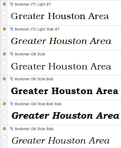
Most of the time I already know what font(s) I want to try or use, but in some other cases, it can depend on the type I intend to set. For instance, if I needed to set something like “Greater Houston Area” as display type, and I already knew I wanted a particular type of font, like Script, Sans, or Serif, I’d also know that the capital G could make or break the shape of the whole thing. The same is true of the other caps and all the glyphs, but to a lesser degree. In a situation like that I use a free utility called Nexus Font, which allows me to sort down through my collection, filtering out the unwanted types, and I can set the actual type to display on my screen at a given size, making it easy to compare specimens and/or “audition” faces until one of them rings the proverbial bell.
This is something I struggle with a lot.. so excited to be taking a typograpy class in a couple months. I am thinking of putting together a printed out font book to start with. This way I can narrow down my font selections, rather than looking at hundreds of fonts that I don’t know.