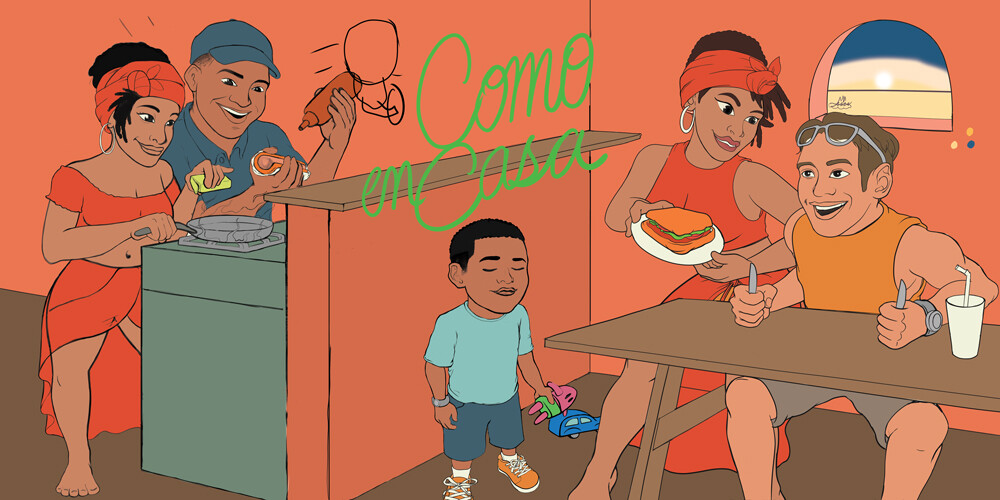
I’m stuck. I have a couple complementary colors working but how do I not make it seem too repeatative?
These are just the base colors, I’ll be adding shading and lighting as well.
Any suggestions would be appreciated.
1 Like
Why are you limiting your work to only complementary colors? Is there some reason I’m missing?
Also, why are most of the objects in the illustration the same approximate value and chroma (color saturation)? Varying those attributes by using various tints, shades (changing the relative lightness and darkness) and saturation levels will preserve the color relationships while breaking up some of the monotony.
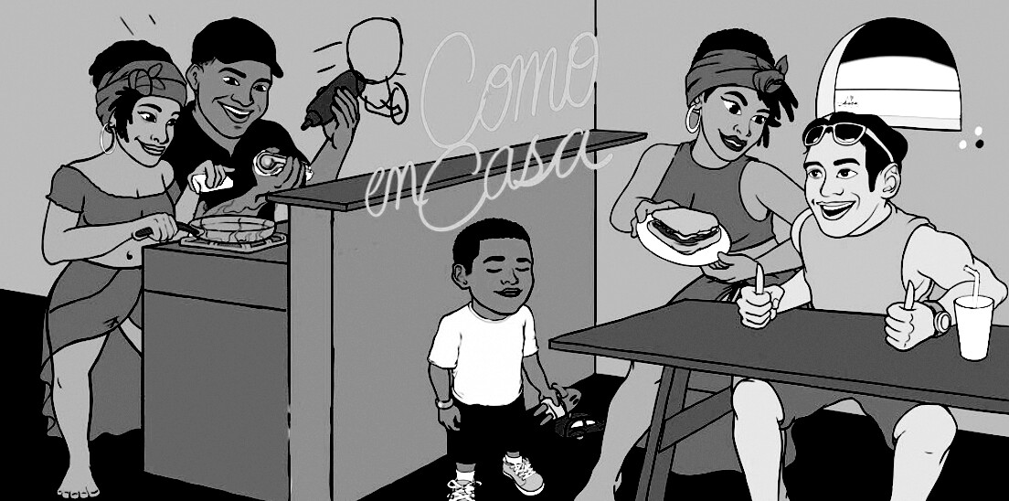
When I convert the illustration to grayscale, the value problem becomes especially obvious (first example). Exaggerating the value differences alone improves the contrast and legibility of the illustration (second example).

Your drawing ability is great. It’s a wonderfully drawn illustration, so why are you seemingly so perplexed over colors. Perhaps I’m missing something in what you’re asking about.
2 Likes
It seems to me that changing the brightness and contrast of individual elements could improve the look of the picture.
1 Like
Looking at your base colors, they’re solid, but to avoid that repetitive feel, try playing with saturation and brightness variations within the same palette. You can also introduce some neutral tones or desaturated versions of your colors to break things up. Adding texture or slight hue shifts in the shadows and highlights can help make it feel more dynamic without straying too far from your scheme.
posted almost 4 years ago…Don’t think he’s been back since…