Hi all.
I have a ebay store that sells supplies and tools for people that like to make stuff.
I sell to all kinds of people. I have Woman customers that make dogs collars and i have males that like to make gun and knife sheaths and everything in-between.
I’m just finishing off my website at the moment.
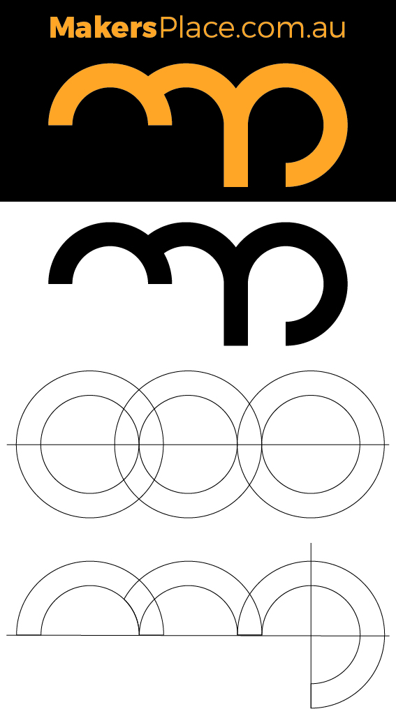
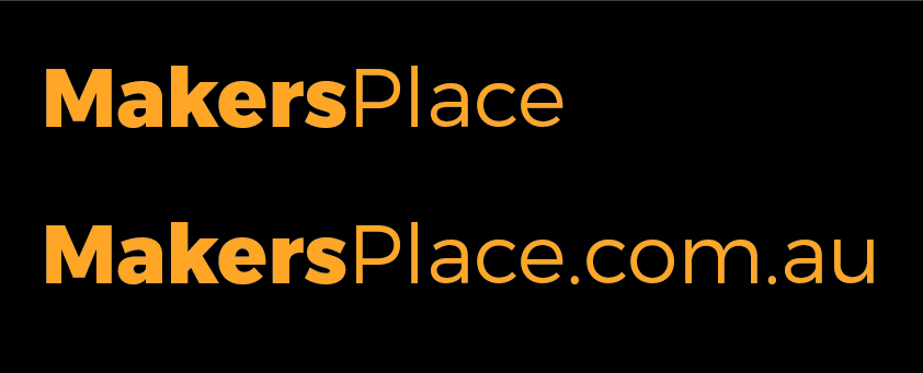
Up until now I have not been using a logo as such but just the text “MakersPlace” as you can see at the top of the image provided.
I was messing around with a logo idea the other day and came up with the “mp” logo that you can see.
“mp” as in Makers Place.
Just looking for feedback.
Im thinking of using an actual logo for the following reason.
A lot of my suppliers offer free branding and custom print on orders over a certain qty. I think having a logo branded onto a tool for example may look better than just having the text.
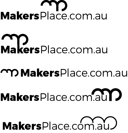
What you have isn’t bad. I see the lower case m / lower case p monogram. It’s easily reproducible in one color across a variety of mediums. You don’t rely on gradients, drop shadows, effects, etc. That said, I don’t think this is the best solution, especially when combined with the word mark. When combined with the word mark, there is too much going on.
I’d suggest you concentrate on designing a word mark for Makers Place without the .com.au text. Since one of the main places you’ll use the logo will be on the website, it will be unnecessary to include the .com.au in that application. Design the word mark in such a way that either a) the .com.au can be added to the end when you want to present the URL or b) you can run makersplace.com.au as as a tagline under the word mark. With regards to option A above, think of how Amazon’s logo works by itself or with the .com added on.
You might be thinking to yourself that what I’m suggesting is what you’ve already done. To some degree, you’re right. But what you’ve already done has too much going on. It reads like a jumble of letters with no clear visual hierarchy or focus. Have “Makers Place” stand out as the clear visual: it should say, “Here I am, I’m the name of the business, look at me,” and then the .com.au should be a subtle add-on.
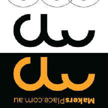
The curves of the M are kind of booty shaped, I’ll second that - but it’s not explicit enough that I would worry overmuch. But it is definitely there, and keeping that nice curvature is going to get some people giggling, so if that’s not something you’re comfortable with you may want to rethink the base.
Visually at first glance, it’s functional, simple, and easy to reproduce. After a more critical second, the white space under the M does seem to be throwing off the balance to me. My first impulse is to pull the terminals on the M to the same baseline as the P, but I’m suspicious that that’d throw it off balance in a different way. You could also try fitting the wordmark in that open space - but I think you should get the icon to a point where you’re happy with it, and then see what you can do with it and the wordmark.
Not quite sure where you juveniles are getting the genitalia thing.
It isn’t what comes to mind on first notice. I had to bo back to see what you were talking about and still it was a bit of a stretch.
But, I’m not seeing the need for a logo-bug at all. It isn’t adding anything other than clutter.
On its own, the mp thing is . . . alright; surely nothing special, and the 3 circles contrivance does nothing to sell it. Once you start trying to lock it up with a word mark, as you’ve found, it’s oddly imbalanced shape becomes a handicap, not to mention a redundancy. So, I agree with:
I didn’t see genitalia or rear ends. It seems like a stretch to me. Then again, some people seeing it might warrant some consideration.
You’ve combined an m and a p into an awkward arrangement. Others here apparently don’t agree, so take my opinion with a grain of salt. In general, I’m not a big fan of distorting letters into logos. Doing so usually doesn’t work, even though it seems to be people’s go-to solution. I’d likely choose a logo more suggestive of people making things.
I wouldn’t attach the logo to the words. That’s another subjective opinion, but it just looks a bit weird to me.
It’s not the first thing you see, and when you do it’s got a kind of innocent charm to it, so I wouldn’t call it a dealbreaker, but it’s something I’d want pointed out to me if I were the designer.
Haha I never even thought it looked like genitals !
Its interesting how different people see the same things slightly different.
I actually agree with what most people are saying, and up until now that’s what I have been doing.
Over the last couple of years I have just been using the word mark as in the example attached.
Its on a Black background because that’s how it is displayed on my website at the moment.
With my website going live soon i was just thinking whether or not to use a logo or not.!
Probably wont now so thank you all for the advice.
Nope. Mine’s usually to be found in the gutter too, looking everywhere for school-boy innuendos (see, there’s even a tenuous one to be had (oo er missus) right there in the word itself – ok, pretty tenuous, but it’s there).
I was once in a meeting – a fairly serious one – that was all getting a bit unnecessarily heavy. At one point someone said, ‘Well, of course, the predicament you’re in is …’ At which point, yours truly piped up with, ‘You said urine.’ (needs the Brit pronunciation to work).
Silence, tumbleweeds. I didn’t get the work. Still, I giggled all the way home. Sometimes it’s just worth the hit!