Hi,
As you can see in these images of a game the background colors are less saturated and grayer:
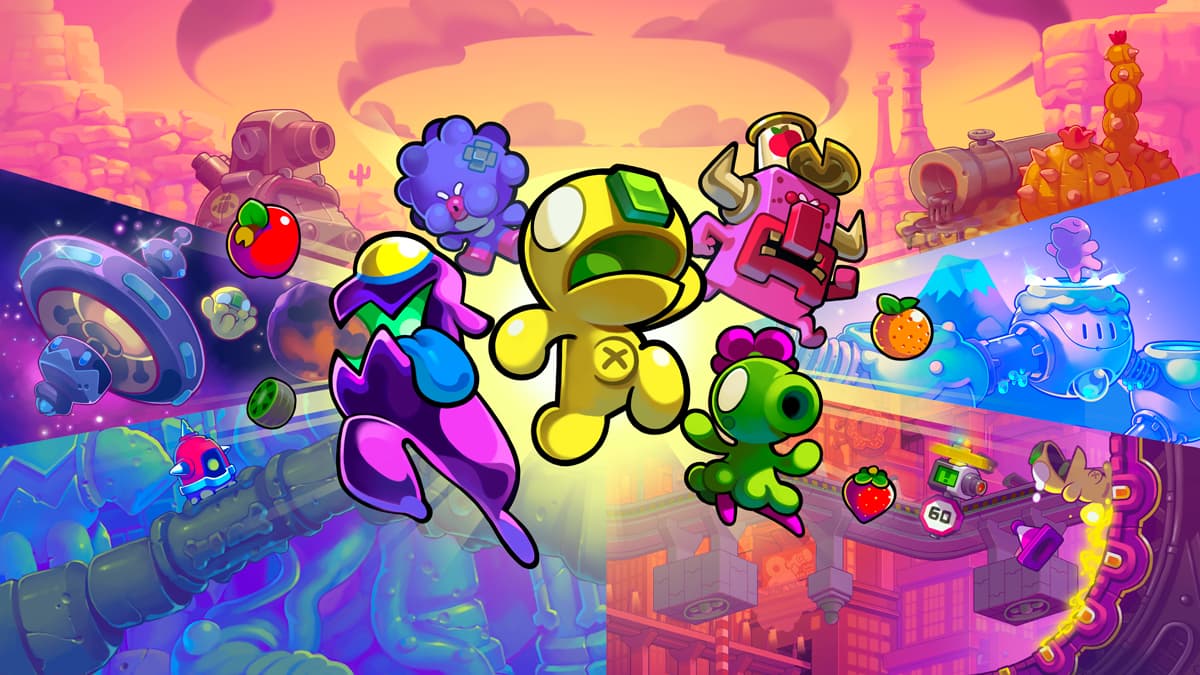
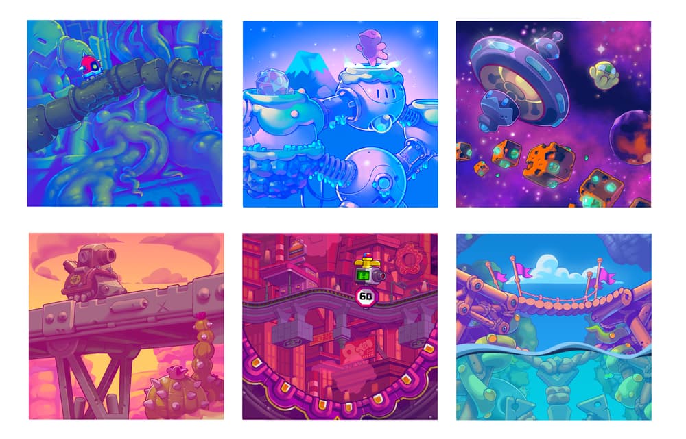
Do you think the designer reduced the transparency in the background or used grayer colors?
regards,
Saeed
Hi,
As you can see in these images of a game the background colors are less saturated and grayer:
Do you think the designer reduced the transparency in the background or used grayer colors?
regards,
Saeed
It is intentional.
Look up “Atmospheric Perspective.”
In digital art, it can be created in many different ways, but ‘gray’ isn’t usually used.
An opacity mask using a white or complimentary color on the “background scenic” layer is often what I do in Photoshop. Or I might create a ‘cloud’ or ‘steam’ effect so the opacity isn’t boringly linear. You can use filters too, depending on what’s behind the scenic layer or how you want to layer in the effect. For instance if you have valley in the distance that is somewhat more foggy than the mountains in the distance, you have to deal with that in a way that works for your art.
Expanding on what @PrintDriver mentioned (which I agree with), the illustrations are complicated and quite busy, Reducing the saturation of the background helps differentiate the background from the foreground. Doing this also causes the background to visually recede, which enhances the desired illusion of depth.
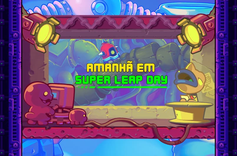
Do you think these in this illustrations, the painter first divided the design into several parts based on the color tone and then put the colors in several stages or did he draw the whole design at once?
99.9% positive the art was created in layers.
Vector or photoshop or some other artware, definitely layers.
It would be very very hard to do flat.
Welll, not hard, really, more Time consuming.
And with commercial art, time=money.
Layers are the way to go.