If you have, for example, a big headline that is on a few lines… and the ascenders / descenders crash into each other, do you adjust the leading of that particular line, independantly of the rest?
Or even when they’re not actually touching each other, it can still look ‘off’ even when the leading of all the lines is the same.
Is it better to just tweak them (so basically the ‘leading’ equivalent of kerning) so that it looks right optically?
Never do this - all lines should have the same leading. Increase the leading so the ascenders and descenders don’t touch. With a heading you may get away with adjusting the wrap, but any spacing will need to be consistent through all headers.
I’ll take the opposite point of view from @StudioMonkey.
I think it is 100% fine to adjust the leading of each line of a headline independently to optimize visual spacing. That said, I wouldn’t go overboard to the point of the headline looking wonky—the differences in leading should be unnoticeable to the reader. But add a couple points here, take away a couple points there to get the headline visually even is fine by me.
The only time this will happen is when you’re using negative leading, which is OK in headlines, but often problematic. If you’re using a typeface for headlines where crashing ascenders and descenders is a common occurrence (usually a face with a small x-height), you’re going to find yourself constantly adjusting the leading.
In addition, sometimes adding more leading to keep the ascenders from crashing into the descenders looks OK, but sometimes it doesn’t. If the typeface and negative leading you’re using causes this problem to occur frequently, you probably need to re-evaluate your default headline typeface and leading choices
If it’s only an occasional problem, sometimes it’s better to rewrite the headline.
If it absolutely has to be that tight they are touching, you can always track some spaces a bit so they don’t touch. Probably a faux pas or caveat or whatever… But you can push and pull kerning and tracking etc so they don’t clash. -5 out of each space is not going to be noticed, for example.
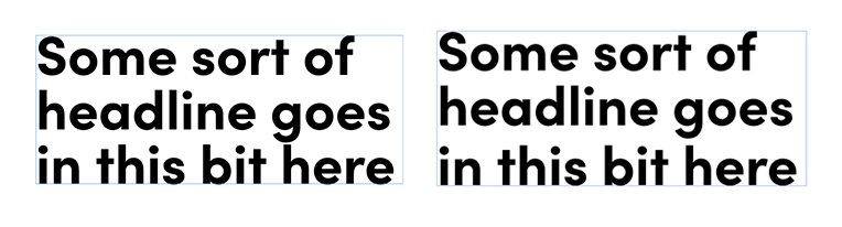
I’ve attached an example headline, using Sofia Pro Bold.
As mentioned in my OP, their not always necessarily touching but still sometimes look ‘off’. This is where the leading is equal to the font-size (I’ll often do this with headlines).
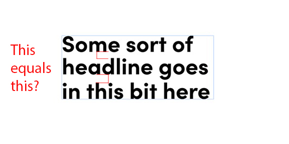
The right-most example is where I’ve bumped up the leading slightly on the 3rd line. I see this as a similar thing to making minor tracking adjustments for rags… e.g. stops it looking ‘wrong’ but without anyone noticing what I’ve done
I think the headline where you’ve adjusted the leading looks slightly better. Not only does it keep the g and the h from almost colliding, but it also so evens out the overall heaviness between the 2nd and 3rd lines caused by all the ascenders and descenders that doesn’t exist between the first and second lines.
As I mentioned in my first response, sometimes adjusting the leading between lines works, and sometimes it doesn’t. However, it wouldn’t be practical in a publication or website to use a typeface set in a way where this workaround was regularly needed. In non-English languages, the additional issue of diacritic marks above some of the ascenders makes the problem even worse.
Personally, I’d probably place a little more leading between the lines as the default style for the headline type. It’s not often that I set type solid unless the type size is over 36 points or in a one-off situation, such as a poster or an ad, where there are no ascenders or descenders to consider.
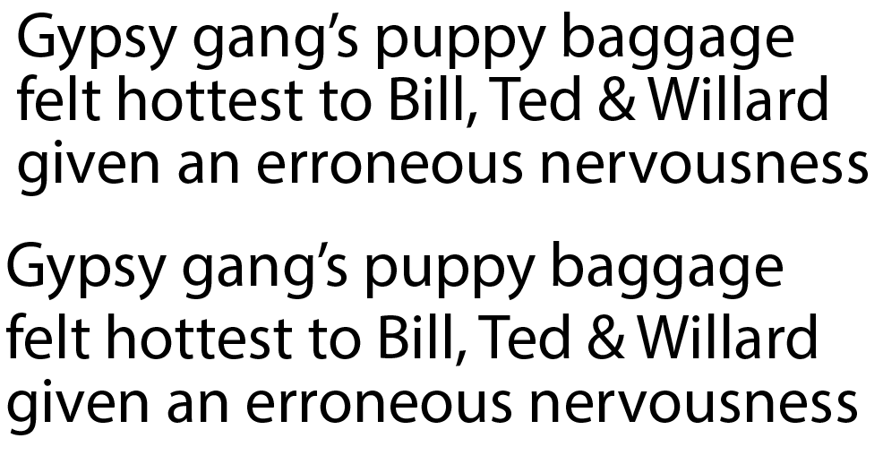
Of course, this is an extreme case that would probably never be encountered, but to me, the second example seems clearly better, even though the leading differs between the lines.
If the inconsistent leading looks better in this extreme example (and perhaps it doesn’t), at what point does it become unacceptable to adjust the leading?
To me, 99.5-plus percent of the time, keeping the leading consistent is preferable for both aesthetic and practical reasons. However, in those instances of a single big headline on a poster or a print advertisement, or an art head in a magazine layout, it’s fine to do whatever is necessary to make the composition of words look even and balanced.
If that third line had an ascender, it would bug me. Because I see what you did there, it still bugs me, but in this case the second, if it were alone without comparison wouldn’t draw my attention.
One of the top rules of Graphic Design
“Whatever Works.”
Graphic design is only rigid if we make it so. The design infrastructure consists of client, rep, art director, designer, illustrator, photographer, copywriter, vendor and supplier. I’m not that naive to think that I have to make do with what I’ve got. If ascenders and descenders are creating awkwardness, think inside a bigger box. Let it be the copywriter’s problem.
Geez. We are designers. We don’t design, we solve problems.