Pantone colors are inherently spot colors. I was whether just doubling clicking on the color swatch in illustrator and then changing it to process would be enough. Do I need to take any other measures?
THANKS in advance!!!
Pantone colors are inherently spot colors. I was whether just doubling clicking on the color swatch in illustrator and then changing it to process would be enough. Do I need to take any other measures?
THANKS in advance!!!
I’m sorry for spelling “Pantone” wrong. Thanks a lot for correcting it, Mrs./Ms.RedKittieKat!
It depends on why you are doing this conversion.
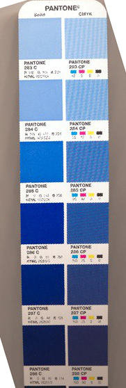
For instance, in 4-color printing, just converting the Pantone to its CMYK values isn’t enough to get a match. A lot of times, you want a different CMYK combination to get the color you intended. If you can lay hands on a Pantone Bridge you’d know what I was talking about. A Bridge will show you a Pantone spot color, and right next to it show you what its CMYK values will look like on a conventional CMYK press (not wide format, that’s a whole other can of worms.) More often than not, they are completely different colors. So you look through the Bridge and see if you can find a CMYK equivalent to your Spot color and use those numbers instead. Good luck with that though… Sometimes you have to work with a print vendor to get proper CMYK conversion of spot, if the spot is even within the gamut of the inkset. About 30% of them are not.
In wide format, you don’t want to be just pressing the convert button. Most of the machines are profiled using Pantone Solid Coated colors (in the US, your mileage may vary elsewhere.) You want to be leaving the spot color callout in there even though the machines spew CMYKcmkOGV inks (no DON’T get the Pantone extended gamut books…Grrrrrrrr.) There are reasons a printer may “convert all spots to process” - most of them having to do with transparency issues - but don’t do it for them.
Here is a picture of a Bridge page.
Bear in mind this is the result you might get in conventional printing (ignore the CP callouts. Only use that library if your printer tells you to.) I say might because Pantone inks on Pantone papers produce these color results. Other media, inks, techs will vary what you get.
In wide format, I can get a lot closer to your Pantone than this would lead you to suspect.
Always converse with your printer,as to best practices when it comes to color matching.
![]() What do you mean by that?
What do you mean by that?
Banners in fabric or vinyl, direct to board printing, wide format photographic. Basically anything a sign shop or lab would do that isn’t conventional sheet-fed or web printed, usually on a print device over 18" wide.
Here’s a little 20" desktop

Here’s a 40foot wide (10m) direct-to-fabric scenic printer

I’v not used the first, but I outsource to the Infinitus a few times a year. Only 2 of them in the world. Because they are in Europe, all Pantone coated colors will more closely match their uncoated versions on that machine. As I said, it’s always a good idea to ask.
It depends. If you’re concerned about getting as close as possible, PrintDriver is the expert and his advice is spot on. On the other hand, if you just want something reasonably close since accuracy isn’t critical, the RGB/CMYK equivalents in Illustrator just might be good enough.
Edit: Whups, that was Indesign… Illustrator later.
![]() HALLELUJAH! I’m glad that I’m way more into Web, UI and UX than anything which is print related.
HALLELUJAH! I’m glad that I’m way more into Web, UI and UX than anything which is print related.