What are some effective techniques for creating a visual hierarchy in graphic design, and how can they be used to improve the overall impact and readability of a design?
What’s the context of the question?
Starbursts – neon green preferably. Make logo pop. Lots of copy.
That’ll be a good start.
Sounds like homework. Maybe ask ChatGPT? ![]()
Let me try to answer this question without a whole lot of context, in short: the most important elements should appear to be the most important.
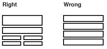
This is a good example, of the distinction:
Use positioning, scale, line and colour accordingly so to give the emphasis to what’s important.
This topic was automatically closed 365 days after the last reply. New replies are no longer allowed.