I am amazed by how these specific colors seem to exactly match and work so well together, to create these stunningly vibrant designs. I think that if you just slightly tweaked the color values of any of these colors, the overall design might totally not work anymore, because the very specific color harmony is what makes these great designs.
I have tried to create this kind of effect with a larger palet of different vibrant colors, but unfortunately I didn’t quite succeed to achieve this.
Is this maybe some generally used type of color scheme? Is there some method or rule behind how to create these specific kind of very harmoniously matching vibrant, lively color combinations?
Curious to know if someone could share ideas or articles / resources on this?
Image is from the Adobe website on transparent overlays
Complementary Harmony - created by pairing the two colors positioned directly across the color wheel from one another. Each color on the wheel has only one complement, which is also called its direct complement. The complementary color harmony is has the highest degree of color contrast.
Is there a specific rule or method based on color theory and the color wheel, to get to these specific kind of very harmoniously matching vibrant, lively color combinations?
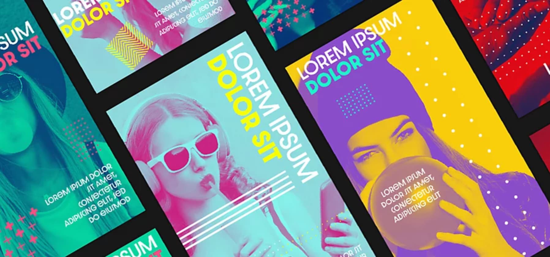
To me these color combinations don’t seem to be compilmentary? For example, purple isn’t complimentary to yellow (image on the right), and light cyan isn’t complimentary to magenta (image in the middle).
There is far more to color theory than complimentary colors (opposites on the color wheel)
This was a whole semester of study in college, one of the basic classes required before you could take any other upper level design course. It went far beyond the simple things expounded on Wiki. Either that or color theory has been dumbed down considerably in the past 30 years, which wouldn’t surprise me.
They are mixed. You need to look at a color wheel.
One combo is complimentary (the aqua/pink/grayscale ones)
The yellow, purple and blue ones are a triad, but I’m not remembering the name (a complimentary pair plus an intermediate color) yellow and purple are complimentary, the light blue is smack in the middle between them.
Sucks to get old.