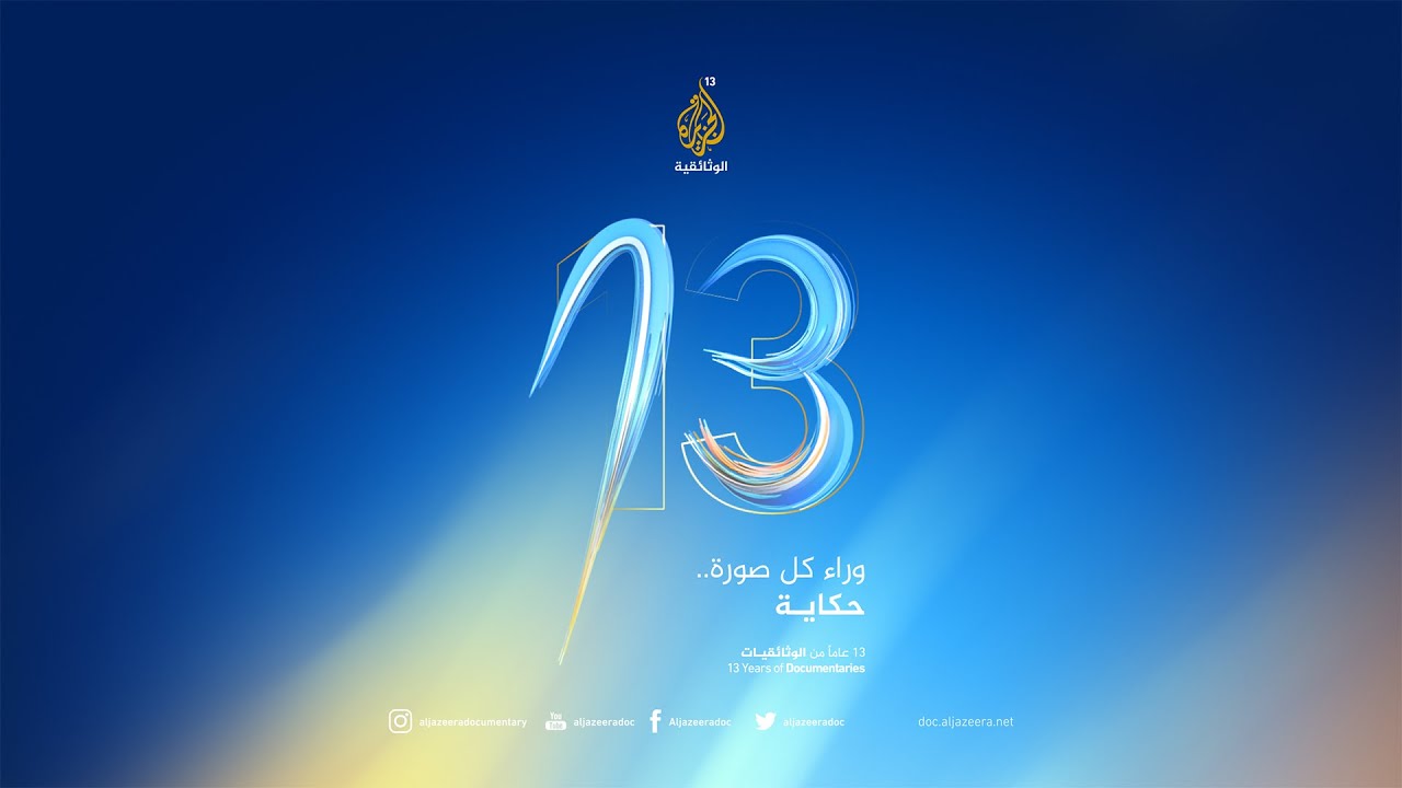
how to do professionally brush strokes like those images any particular videos like the “13 No image”
any videos or topic will help
look at the 13 No image looks great strokes insides and out
Well, I don’t know for sure, but it wouldn’t be too difficult to recreate something like it using Photoshop’s smudge tool with different colors on two or three layers
1 Like
Not to be a dick, but practice.
Seriously, that looks like a vector art image (because of the crisp thin lines) but the effects look to slick to be vector (maybe?).
- Draw a circle
- offset a smaller circle and clip (to get pointy edges of top of “3”
- repeat for bottom of “3”
- copy and paste several layers in place
- Expand new layers so they are fills not lines.
- Use filters ((mainly Gaussian blur to create the thickness (blue areas).
- Use gradients to fill with a slight outer glow filter.
Those are pretty much all the steps.
You just have to play with layer transparencies (blues all look like they are overlays btw) until you have what you like.
2 Likes
I think the most difficult thing about this image is going to be keeping green from popping up where the yellows and blues merge in the background.
Just-B or Print Driver might have a trick on how to isolate colors for print.
A lot of the effect is the transparencies. So even if you aren’t using a background, to achieve the effect you will probably have to back the art elements with some color.
1 Like
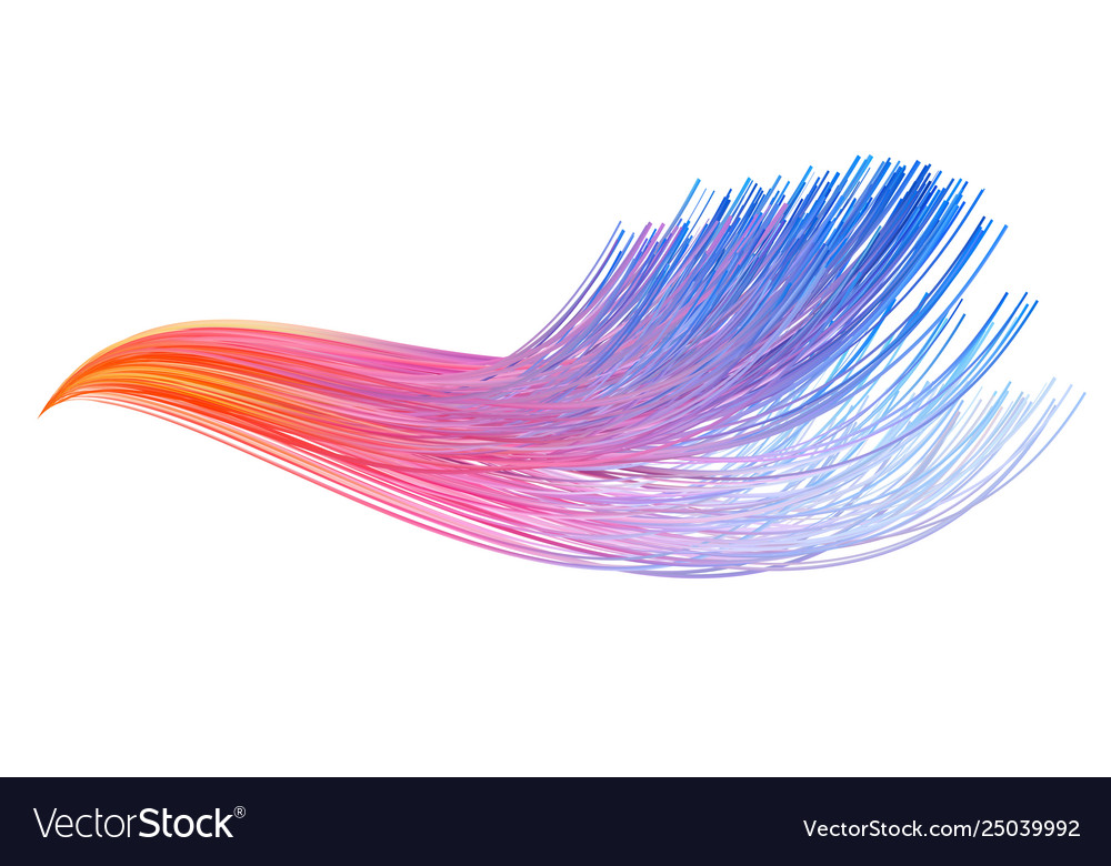
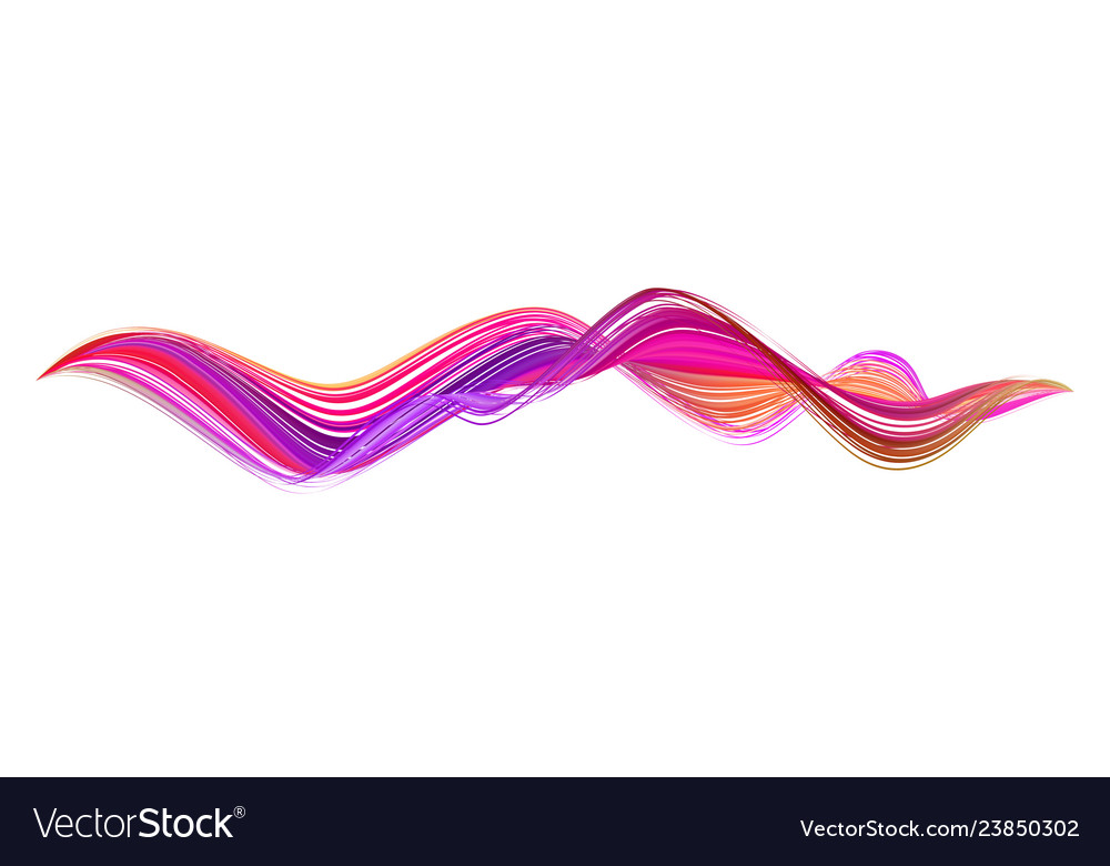
Do u see the images in comment can explain it to
For the lines it just looks like a common step and repeat (copy and paste) with a single origination point. Simply draw a line. The most difficult part will be to keep the line nice and smooth so use a pen tool to control your angles.
Then you can just copy and paste, Edit - Transform - rotate around the starting point at (estimate) 2 degree intervals. Repeat to about 8 lines, then copy and paste another and stretch it out (so there is some variance but it keeps the same basic shape). Repeat same rotation process with new lines.
If you want the solid look (like a ribbon):
- “select all” copy and paste in place on lower layer.
- expand the lines of lower layer into fills
- give lower layer a Gaussian blur.
- Go back to your top layer (the original lines).
- Make another copy, paste in place.
- Select all elements on the new layer
- Expand them to fills and Pathfinder - Add
- make sure all these are still selected (one lumpy shape)
- delete the fill colors, make sure no strokes are left.
- Pull your new layer above the one with the Gaussian blur.
- Select both layers and object - Clipping Mask. This will delete any color outside the shape so you have a nice ribbon edge)
- Bring your original lines above the newly clipped layer.
- The gaussian blur layer will fill in the areas behind the hard-edged lines and give it a “glow”
- create a a white to 0 gradient on top
- Change transparency to lighten where you want it to show hi lights.
Steps are easy. It’s the practice that makes one a good designer.
1 Like