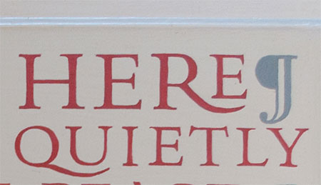
I was looking at some (amateur) design work, and I couldn’t help but notice the wide spacing between the R and S. I instinctively want to push the letters closer together, but there will obviously be a collision between them because of the way the typeface is designed. So, what’s the solution? Keep the wide kerning as it is? Or bring the letters together and have them partially overlap, so that even kerning is maintained throughout the entire word? Thanks in advance for your feedback.

The right answer is don’t use a typeface in all caps that isn’t meant to be used in all caps.
Choose something else.
You say this is amateur design work. It’s a trap a lot of amateurs fall into. There are many others.
Very interesting. Now it makes sense why the letters look so “off.” Thanks for the reply!
Typefaces like these are more or less decorative and only used in those situations where they work, for example when used with extreme spacing between the letters. They often have alternate characters and special ligatures to handle the awkward pairing, like with the R and S. For example, I can imagine an alternate version of the R where it’s leg descends below the baseline enabling a following letter to be moved in closer.
@Just-B That’s a fantastic solution, assuming the typeface you’re using has alternative characters for the characters you’re attempting to change (most free font’s won’t have alternative glyphs, it’s something you’ll typically see in paid fonts).
@EmeraldStorm To check whether there are alternatives for the character you’re trying to change:
In Illustrator (or InDesign): Select your character that you want to change > Type > Glyphs > Show > Alternatives for current selection
I you must have caps, I would move the other letters apart so the spacing matches (not ideal for some situations).
