Below is a screenshot of a software application I am developing.
It’s look&feel needs improving and after changing it a few times I realised I need advice.
Can you help me pinpointing what needs to be changed? How to choose colors that fit well in this UI ?
Please let me know all your sugestions.
With Doctors, it isn’t about pretty colors.
It’s about fast functionality and legibility.
Dark gray on gray?
They are busy people. Don’t make them navigate multiple windows with multiple choices.
(caveat, I only say this because a few of my doctors are retirement age old folks and every time they interface with their medical center computer system they literally curse how many clicks it takes and how lost they sometimes get. Last week it literally took 6 screens to write a simple script to the pharmacy downstairs.)
Now, if this isn’t a medical software, that just shows you what happens when you give someone minimal information and ask for color advice.
What’s it for, who’s using it, on what type of system will it be deployed and what is the interface?
For starters.
You’re right … I will delete this post and create a new one with more information,
Thanks
You can’t delete posts after they have responses.
You can start a new one or continue to add to this one.
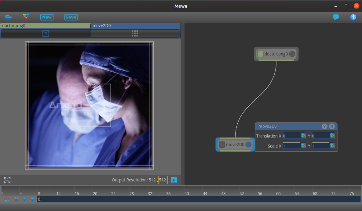
The software applications is called Mewa and it’s still under development.
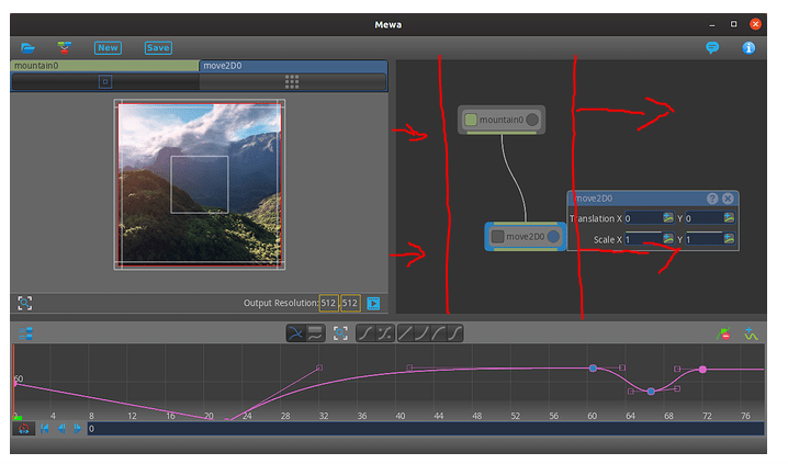
At the center of the UI is a node-graph. In the screenshot above the node-graph has 2 nodes connected to each other through a curved line.
The connection represents the data flow. Data flowing through the nodes are video or images. Each node applies some processing to the input data.
Each node has 2 buttons, a squared button on the left and a circled button on the right. Note that left button is green when toggled and the right button is blue when toggled.
The same green and blue is used together with the node name at the top left of the screenshot.
I’m using colors to make the UI more intuitive, but I’m afraid it’s turning the whole UI undesirable.
Since this software and its purpose are unfamiliar to anyone here, I don’t see how insightful feedback is possible.
Are you assuming the interface design is largely about aesthetics rather than usability? If so, that, by itself, is a problem. The gray on gray looks nice, but I have no idea what your software does beyond your comments about it somehow being related to video or images.
Is the graph at the bottom a timeline that can be manipulated in some way through Bézier control points? Is this stand-alone software? Is it part of something larger? Is it a special-purpose application of some kind meant to add various effects to a video timeline?
Aesthetics are of course, important, but on something like this, they clearly need to be subordinate to functionality. Unfortunately, I don’t know what the function of this software is supposed to be or what it’s supposed to do or in what context?
I don’t think especially meaningful suggestions can be given on something like this without becoming much more familiar with the software and having some experience in using it. Improvements, in my opinion, are not about choosing the right colors for the UI, as you asked, but rather about making the UI as functional and intuitive as possible.
Are you just asking us only for suggestions on making it look nicer? Good UI design involves much more than making things look nice.
1 Like
I think you software UI lacks change the color combination. It seems like a medical or hospital related software change its color to light ones for the better user interface.
@goulart Am going to be honest bud, am a bit lost. ![]()
Is it video editing software that applies a filter as it itterates through the frames?
In the node-graph data flows from top down. If the top most node is a video, the nodes below, connected to it, apply a filter to all frames of the video.
The sketches below show a node-graph with 3 nodes. The top most node represents a video. The node below adds a star on top of the video, and the last node adds a circle on top of the video+star.
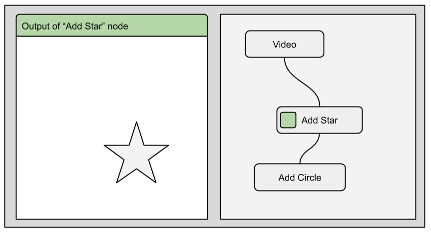
When toggling the node left button (green button), the output of the respective node is shown on the output window (window at the left).
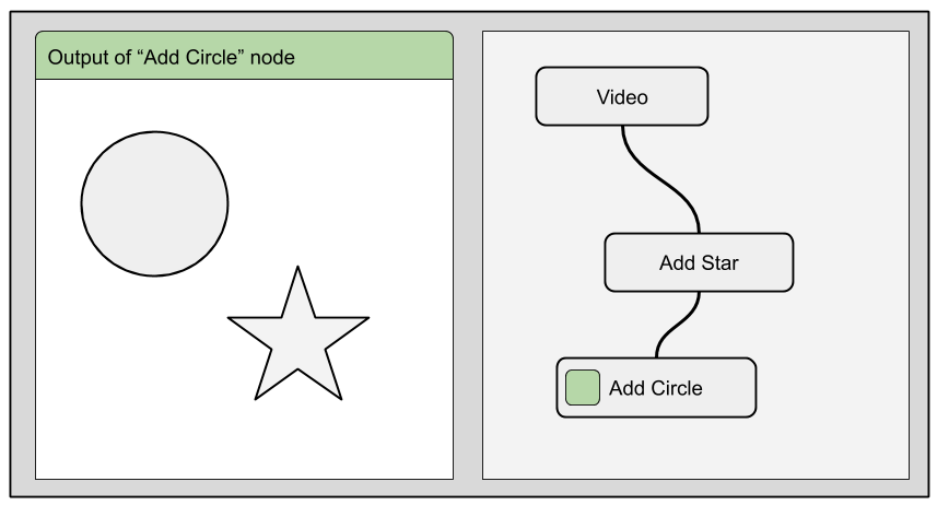
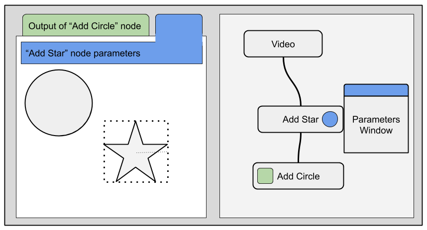
When toggling the “Add Star” node parameters (blue button), the parameters window appears, as the controls that allow resizing the star appear in the output window.
Please let me know if you have any more questions.
This UI can look complex and that’s why I thought of using colors to make it easy to understand.
Ahh ok - so it is video editing software then?
If that’s the case, why don’t you make this apparent this is a timeline then:
What lanuage are you coding this in?
Mewa does not have a timeline like traditional video editor applications. Mewa’s timeline is made of curves.
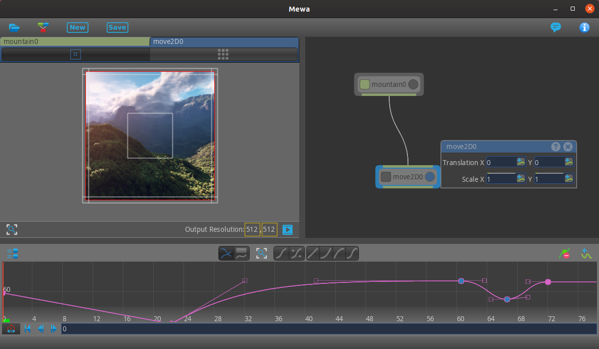
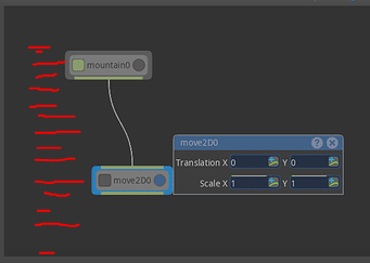
The sketches below show a node-graph with 2 nodes. The video node at the top represents a video file, and the Move2D node below applies a resize/scaling to the video file.
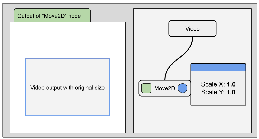
The scale values are shown in the node window (also called node parameters window).
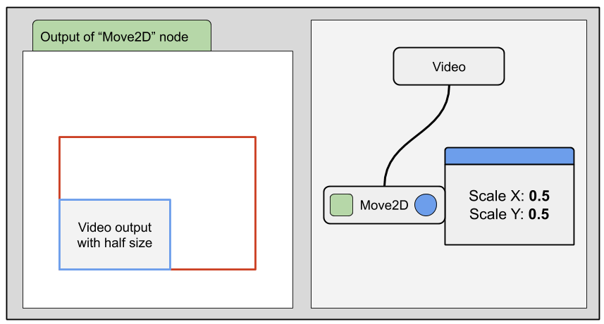
The user can change the scale values by changing the values on the parameters window and/or resizing the image in the output window.
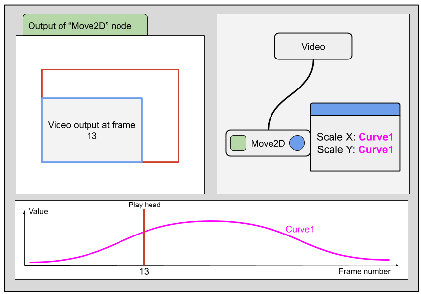
To animate the image size we create a curve. The curve holds the scale values for each frame. The user navigates through frames dragging the play head.
Mewa is written in C++ and OpenGL, and the goal is to make it available to Windows, Linux, Chromebook and Android tablets.
Does the idea make sense?
Yeah I think we’re on the same page now bro.
Before I give you my feedback, can I also ask: what other effects/changes are you able to apply over the curve (other than scale/move)?
At this moment the focus is on the implementation of the idea we have now and, at the same time, keep an eye open for opportunities to innovate.
Beside the Move2D node there are no more effects/nodes. But there will be an open API that will enable anyone with some understanding of shader coding (GLSL) to create custom nodes and publish them on a online public library. Users will then be able to extend Mewa by installing nodes from the online library.
From the previous posts I understand that the current Look&Feel of the application should not be a concern for now. Instead, the concern should be on explaining it’s UI and how it works.
If you have any advice/suggestions please share it.
Very well then.
At the moment the way I would percieve the box on the right hand side as something which is being applied to the frame in shot rather than a timeline which applys an effect to the video,I think it’s because they are both the same size. I’d make the window where you view the video wider and I’d make the box where you apply the effects narrower and more linear.
Hope this helps ![]()