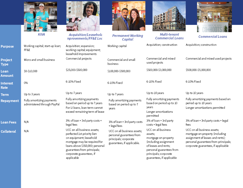
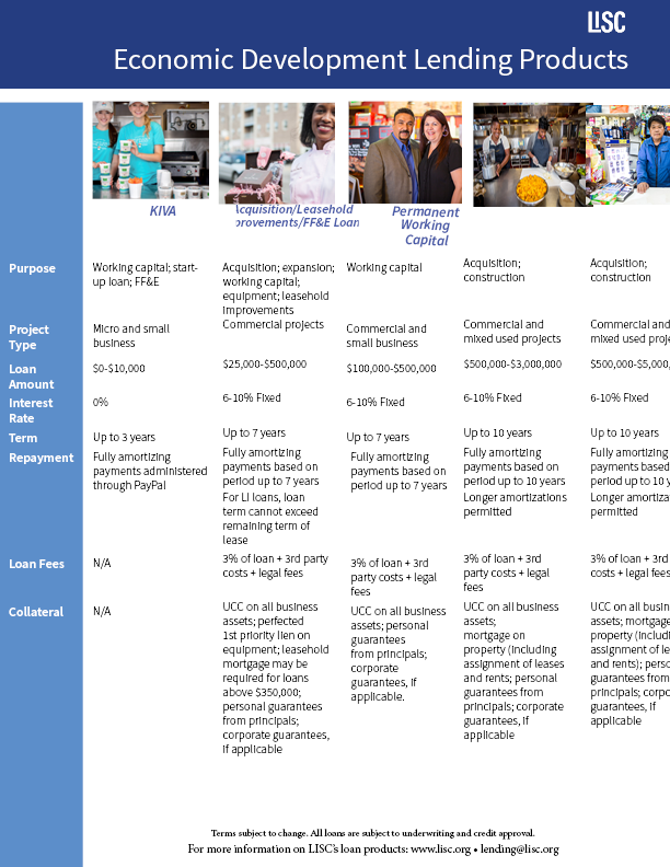
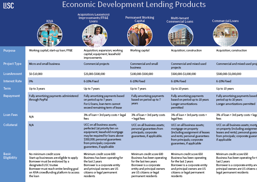
in InDesign. I tried to make this landscape but maybe I should go back to the portrait view. My problem is how to make this look engaging and how to fit all the text on the page. Any suggestion on how to lay out the photo (they look boxy and boring)? Any recommendation on fonts? Both views having the last row missing because there wasn’t space for it. Thanks.
I don’t think you’re off to a bad start. I’d say you could clean up the typography, spacing, and alignment. Maybe add vertical rules to separate the columns and add horizontal zebra striping. I prefer the second option that has the headline on the page and the photos below the blue box. Define the problem. Your problem is coming up with a solution to quickly convey a lot if information in a limited amount of space.
I add the zebra striping that Steve suggested. I decided to put the images in circles because the rectangular framing of them looked very boring. I am still having a problem fitting all the content on the page (you can even see the contact info that is in the footer because there is not enough space). The body text is already at 10pt using Source Sans Pro. Should I use another font if so any recommendations? Any feedback is greatly appreciated.Thanks.
Can someone tell me how to get the two images on the left side to dip below the blue banner the way that the last three images on the right do? I don’t low how the border for the image rests right on the blue banner I want it to dip below the banner in the middle the way that the others images do. Thanks.
I tried that and also send backward. The blue banner is on the master page. I don’t why the three images on the left dip below the blue banner (which I prefer). I don’t like to see the white frame surrounding the images to look as though they are butting up against the blue banner. I even tried to just copy the image and frames of the effects I like and when I place the photo it still has the effect I don’t like. I am assuming the photos are the problem since I copied the images and the frame with the effect i liked and once I changed the photos I lost the effect.
Improved over your first try but can you edit down the copy? Simplify and make sure it follows the same order.
I would also make the columns equal sized and be consistent with your line breaks.
As for fonts, you could go a bit smaller than 10pt or try a more condensed font style.
I also wonder if you add bullets to break things up a bit, especially in the larger paragraphs.
Unfortunately, it’s not my wording to change. I asked the owner if she could pair it down because it is word heavy. I will make the columns equal size. I think adding strokes to the cells might be helpful. Thanks.
I think it’s already clear where the columns and rows are. Adding strokes would just add extra stuff.
When I’ve run into layouts like yours, I’ve often used a condensed font. Choose the right typeface and the words are generally just as readable, even though they take up less space.
Right now I am having a problem with spacing between columns. The photos are now circular which I think looks better but center them in their column and giving equal spacing between the photos is proving to be a challenge. .