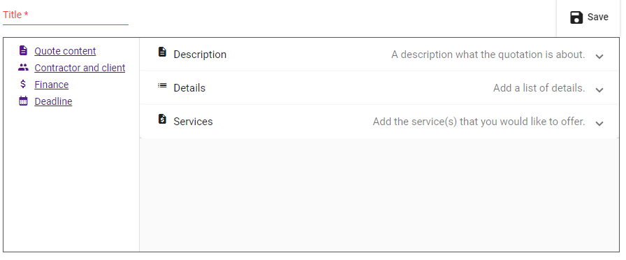
I am a software engineer but I have no idea about design. I have a form, which has too many input fields (most of them are not mandatory). I don’t want all input fields to be listed like a simple form, since the user will probably be bored. So I am looking for a way to make it user-friendly. Attached, you may find my current version. So the left sidebar includes links. When the user clicks on them, there will be further input fields related to the same form (browser will NOT load a new page). So it is similar to tabs but I did it that way since I don’t like tabs. But I also don’t like my version, since the user could believe that the links will redirect to a new page and they need to save the form before clicking on one of them.
Another option is to use collapse but some of my menu items in the sidebar already use collapses.
That question is a bit like asking, ‘I’m a designer not a software engineer, I have something laid out well, all the hierarchy, legibility, readability, UI and UX issues sorted. How do I make it all function?’
A: Find a software engineer to work with,
Your question, to my mind has no easy answer. It depends on a lot of things. Who is it aimed at, demographic, age, etc. the way it is styled will depend entirely on who you want to talk to, to guide them to what you want them to do. There are universal practical considerations, but, that’s the job of a designer and usually takes years to get right. It is not a one sentence answer. So, my advice would be find a good designer to work with, who is used to solving this kind of problem.
I agree with Sprout; a problem of this kind requires much more information to fully understand the problem.
However, if all the fields in the form must be encountered or filled out before the submit final submit button, my initial inclination would be to make them sequential pages. Of course, you’d need to cache the field information from one page to the next. I see sequential pages used quite often, so I think most users feel comfortable with them. I’d also be inclined to number the pages, as in 2 of 4 or 4 of 4, so users know there’s a limited number of pages and that it doesn’t go on forever.
There’s also the matter of making the form clear and engaging enough to keep users moving through it, but that’s another aspect of UI design that requires lots more information.