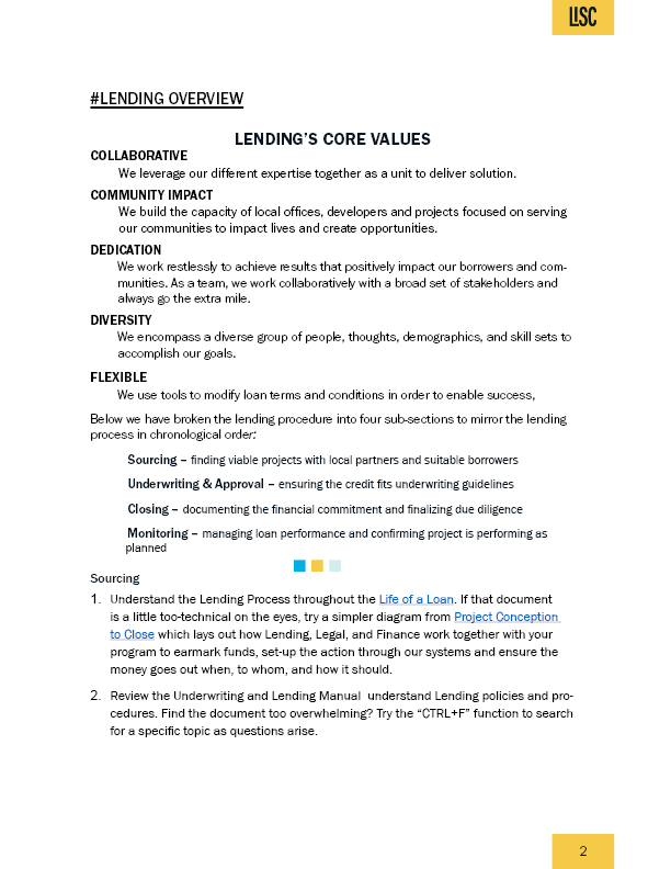
Hi All, I am doing an onboarding guide in InDesign. I am trying to work with company’s font from their brand styling guide (Futura Gothic mostly using Futura Gothic URW). It is going to be about 17 pages so I am just posting the first page for input on how to make the type and layout look better since the subject matter is not very interesting. Any ideas on what to do to make type better should I make margins larger? Any constructive critique is much appreciated, I think - haha.
It’s it’s all one column, I would definitely try bigger margins.
First, I’d be looking at other recent documents in the company archives so I could match their existing style. Do they have Indesign or Word files with styles already set up by someone else?
The two different types of numbered lists on the same page bother me.
When you create the 17 page document, keep an eye out for widows and orphans. The word ‘arise’ on Sourcing 2 is an orphan. The Chicago Style Manual says to get rid of them… change leading, increase margins, etc., so words don’t get stranded on a line by themselves.
Futura Gothic? Are you sure that isn’t Franklin Gothic?
I don’t think the answer to making it look more interesting can be found in one page of the booklet. I think the entire booklet needs to be considered as a unit in conjunction with whatever other aspects of their branding are relevant.
1 Like
It doesn’t have to be boring. ![]()
I good communications designer can make it fun and entertaining, with a lot of work.
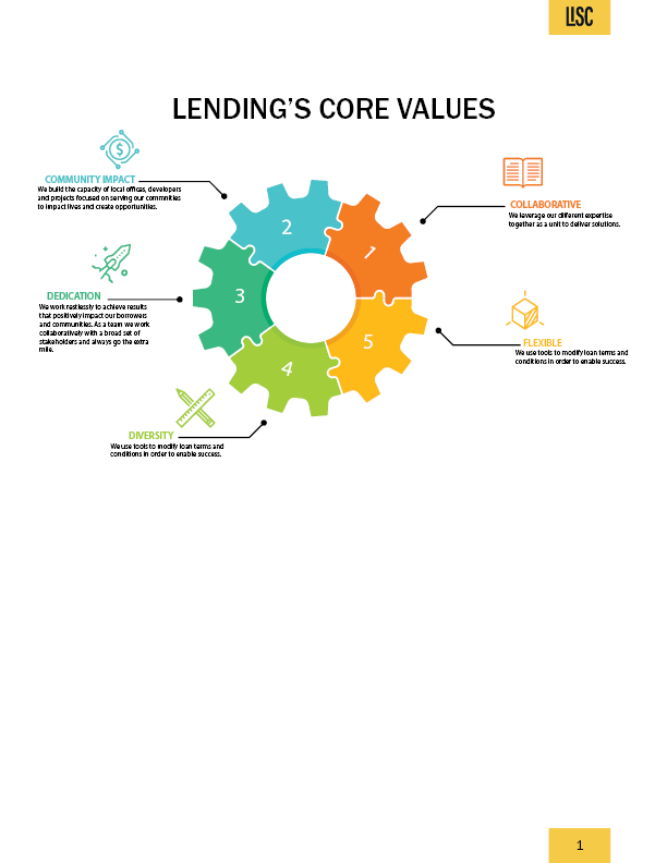
Maybe you end up with more pages but you could use images like this one for “going the extra mile” at (3) dedication

Hi everyone, thanks for your feedback. unfortunately the branding guide for the department (not for use company wide but it would be nice to create something that could be adopted by all departments) is very sparse and doesn’t give much guidance on creating documents. I tried to at least incorporate the company colors. I tried to give the document more white space and finding it a challenge to incorporate illustration and photos (a bit of a challenge since the cues from the subject matter makes it a challenge to find appropriate graphics). Mojo, this is a new guide so unfortunately nothing to rely on from past files. I will take a look at The Chicago Style Manual. I haven’t finished the document yet (will need to add more text or take some out) but I will look for the widows and orphans and words that aren’t hyphenated properly. Just-B yes, its Franklin Gothic (don’t know why I had Futura on the brain). I am showing you only a few pages because the document is over 20 pages.

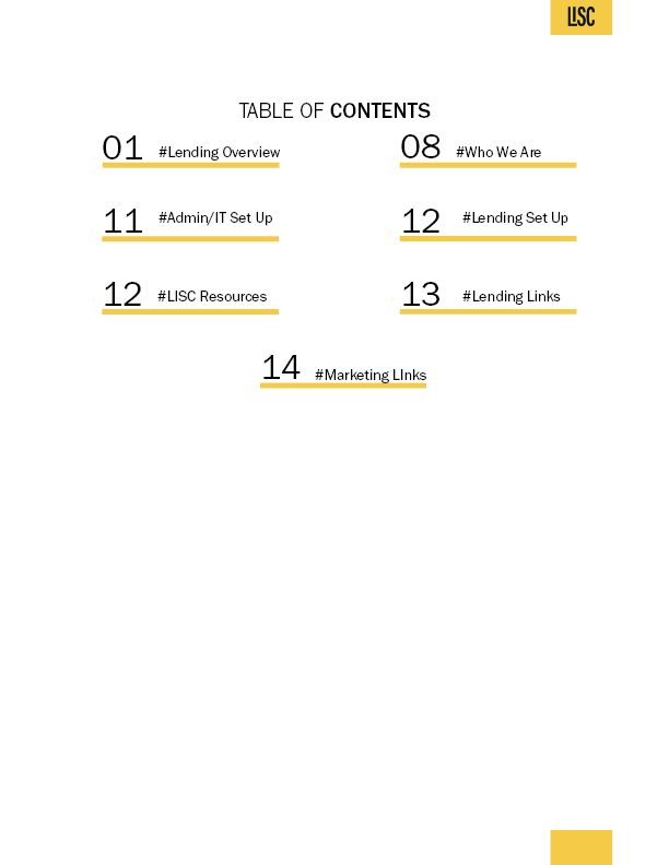
I have to work on the alignment in the Table of Contents because right now the section titles aren’t aligning with the yellow bars (I had the text aligned to bottom of their text frame and there is nothing below or near the text that would make them not align to the bottom so I am a bit confused).
Please not that for some reason the rectangles that have the company name and the numbers for most images are overlapping so the rectangle height looks doubled - when I export the images it is overlapping the rectangle for the footer (which has the page number) with the rectangle for the header (which has the company logo) and is on the next page.
The first page or two, I thought was an improvement, but then when it gets into pages of text, I’m afraid it all still looks a bit too, type design from the school of MS Word. There’s not a lot of elegance in those nested, excessively deep indents. I have a personal dislike of numbered indented paragraphs. There are many other ways to format information like this without resorting to word-processing formatting.
Hi Sprout, thanks. The document originally had numbers. Do you think I should just use some kind of list icons instead of the numbers. I have been looking for some good list icons haven’t been able to find any.
If it needs to be a numbered list, as that is what the author intended, then there’s nothing wrong with that per se – though there are other ways of displaying this kind of information. It’s all about how you format it. Personally, I find it a redundant construct. You read them in numerical order anyway, by definition. The first para, necessarily, is followed by the second, then the third, so to number them one, two and three, etc seems unnecessary to my mind.
Remember, your job is to make the text as transparent and easily digestible as possible. Huge, great indents interrupt flow and make for staccato, jerky, disordered reading,
You need to get the words from the head of the author to the head of the reader as seamlessly as possible, whilst using typography to help convey the emotional gist of it. You are an interpreter.
For me, the worst thing that ever happened to the laying out of tracts of text was MS Word. Because it is in every office, everywhere, it has become the de facto standard. Just because it is the default norm amongst those who do not understand how to set type, doesn’t mean you should follow it.
Have a look at blue-chip corporate communications, books by high-end publishers. You are very, very unlikely to find text laid out with that kind of visually over-bloated visual system.
For what it’s worth, whenever I start a book, I go through the original author’s manuscript, determine how many levels of hierarchy and different call-out formats are required, then devise a system that requires the fewest possible variations to communicate the intended message. That way when the reader comes across, say, a paragraph with a half line space either side and set in italic, they know it’s a quotation. You need to make them understand the visual language system as quickly and cleanly as possible. That way, the typography itself doesn’t get in the way of the text.
I have (probably, mis-) quoted this before and will likely do so again because it describes the above perfectly. Adrian Frutiger once said, something like, ‘If you notice the shape of your spoon at lunch, it was the wrong spoon.’
Hope this helps
Simplicity and elegance with a hint of seasoning should always be the aim when laying out large amounts of text. It is the exact opposite of relating headings for adverts. You don’t want to grab attention. Less is more, and all that…
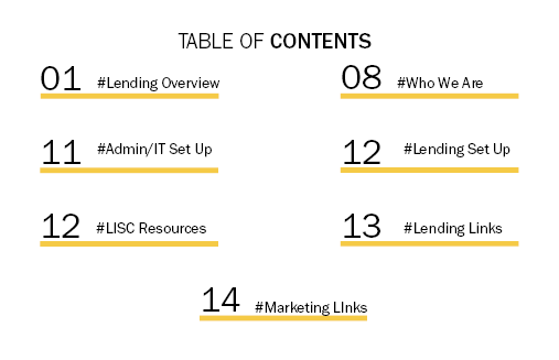
Consider omitting “Table of Contents”. Could just be my opinion, but it’s a bit like printing the word “Book” on a book cover. If you must have a header, there are more elegant possibilities; even just the word “Contents” would be better.
Numbers preceding the section title read like section numbers. Page numbers should always follow the section title.
The 2-column layout doesn’t work/makes reading order ambiguous. And, you have an odd number of items. The centered final item is not a good solution.
The hashtags and heavy yellow rules are superfluous decoration. They serve no purpose.
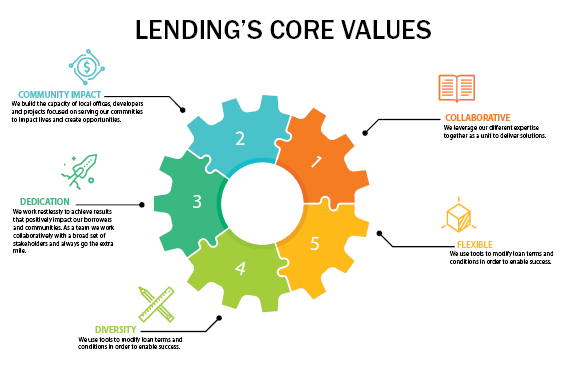
Consider rotating the graphic so that the number 1 is at the top, and making the order clockwise, rather than anticlockwise.
Why are #'s 2, 3, and 5 upright while 1 and 4 are rotated?
The callout connectors don’t connect , or even land in consistent proximity to their targets.
The placement of the icons appears to be happenstance.