Okay, I am going to be the devil’s advocate – or the client’s advocate – here.
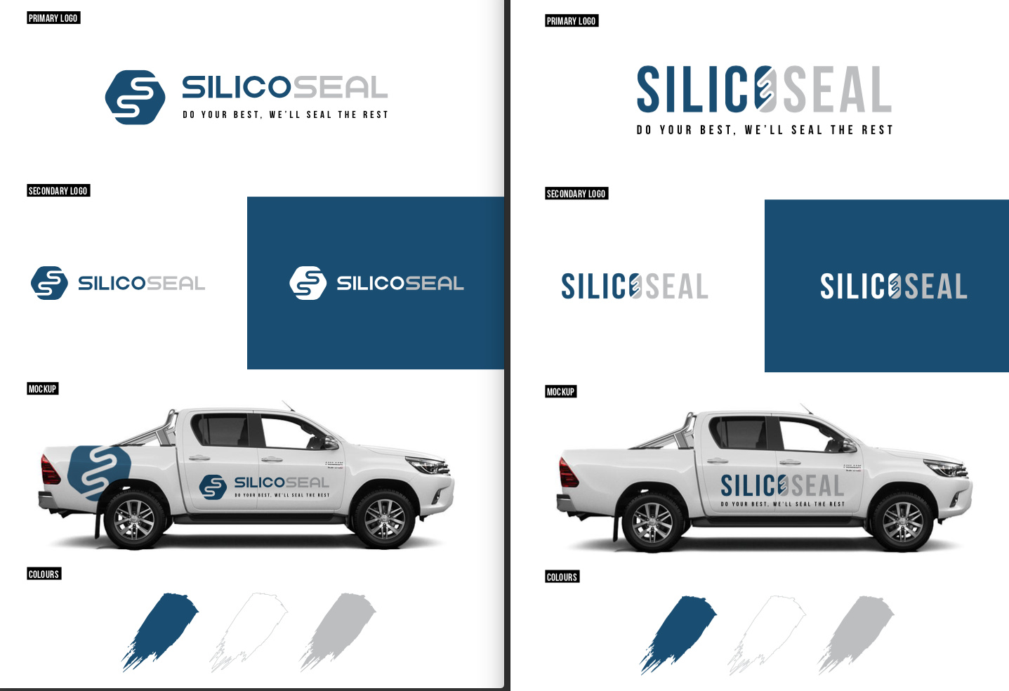
First of all, let me say that you did some nice work. Showing the primary logo, secondary logo, reverse, vehicle, and color palette is great. And the logo work itself is nice – though I am more drawn to the logo on the left since, as Print Driver said, the logo on the right doesn’t really read “silico.”
That said, here’s where I’ll be the devil’s advocate. In some ways, these are the same logo. They both use the double S reversed out of a shape. If I were in your shoes and this was my work, I probably wouldn’t have shown both of these as two different concepts. I would have shown the one on the left and a second option that used a different graphic.
My strong suspicion is that that’s what the client is seeing. They probably like this work, as they should, but feel they are two options that are very similar and would like to see another option using a different graphic device.
The question that comes up, and your original question, is how to you handle this.
I don’t think you have to go back to them and ask what they like and don’t like or what they want to see. The way I’m reading it, I think it’s pretty clear. So I’d say you have two options. Option 1, stick to your guns. Tell them you said you’d deliver two logos, you delivered two logos, any additional work would be billed over and above the estimate. Option 2, fall on your sword. Tell the client that, in hindsight, you see that the two options are very similar and that you’ll design one more that doesn’t use the double S to give them another option.
Without really knowing you, knowing the client, knowing all of the communication that went on, etc., I’d lean towards option 2 if I were in your shoes. You might have to bit the bullet on the extra time incurred and chalk it up to a learning experience.
Again, I think you did nice work here. But I would say that you have one concept executed a little differently. Show them two unique concepts.
Hope that helps.