Hi everyone
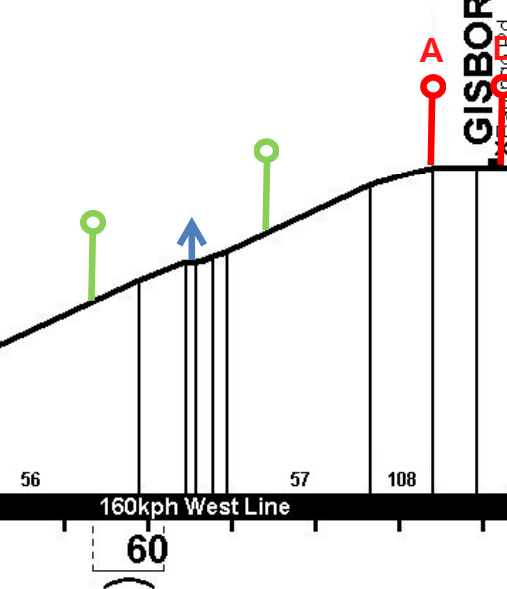
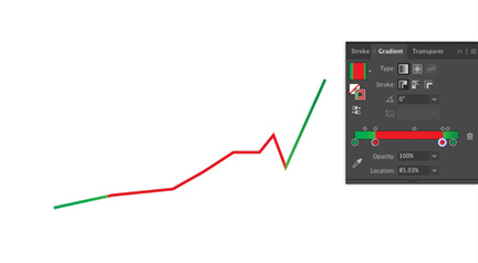
I’m trying to re-design a gradient diagram for our transportation services. Rather than depicting the hill gradients in terms of ratio (eg 1:56, 1:57, 1:108, as depicted here), I want to use color on the hill profile. As an example, the steep part of the hill - 1:56 and 1:57 - might be dark red, while the shallow part would be light red, and the level part perhaps green. It would let us get rid of the clutter of numbers.
Does anyone have suggestions for the best way to go about doing this? I’m particularly keen to check out examples used elsewhere for a similar purpose. I’m also very open to suggestions for other ways of approaching the issue.
Thanks! John