Hi guys, i had a job test for html and css for a web designer position.
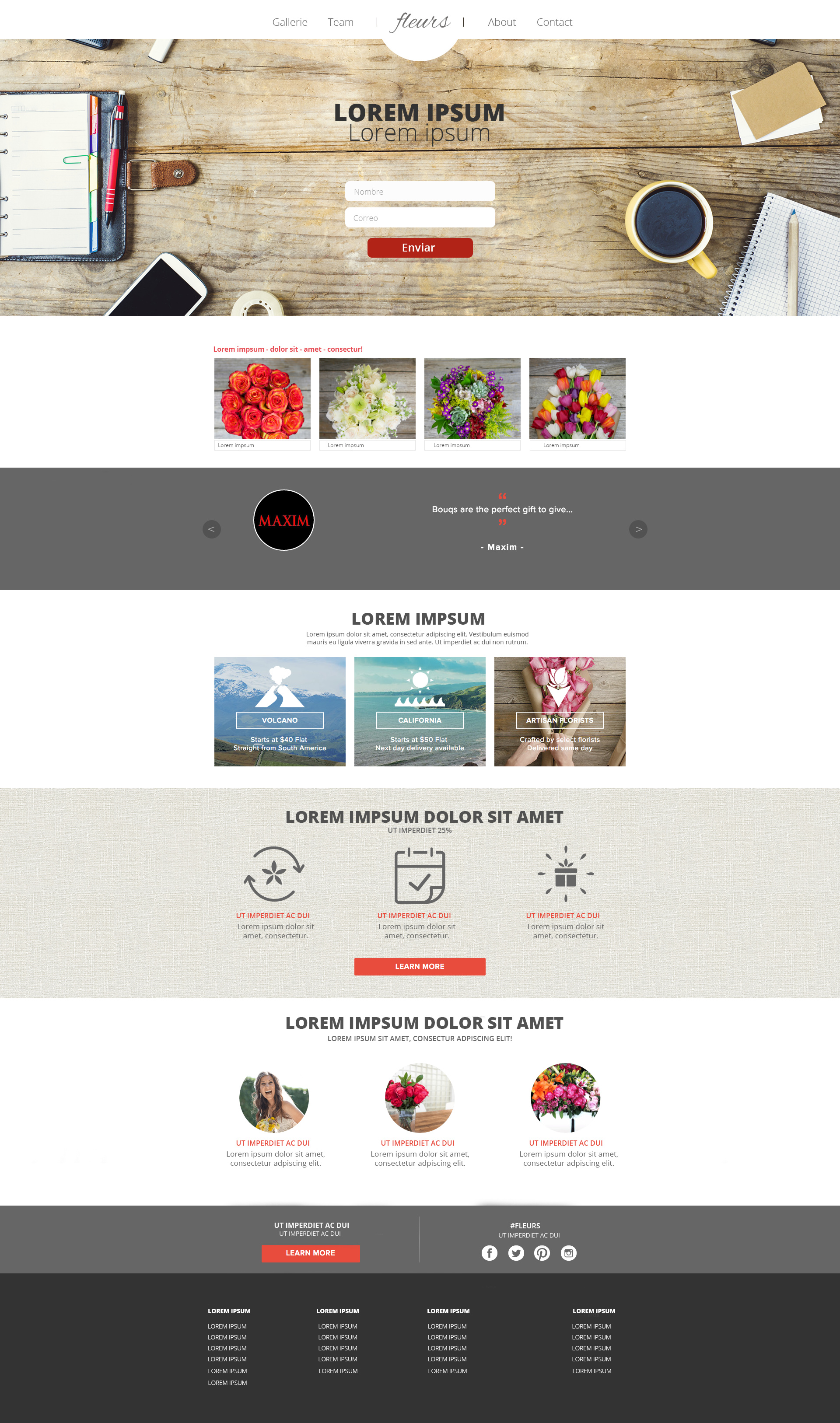
They gave me a jpeg client template and I had to build it the most simillar possible in html and css, without downloading anything and in two hours, it should be responsive for deskopt, tablets and mobiles and trying to do it the most simillar posiible to the image below, with all the texts dinamics, not images. The adobe software was available to do the test:
I didn’t succed the test but, honestly i thought the time given was absurd and not being able to use internet or alternal tools such as frameworks) want to learn for future test
Pretty easy conversion one you learn to see it in a modular way.
I would create a couple of classes for the rows and a few for the columns. You can see that it’s build using the columns - 1, 4, 2, 3, 4, 4, 2 and 4 for the footer. The section headers are just centered bold text.
If you can use flexbox or bootstrap you don’t have to do anything special. If you can’t- or have to support older browsers then you can use the float trick (which would actually be faster if you don’t know flexblox/grid).
Everything is wrapped in a container with a max-width set with 0 auto margins.
And by everything is wrapped in a container I mean something like this. So each row has 100% width, but the content is wrapped in the container.
<.section> 100% width -class with 3 col set up and row color (odds are white)
------- <.div> example 1000px width, 0 auto margins
------------- <.h2>header here</h2.> centered
-------------<.p>random string of text</p.> centered
-------------<.your choice of column containers>
------------------- <.1 2 3 or 4 responsive columns> column content
---------------------<.1 2 3 or 4 responsive columns>
---------------------<.1 2 3 or 4 responsive columns>
-------------<.end column container>
-------<./div>
<./section>
I would have coded it by hand using BBEdit (or most any other code editor) and Photoshop to determine the solid color hex values. It’s just a series of images inside containers inside of other containers. As for the responsive part, that center column is already about the right size for mobile, so I’m not even sure any special media query-based coding would be needed to address it as long at the full width-container divs expanded to fill the extra space to 1200 pixels or so. Maybe that wouldn’t have gone over too well with them, though.
If this were a sample page for a real website, I would likely do it differently and use a framework inside a CMS, but if the objective is to just code one page and make it look like the example, this one’s fairly straight-forward.
I doubt I could have done it in two hours without looking up a few things, though. I have a habit of not bothering to remember things that can be looked up with less effort than it takes to memorize them.
I doubt the objective of the test was to have the winner produce a fully coded page. Instead, the objective was, I’m guessing, to see who could get the farthest writing the most compliant code in the least amount of time.