Hi!
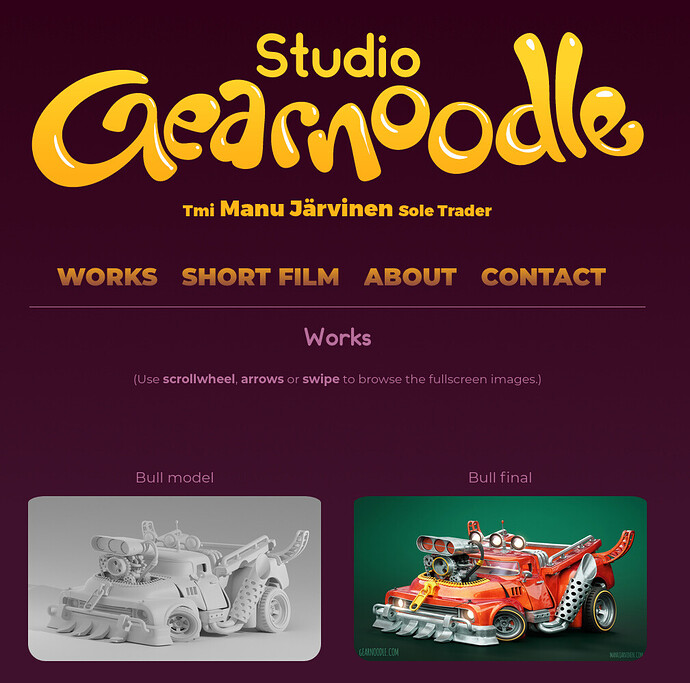
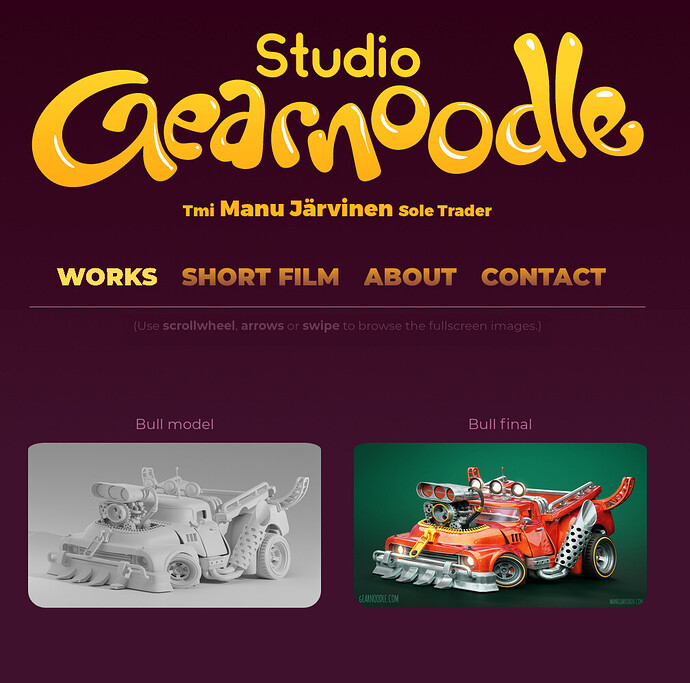
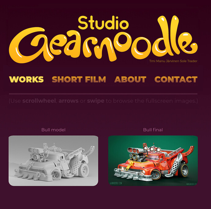
I haven’t yet published my website, but the design is almost finished.
You can see for example the ‘Works’ page here:
I would need help with the layout of the logo, texts and the navigation and further texts like the gallery instructions. How could they be arranged better without losing the information?
And here is the landing page, but I think it’s alright already:
gearnoodle .com/indexREAL.html
Thank you everybody!
(Sorry about the scattered links but I’m not allowed to post full links - which in my mind sucks because this is the WEB DESIGN category for … sake. Okay. Thank you.)


