Hello everybody, I would love to have some constructive feedback be it negative or positive on a mens shirt I designed.
I would like to know what you guys think. Some I have questions I have are like:
Would you wear it yourself?
Do you like the color combination?
Are there things I could improve?
Score from 1 to 10, 1 being worst design and 10 very good.
I don’t wear branded polos. Especially not brands I don’t recognize.
Welllll, that’s not entirely true, work issues branded polos that you wear or else, but this? Nope.
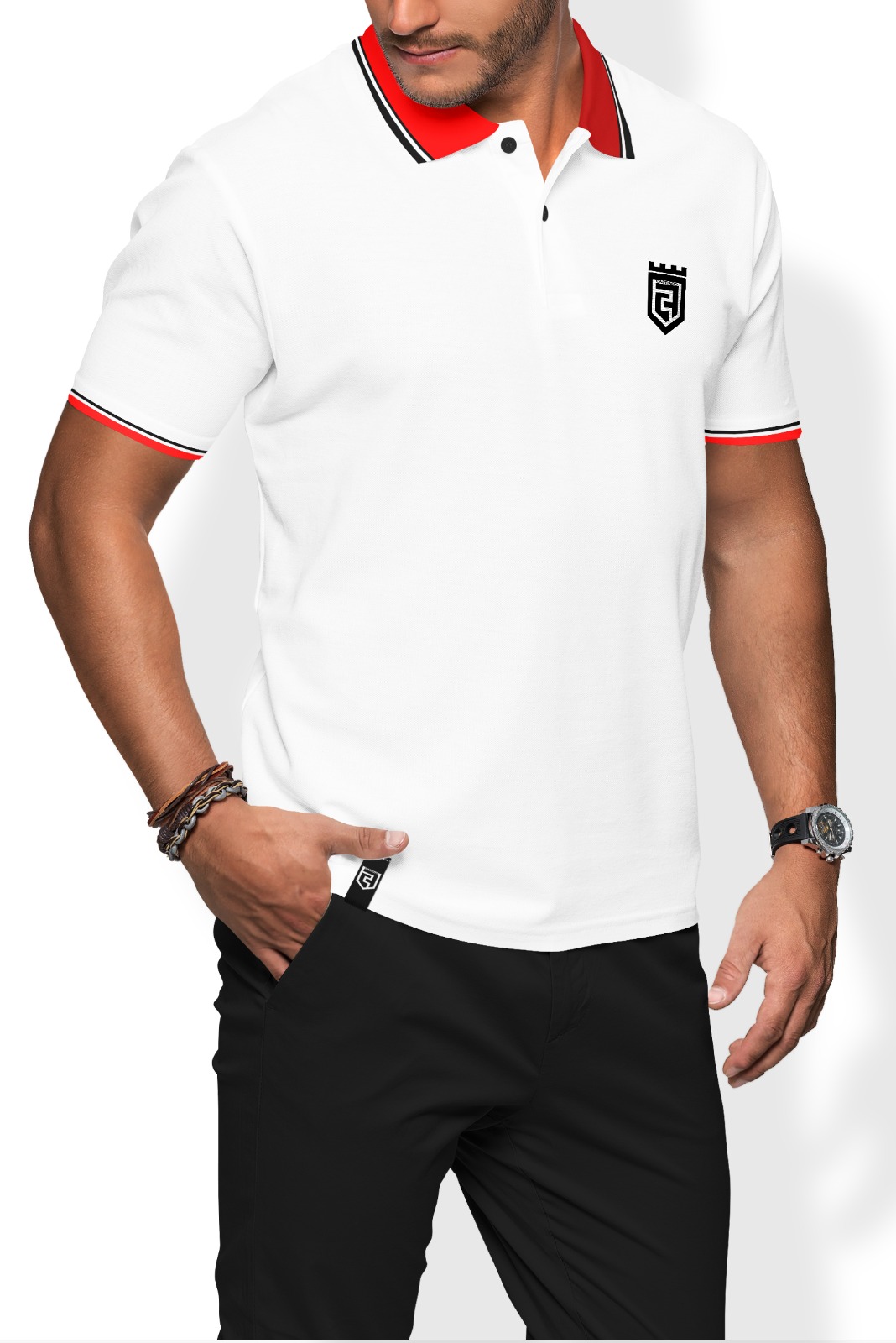
It’s just a white shirt with a stripey collar. Meh.
As shirts go I guess it’s a nice polo. I don’t wear them so I have no clue what is “in” right now. What is the symbol? Did you design that as well. Just wondering because there is something blurry under the first solid line. Not sure if it’s lines or a word.
I only wear plain, non-advertising shirts, unless it’s something I’m passionate about (a favourite football team, for example), so, no, I don’t have an opinion on it.
The way I see it, I have to be paid to wear a shirt to endorse somebody’s product.
The shirt isn’t my personal style, so I wouldn’t wear it. But I’d say it’s a nice looking shirt. Of course, you’re talking to a guy that spends the majority of his life in shorts and a t-shirt, so put much stock in my opinion.
Hello,
I really like the way you design this T-shirt as it looks not too funky.
It looks sweet and simple.
You can also check my blog for link removed Ideas.