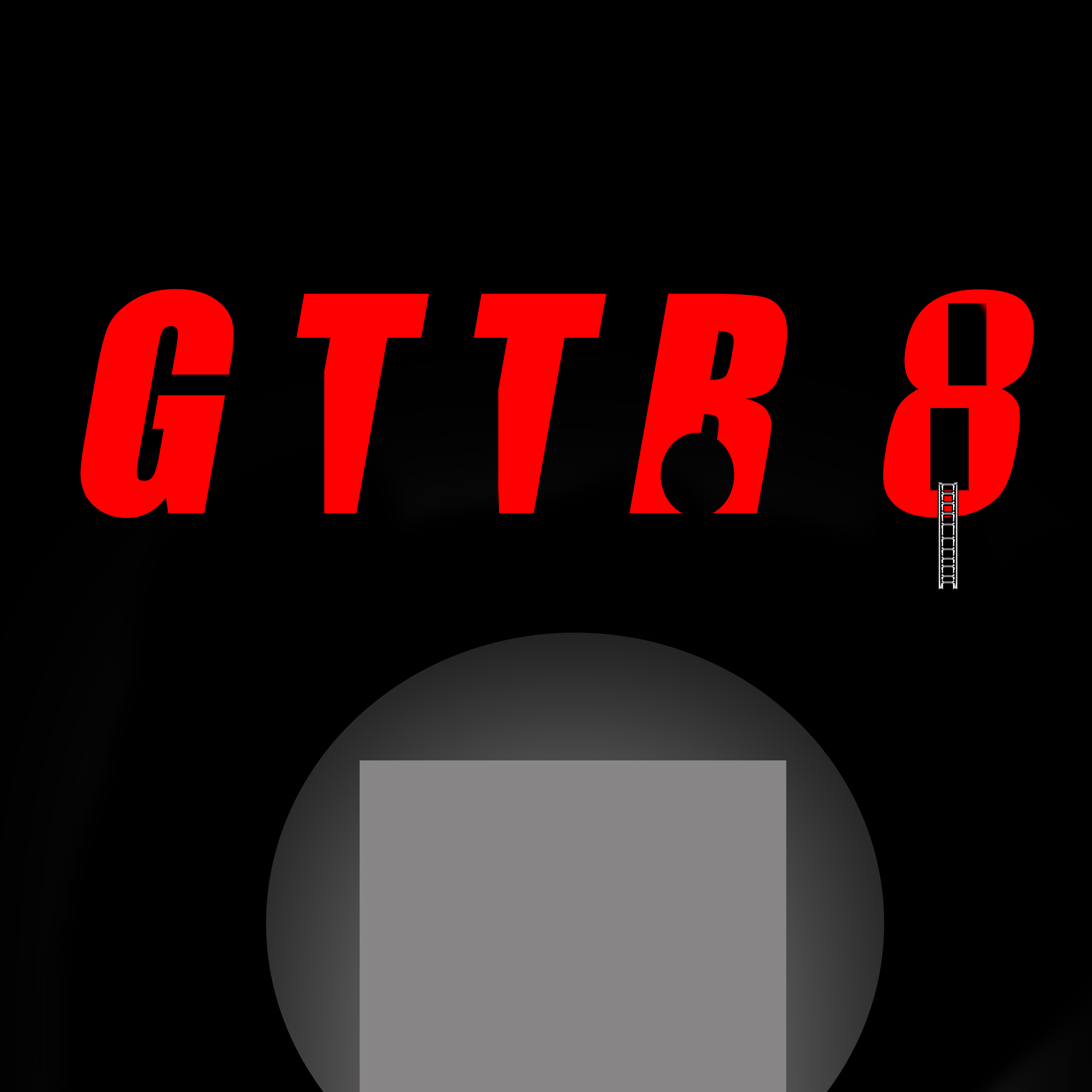
Does this translate well? Get to the roof 8? Like a preview for a game/cover art?
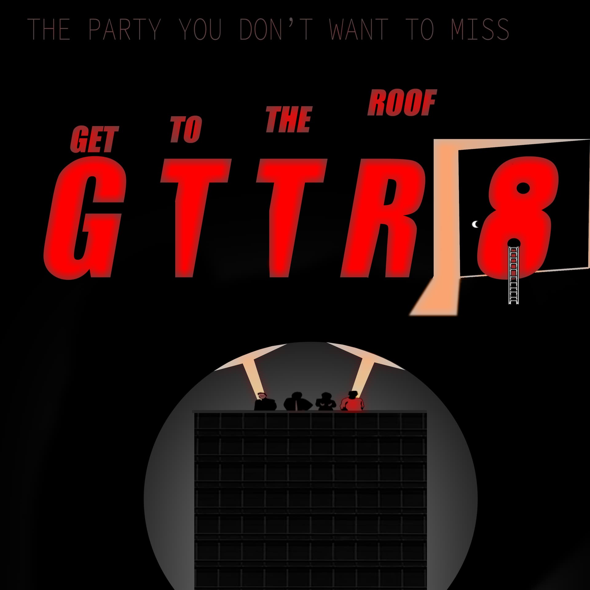
I just made it in Photoshop. Should I add more or just give up on graphic art entirely?
Does this translate well? Get to the roof 8? Like a preview for a game/cover art?
I just made it in Photoshop. Should I add more or just give up on graphic art entirely?
Hey Korupt,
Fair play for putting this together and asking for feedback, it’s tough out there and asking for feedback is spot on and exactly what you should be doing.
The good
Strong: The black and red combo gives it a very bold, ominous feel, like a thriller or action game.
That grey pit or platform below draws the eye, but has no detail or function in my opinion.
“8” with the ladder tells a mini-story and actually gives meaning to the “Get to the Roof” idea.
The bad
he text “GTTR 8” is confusing at first glance. Without your prompt, “Get To The Roof” isn’t immediately obvious.
Possibly writing “GET TO THE ROOF” above or as a subtitle to clarify the title
The silhouette in the R not immediately clear what it is a person? a bomb? If it’s meant to be someone rappelling or dropping in, make it more distinct.
The 8 works well with the ladder, but people might read it as “GTTR B” instead of “8”. Maybe outline or stylise it more as a numeral to avoid confusion.
The maybe
Could it use a tagline?
“They said the roof was safe.”
or
“Only one way out.”
Maybe some subtle gradients, light flares, or rooftop textures to give the impression of height or danger.
Don’t bin it. You’ve got style and mood nailed the concept is there. You just need to lean into clarity and storytelling a bit more. Graphic design isn’t about perfection on first try it’s iteration. Keep swinging.
Would be cool to see a v2 if you update it.
It’s hard because it’s worth doing. If you want easy, then do nothing, but that doesn’t get you better, that just gets you gone.
Keep going. I know you’re better than this - you should start knowing it too.