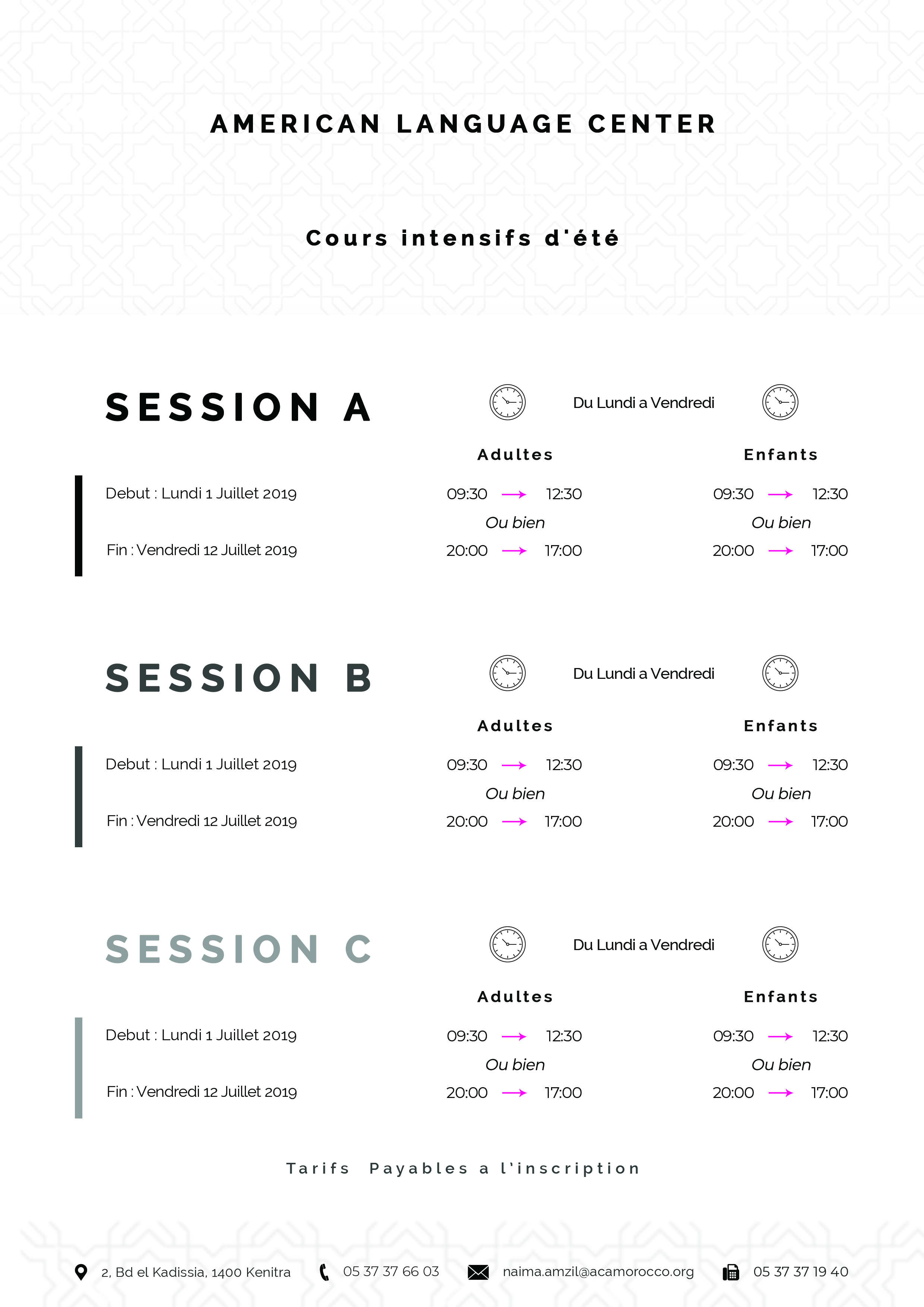
Hi! I have an internship in a language school, and I’m redesigning their summer sessions schedule, the old one was just plain text and I tried to do this, I made three versions, please leave your feedback ![]()
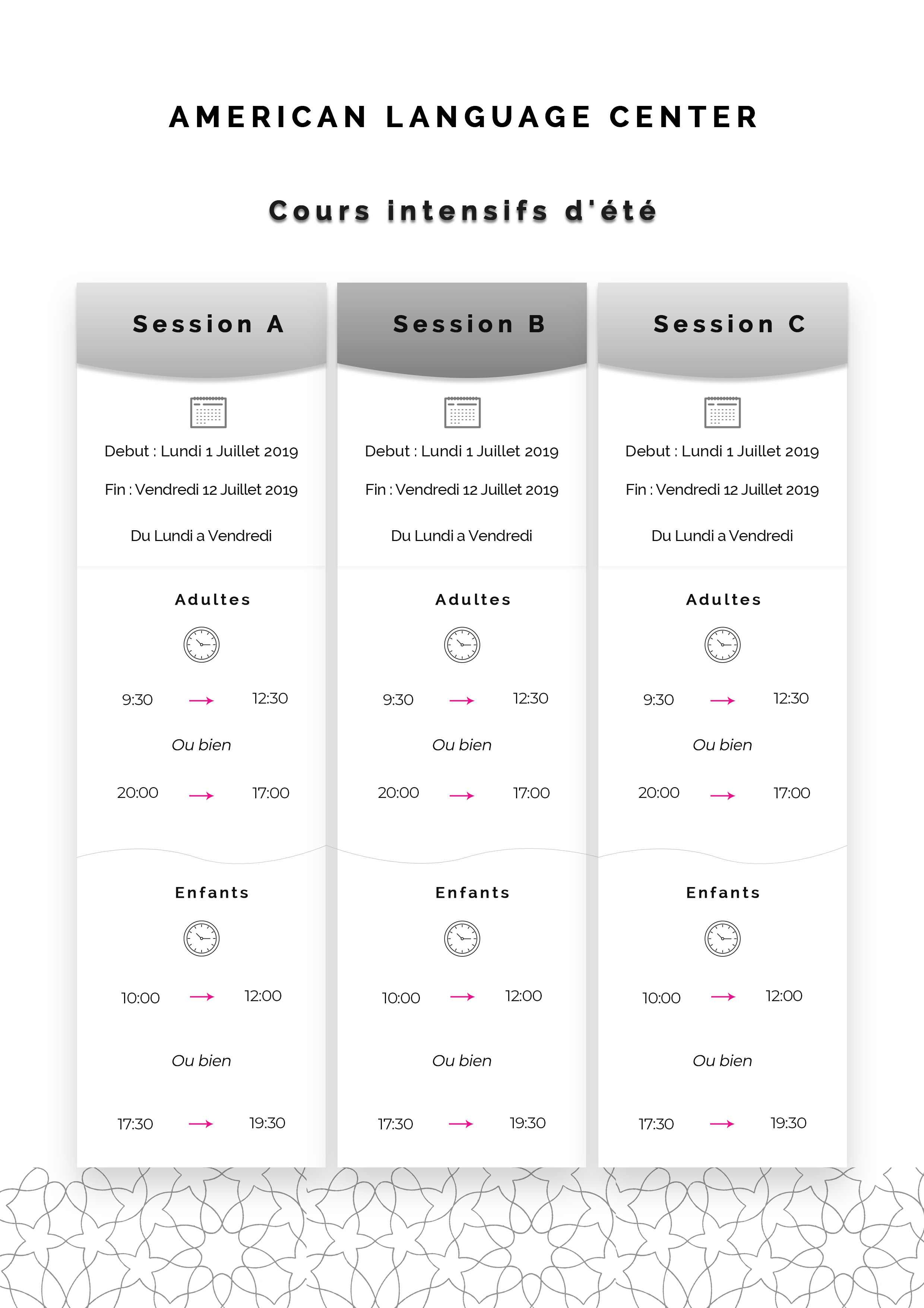
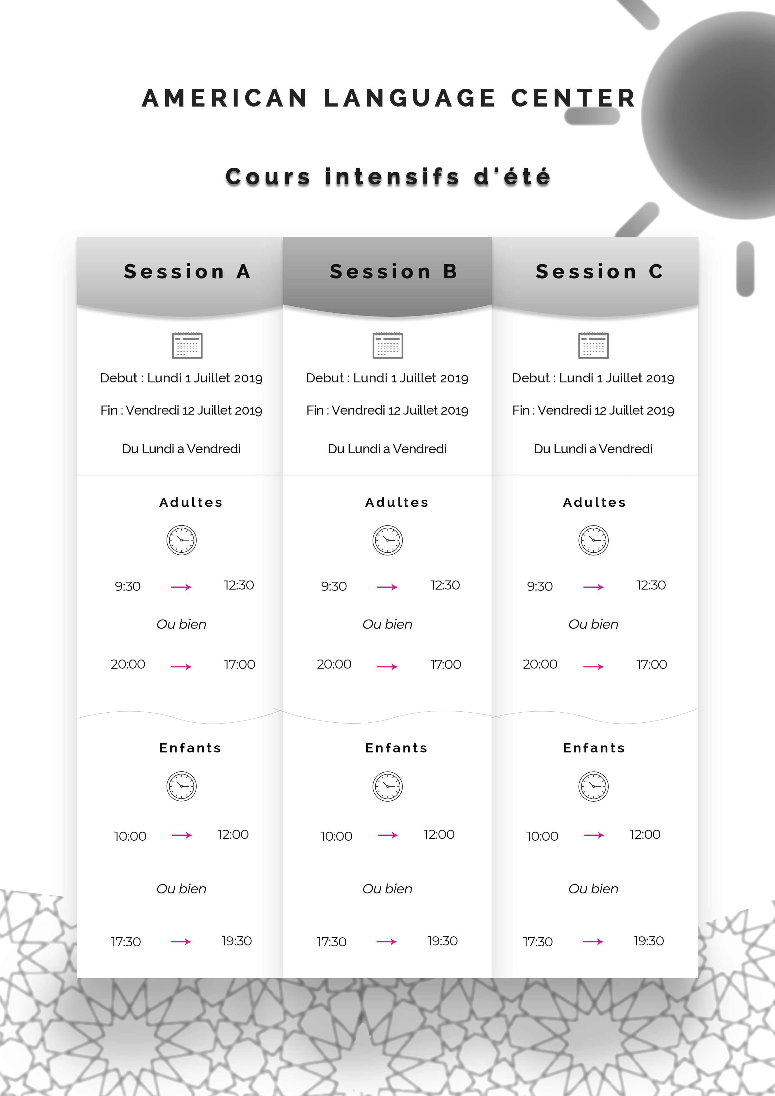
I like version one. Simple, minimalist, flows well - easy to print. Although I don’t mind the graphic elements added to version 2, the pertinent information is going to be painfully small to read.
Nothing wrong with 3 exactly, I just really enjoy the vertical layout of version 1 over this.
However if that contact information is important, you should consider adding it to whatever your final selection is.
1 Like
I think version 1 is the strongest. there’s a slight drop shadow behind “Cours intensifs d’ele” that I would remove. The pattern is nice and hides the fact that it repeats nicely but maybe subdue it to ~70%. Is there any online source you might need to direct them too or is this [printed copies] their only source of the info?
1 Like
Thank you ![]()
THank You ! ![]()